HOME | DD
 brightredrose — Worth It
#equestrian #fox #horse
Published: 2016-03-12 15:21:35 +0000 UTC; Views: 1140; Favourites: 76; Downloads: 0
Redirect to original
Description
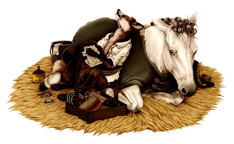
(Edit: Minor lighting adjustments)Horse people will understand.
Sample illustration for a children's book idea.
Heavy reference of my own photos for the horse (Zena from the barn); the fox I kind of made up as I went. Hopefully they're in the same family of realism-with-a-smidge-of-cartoony.
Related content


Comments: 6


I'm glad to see this colored up! The graphite version was really nice, and the color adds another layer of interest. Your coloring method just works very well together with your lines and shades.
Really excellent work on the tool box! That's probably one of my favorite little things about this, as each item looks well referenced so I can tell what each is and they are just as detailed as everything else.
The horse's face is my favorite. The subtle shifts in shading is really lovely, especially on the nose, and that expression totally makes it. xD Same with the fox too. He just looks so tuckered out. I totally know how you feel, foxy. Especially after a long day of riding with a fussy horse. I can so relate.
A bit of critique, the entire area around the fox is a bit too dark. If you print this the colors will end up even darker and you won't be able to see what's happening. I can no longer tell he's holding a saddle because it appears like a very dark blob. His shadow on the horse's side is strange and makes it appear as if he's "sinking" into the horse's body instead of resting against it. So just lighten up those values and tweak the shadow a bit to fold around the horse's form and you'll be golden.
Additionally, and this is something you probably, unfortunately, can't fix, but for the sake of future reference, the hay doesn't much look like hay, it looks like a fur rug. Hay (as you know) is much more splintery and should be stiffer and stick up a lot more chaotically like this instead of rolling very smoothly. You could say it's a stylized choice, but it doesn't fit the overall realism-base the illustration aims at.
I'm very interested in seeing more of this project! I've enjoyed what you've posted on Tumblr of these two. Their relationship is definitely an amusing and curious one. Really awesome job overall! I can't wait to see how this project unfolds! Best of luck!
👍: 0 ⏩: 2

OOOOOooooooooh one more thing if you don't mind me asking! Do the shadows on the horse's blanket and under the fox seem too deep in the graphite version? Trying to narrow something down here.
👍: 0 ⏩: 0
Thank you! Lol I was wondering if someone was going to call me out on my cartoon hay--Actually I could fix that (a lot of my drawings have "shopped" layers over top where I've gone back and re-drawn entire chunks and "sewn" the fixes on, ssssh, don't tell anyone). But believe it or not I'd actually done about 1/6th of their little "base" in a very sticky, prickly way (you can see some remnant of that up in the top right of the base even though I toned it back)...for the first time in a long time I'm going to plead artistic license because it didn't work overall and I ultimately decided to keep it looking comfortable rather than completely realistic. Will definitely tweak the shadows and the color of that saddle though--I've been working on two monitors so keep any lighting tips you spot coming, because suffice it to say my monitors do NOT play well together and leave me as a confused third wheel. 
Thank you very much for the feedback--I'm taking this to conference soon and the fact that the shadows needed to be dialed back is suddenly very, very obvious now that I had a fresh pair of eyes take a look (and hell yeah it would print too dark, the local print shop's quality is not exactly "exceeds expectations").
👍: 0 ⏩: 1
Ahaha that takes some skill because I can't edit graphite stuff digitally for the life of me!
I can completely see the monitors being the issue. I know I had to double check the image on other monitors (phone included) to make sure it wasn't just my laptop appearing dark.
I think the reason the saddle appears super dark is also due to the fox's arms and legs having the foxy darker limbs, which doesn't help with preventing things blending in (not saying they need to be changed, just saying that's probably an added factor); so tweaking either should fix it well enough.
As for the shadows on the graphite version, they look fine on that! I can't even see the subtle wrinkles of the blanket on this colored version like you can on the graphite. So graphite version is fine, I think, aside from the saddle possibly being too dark on that too, but not by much. My biggest source of contempt is the shadows on the blanket to the left of the fox (the fox's right) on this colored version as there shouldn't really be any shadows there at all as nothing is there to cast it, so it creates the sinking illusion the graphite version doesn't have. So likely just completely lightening the shadows on the blanket should fix that super quick!
Also you're very welcome!

👍: 0 ⏩: 0