HOME | DD
 BroHawk — Prototype
Published: 2007-03-01 05:03:05 +0000 UTC; Views: 2569; Favourites: 15; Downloads: 183
Redirect to original
Description
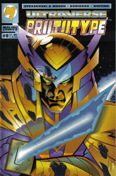
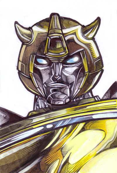
Prototype cover for Malibu inked by Mike Christian.Related content


Comments: 22

*wipes away a tear* This series will be missed...
Thank you, good sir, for the awesome pic allowing me a trip down memory lane.
👍: 0 ⏩: 0

Whoa! Digging into the crates for this one. I remember this cover. I was working at Malibu during the Ultraverse years. Nice work! Didn't know you had done stuff for Malibu.
👍: 0 ⏩: 0

I'm a dork, and i love your work! Thans for keeping up the art! [link]
By the way what part did you do? Colors? Pencils and colors?
👍: 0 ⏩: 1

I just penciled the cover.
 (Smile)")
👍: 0 ⏩: 1
Very nice work! I DID notice the reflection of prototype in his armor! Very cool cover.
👍: 0 ⏩: 0


Thanks again...Some beg to differ though. (Wink)")
👍: 0 ⏩: 0

wow, the glows on this are awesome, especilly with marker!!
👍: 0 ⏩: 1
ooh...damn, sorry dude, i guess its the texture of the pic.
👍: 0 ⏩: 1


Good job. I don't think there was any need to show the sword though. I'm guessing there's gunna be a lot of sword play inside the mag? Maybe just the moody face, or a closeup of the character's eye would have looked nicer. The character's enemy could have been subtley reflected in the warrior's armour.
There's a retro feel to the way this has been colored. I like it. I'm sure it looks even better all glossy, then the sword'll shine.
It looks like it's been over-inked in some places. Some of the reflections have black lineart, which is a bit weird. This doesn't help the eye distiguish between highlights and decoration.
Rant over.
👍: 0 ⏩: 1
Deep.
Are you an editor?
A teacher of comic art?
👍: 0 ⏩: 1
Nope, just a bit of a geek in my old age!!
👍: 0 ⏩: 1
A geek that sweats the small stuff and gives bad critiques.
29 aint old son.
👍: 0 ⏩: 1
it wasn't a bad critique, just my opinion. That is aloud.
👍: 0 ⏩: 1
I don't mind HELPFUL criticism.
The book was printed in the mid 90's.
First off... you come in critisizing...no Hello...How
are you... my name is...You just open up with both barrels. Why? At this point I don't care.
Look....
A good critique on the art you are criticizing
would be from the advantage of KNOWING the
book the characters and motivations...Which you so
blatantly show that have no clue about.
So it was a bad critique.
👍: 0 ⏩: 1
far enough.
i think i was in a bit of a mood.
👍: 0 ⏩: 0

WOW! THIS IS INCREDIBLE! O_O!!!! Fantastic job all around! Everything's so cool! 
")


Faved!
👍: 0 ⏩: 0