HOME | DD
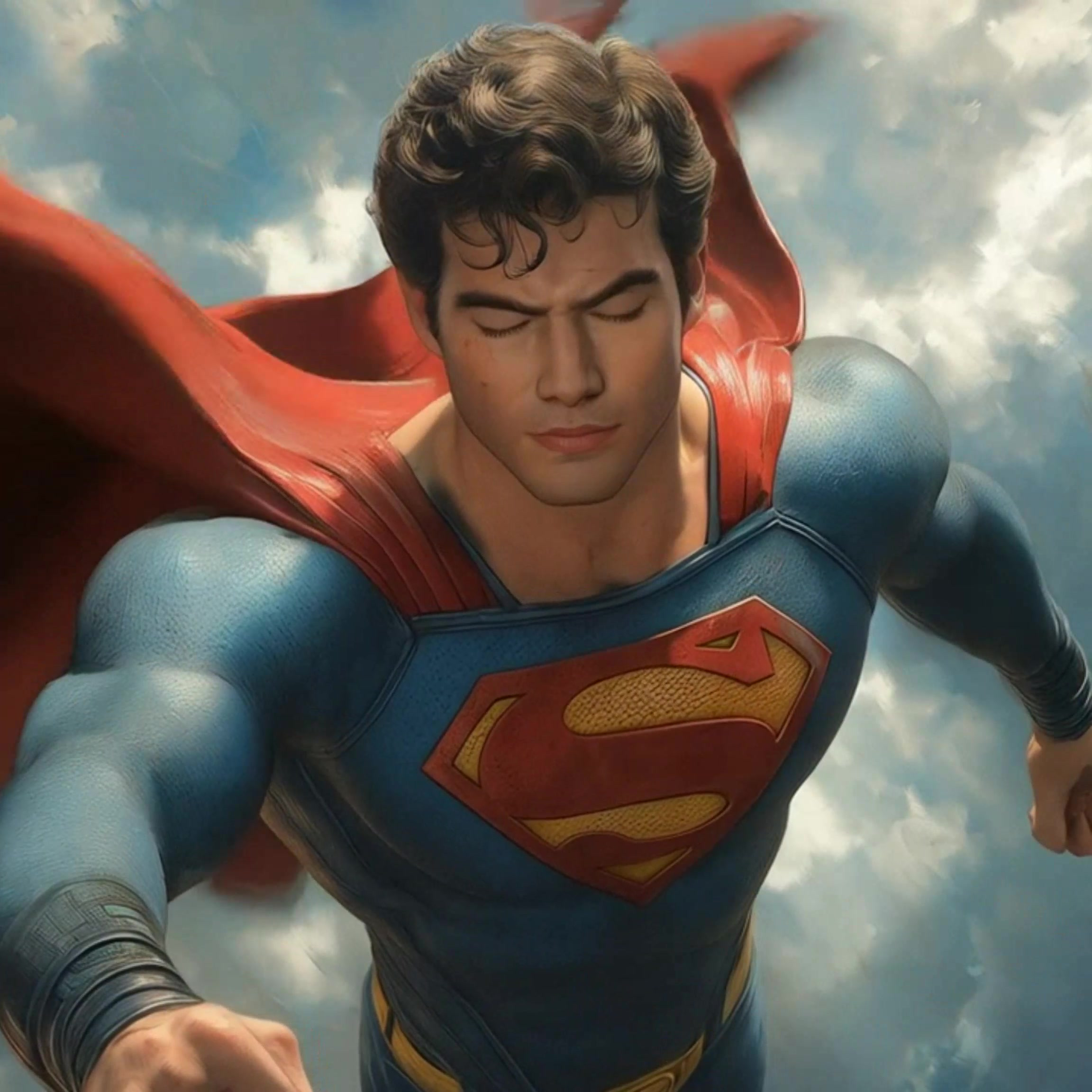
 BroHawk — The Kryptonian

Published: 2007-09-11 04:29:47 +0000 UTC; Views: 18542; Favourites: 537; Downloads: 0
Redirect to original
Description
It's Supes...Did this awhile ago...
Tryin out my prisma pencils
Related content


Comments: 68

I never undestand how you do theses half- tons.......
I´m really a bad inker !
👍: 0 ⏩: 1

You are a bad inker like
I'm the queen of England.
Just get yourself a black prisma
pencil and go to town.
 (Wink)")
👍: 0 ⏩: 1
Black pencil????
Man,in all my life I tought you do it with dry brush!
Shame on me... hahahahahahah
👍: 0 ⏩: 1
Ha!
You did think way to highly of
my skills.
👍: 0 ⏩: 0

swank.. and classy love the post modern Shield
👍: 0 ⏩: 0


All your works are awesome dude!!! I got a lot of favourite from them! ^^
I'd like to color this work if you would allow me! (don't worry, if you say yes, I won't forget to say it's your original work that I only colored!)
I'd be so glad if you said yes but I'll understand if you said no! ^^
Try to keep me informed please!
Take care and keep it up with your fantastic art!
")
👍: 0 ⏩: 1
Oh thank you very much man! Hope you won't be disappointed!
See ya soon!
👍: 0 ⏩: 0

great mix of new and old school, I like, it great work!
👍: 0 ⏩: 0

This piece is two fold for me...
I love the classic almost andrew loomis feel to it. The pose is strong and the redering is super clean.
Your vision of supes here is fantastic too. A little bit more alien in feel and that is is soo slick. I'm a sucker for personal takes on classics and this grabs me.
great stuff.
MC
👍: 0 ⏩: 0

wow, this is an amazing piece. I remember picking up the What If? but I didn't know who you were. I've woken up your stuff is sick. This is a dope Superman.
👍: 0 ⏩: 1
 (Smile)")


you don't see a lot of revamps that work on Supes... this does.... kudos!
👍: 0 ⏩: 0

Now THIS is how Superman should've looked from the start! The Man of Steel has never looked better or more heroic. An impressive job and a definite fave!
👍: 0 ⏩: 0


Very slick. I love the dramatic shading here...The shadows get sooo dark, the lighting on the chest looks very...dramatic. Yeah.
I agree with the others who mention it updating his look and keeping it in line with classic looks. I don't pretend to know much about his classic looks in particular, but I do like how elements of this design are very slick and modern, but it somehow captures a classic superhero feel at the same time. I think it comes from his physique looking "realistically ideal," rather than overly-ridiculously-musclebound. It is obvious he's very muscular and his muscles are emphasized, but still, they look believably ideal rather than having like a million bulges of muscle covering every inch of his arms. I dunno how to explain it I guess, even though I've mentioned something similar commenting on your pics before. 
I like the shading on his face, and how you use it to more effectively define his features.
Very awesome work on this pic. : )
👍: 0 ⏩: 0

Gotta agree with ~ice21900
I like how you updated the look while keeping the classic look in tact!
👍: 0 ⏩: 0

Wow! This is easily one of my top 5 favorite pictures of Superman. It seems like there are certain artists that have a style that seems almost tailored to fit a character, like Frank Miller and Batman or Ed Benes and Birds of Prey. I think you totaly OWN Superman. You not only nailed the look, but more importantly you got the attitude and presence. The DC big wigs are idiots if they don't let you do some Superman books.
I love the "S" idea you had and the idea of the alien one piece suit. I mean if his body is invulnerable and his suit wasn't at least nearly invulnerable he would have quite a few wardrobe "malfunctions" during his battles. The only way to resolve this that makes sense would be that his suit has to have come from the advanced technology of his homeworld. If you go with the movie descriptions, and Kryptonian technology being based off of crystals, then it's possible that these suits could be "grown" on rather than pulled on.
👍: 0 ⏩: 0


Now that is f***ing beautiful. You have captured the feel of a Max Fleischer Superman, updated the costume without changing it at all. Then, you pushed it a level that, I believe, Alex Ross will say, " You are the man!" Damn that is good.
👍: 0 ⏩: 0

love it man.
for some reason it looks like the classic supes look with a nice morden twist brilliant
👍: 0 ⏩: 0

The "S" is tight, reminds me of the spearment gum commercial.
👍: 0 ⏩: 0

I love Superman, this is the greatest.. I love the 'boots', the emblem is fantastic.. can you PLEASE do a colored version of this and offer it as a print?! PLEASE!!!
👍: 0 ⏩: 0


This should come as no surprise at this point...but I love this drawings. especially the boot re-design.
👍: 0 ⏩: 0

I think you're really good at anatomy. 
I like the boots myself. I'm not as keen on the S-symbol, but at least you're trying something different.

👍: 0 ⏩: 2
If you squint your eye's it looks like an 8 on his chest or an infinity symbol.
👍: 0 ⏩: 1
Thanks...For simple standing shots I don't use ref
But if its an odd pose ore forshortening I might.
I don't have models like some artist I know...
Well the \S/ symbol was inspired by the smallville Kryptonian glyphs they used.
I think is should look almost alien and only happens to look like the letter "s".
👍: 0 ⏩: 1
Yeah, I agree with the alien S-theory. I like how Mark Waid established in "Birthright" that it was a Kryptonian symbol that was important to their culture, so supes wears it as a tribute to his heritage. Then Lois actually dubs him superman because to her it looks like an "S". In the original movie it was the "El" family crest cuz Jor-El had it on and the other men had other symbols.
👍: 0 ⏩: 0

Should have used this design for the new cartoon coming out - waaay better design here...ya killin me man...another classic...
....don't make me break the clay out on you...
")
👍: 0 ⏩: 0

Classic AND futuristic, how cool is that?! Awesome work man!
👍: 0 ⏩: 0


The classic style looks awesome, and the expression, simple lines but striking look, nice!
👍: 0 ⏩: 0

That's really awesome, I like the old fashioned bw feel to it, and the costume.
👍: 0 ⏩: 0


heh, the kryptonian..... there's something to calling him by his race and then him with the expression on his face.
is he ready to take over the world?=]
👍: 0 ⏩: 0

A bit more of an alien flare compared to the classic costume, but it works.
I'll have to invest in prisma pencils. They look really nice on this.
Plan on coloring it, buddy o' pal?

👍: 0 ⏩: 0

I am a great fan of superman and I find yours really good. you have a good style!
👍: 0 ⏩: 0

Indeed. Like the little updates on the costume. ^^
👍: 0 ⏩: 0

| Next =>