HOME | DD
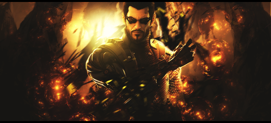
 BrunoWC — Adam Jensen
Published: 2011-08-06 05:47:18 +0000 UTC; Views: 5410; Favourites: 94; Downloads: 127
Redirect to original
Description
Adam JensenGanhei:[link]
Related content


Comments: 8

I never asked for this, but damn it, I'm glad I got it
👍: 0 ⏩: 0


Congratulations, you have won 1st place with this sig on Signature Lab's Daily Signature Competition #201
Here is your award: [link]
👍: 0 ⏩: 0


Same problem that I've had with your sigs before Bruno. It's a bit too big and needs cropping. I'll explain why. Too much negative space in a sig provides contrast against the focal, leading to the tag as a whole becoming unfocused and the focal point being less defined. My eyes are drawn to the sides of the sigs because of the dark negative space, which isn't what you want. You want the eyes to be drawn to Adam.
But anyway, I voted for this in the Sig labs competition of the day. Still the best from today.
👍: 0 ⏩: 0

Congratulations, your sig has been nominated to be entered in the Daily Signature Competition #201 on Sig Labs [link]
👍: 0 ⏩: 0