HOME | DD
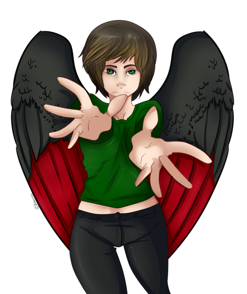
 Bubonicc — Reach
Published: 2012-06-08 01:15:25 +0000 UTC; Views: 477; Favourites: 20; Downloads: 0
Redirect to original
Description
Perspective practice I Guess. I dunnoRelated content


Comments: 10


Yeah it was compleatly unintentional XD, and sorry I have not bee on, I have finalls and I had to move my buns into gear, I bounced my math Average up by 30 points in the last 2 days, I feel like a boss.
👍: 0 ⏩: 1

my finals are next week too, it's ganna be what it' ganna be
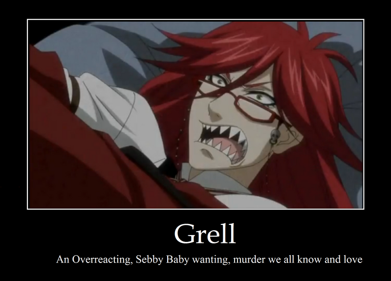
also this, epicly funny Johnlock
[link]
👍: 0 ⏩: 0

oh wow great job! I almost didn't recognize this as your work! the perspective is amazing! difficult pose to do but you did a great job
👍: 0 ⏩: 1
 (Smile)")

This is really nice. Though a few little nitpicks I have about this picture are some of the facial features. The character's forehead seems a little... exaggerated, doesn't it? The eyes, nose and mouth seem to be located a little too low on the face. The character's barely got any room for the chin. Another thing to note is that maybe their neck is a little thin? I dunno, but the head looks kinda big on such a small neck. A few of the wrinkles in the shirt look a little wonky, but I'm no expert on clothing. Plus, I'm not sure if that shirt's supposed to be tight or loose or comfortably fitted. I also cannot tell where their left leg (my right) is going, or what it's supposed to be doing. Is it going backward? Is the character pushing their right side (my left) closer to the viewer, so that the left side looks farther away? These are just some things to note if you're ever to do another picture like this. A nitpick I have that you really don't ever have to change is the way you colored the feathers on their wings. It has no need to be super detailed since the entire piece isn't super detailed, but if you'd colored it the same way you did the hair, it would've looked even better.
However that being said, your eyes and hair were wonderfully colored. Especially the hair. I love the way you drew some of the highlights and individual strands. The colors you chose for the skin work perfectly with this piece. And your lines! They're really cool. It's intriguing how the lineart for their wings are thicker than the lines in other places. They don't subtract from the piece though, since my main focus is still on the character's hands and face. Though you could practice on making the lines thinner where the light is closer, and thicker where the light is totally gone.
Keep it up!
👍: 0 ⏩: 1