HOME | DD
 BuckingAwesomeArt — Derpy Hooves Poll
Published: 2012-04-25 01:35:14 +0000 UTC; Views: 1733; Favourites: 28; Downloads: 0
Redirect to original
Description
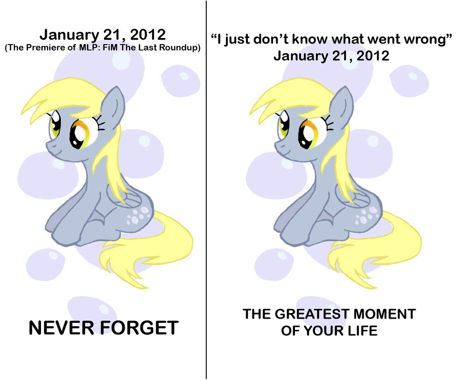
Calling all bronies. This is an experiment I would love to have all of you join in. Here are two posters of Derpy Hooves. Both are in reference to the first time she was made canon, the first time she had a significant line, and the subsequent stripping of this beautiful acknowledgement to bronydom. I would like to know your thoughts on both posters. Which one do you like more? Do you understand both of them? If not, which one is easier to understand? If you wanted to buy one of them, which one would you buy? Why? I know I have a lot of questions but if you could just take a few minutes to answer them, it would be greatly appreciated.Thank you all so much for your feedback. I really appreciate it. This is dinopants174 and this is one of my first completed pieces. I have a clean and true-to-style take on my fanart and I hope you like them. I will upload whichever one seems to be more popular as a final.
Related content


Comments: 26

i certainly will never forget that moment.
it was THE moment of the entire season after all...
or at least from that episode
 (Wink)")
👍: 0 ⏩: 0

the first one was made. the 2nd was drawn! *grabs real derpy* mine!
👍: 0 ⏩: 0

I guess it's handdrawn, that may cause some slightly uneven shapes (e.g. the hooves). That's no big deal of course, but if you want to publish this a poster, it could help to ask someone to go over the image with Gimp or PS to make smooth shapes. This may take some time and should be done precisely by someone with some experience in digital pony art. Otherwise you would get inconstant line thickness or slightly wrong proportions.
Of course it's fine if this is not so important to you, it was just standing out a little bit for me because I am currently busy at remastering some characters from MLP screenshots in Photoshop, e.g. Derpy in "The last roundup" here .
👍: 0 ⏩: 1

well yes, but that was kind of the thing i was going for. similar to the show, but not so clean and defined. the more relaxed lines give it a softer and more subtle tone overall. i completely see what you're talking about, but this is just more of what i was trying to do. (quality work on your end by the way)
 (Smile)")
👍: 0 ⏩: 1
Quality depends on the viewer and the artist has the last word
Have a nice weekend.
👍: 0 ⏩: 1
Thank you all for commenting. The final is up now. I did end up choosing the one on the right but I put the phrase "Never Forget" at the bottom instead. Your feedback helped me out a lot and I really appreciate it. ~dinopants174
👍: 0 ⏩: 0

Right.
I don't know why she was censured! We had Snail, whose special talent seemed to be being slow! And I can't think how many other characters that supposedly "put disabled people in a bad light". If anything, she puts them in a GOOD light!!!
👍: 0 ⏩: 1
FACK. Derpy herself is loved by anypony. Besides, anypony makes mistakes. There's at least one episode with one of the mane 6 going crazy. Derpy is just adorable, no matter what she does.
Anypony who associates Derpy with mentally disabled people has to admit that Derpys positive attitude and her way to help ponies and participate in social events (e.g. Winter wrap up, Nightmare night @ Luna eclipsed etc.) cause a very positive impression of her character.
👍: 0 ⏩: 1
*sigh* some people want to ruin all our fun
👍: 0 ⏩: 1
Oh! Nonononono! I mean other people who would complain about Derpy
👍: 0 ⏩: 0


The never forget has more of a foreboding tragic feel to it. As in even if someone was not familiar with the context they would assume something sad happened fallowing. Which is true. How dare they change that magical moment. She was adorable the way she was...not offensive she had the cute naivety to her. Nothing offensive in the least. She reminded me of my young nieces and nephews...they mean well they really do. Its what makes you love them.
👍: 0 ⏩: 0

Id have to say the one on the left, but they're both great~
👍: 0 ⏩: 0


I love both of them, but if I had to choose I like the one on the left more. The phrase "Never forget" has a lot of meaning to it.
👍: 0 ⏩: 0
dinopants174 here. Thank you all so much for your comments. I really do appreciate it. You have helped me choose my final design.
👍: 0 ⏩: 0


")

i feel that the one on the right is better, in my own opinion.
👍: 0 ⏩: 0

I like the idea of both lines. However, my preference is for the one on the right. Regardless of the aftermath or the changes, Hasbro DID acknowledge us. It felt wonderful.
👍: 0 ⏩: 0

I think second is better, a bit exaggerate, but hell we're bronies!!!
👍: 0 ⏩: 0

I would buy one with the top line of the one on the right and the bottom line of the one on the left together.
ouo
👍: 0 ⏩: 0