HOME | DD
 buffydoesbroadcast — Mark Up Staged's Journal CSS

Published: 2008-06-05 02:34:41 +0000 UTC; Views: 3700; Favourites: 20; Downloads: 1105
Redirect to original
Description
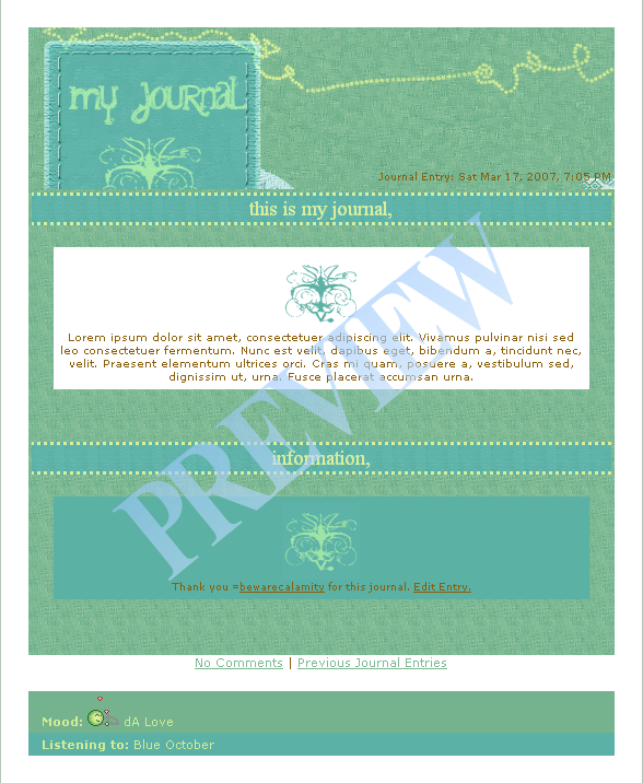
Brushes: [link]My first draft for ^Staged 's journal css contest [link] She seemed to be looking for something that I usually incorporate into my journal CSSeses, so I thought I'd take a shot at it.
"A nice header, either with a nice floral design/ornaments or one or more of my images. If you have better ideas, go ahead - you're the designers!"
The simplistic swirl header was created with a splash for floral design. It's also created with a spotlight place for a featured thumb (a recent deviantion, Daily Deviation, or feature) and with a small place for ^Staged to talk about who she is and what she does for dA.
"A nice colour scheme, either in the dA-greens/grays or in dark grays like my blog here: [link]"
I wasn't sure to go with light green or dark green for the background, whatever ^Staged wants (it can be changed). The header and blurb curved sections are designed to look easily integrated within ^Staged 's profile. They are both the same colour as a typical dA profile, so they should be visually appealing as well as noticeable.
"I'm very fond of boxes and listings.
 "
"I can easily change the boxes, as well as include a number of different colours for whatever ^Staged may need. I'm also considering adding one box with a scroll and maybe using `thespook 's amazing gallery script as seen in ^Helewidis 's journal.
"It must be easily updateable - sometimes I need to do a quick update and I don't feel like working myself through too much code."
I always keep this in mind for designing CSS, because when I'm using journals I look for two things: easy and organized. For this purpose, I'd be more willing to work with ^Staged on what she needs (with the boxes).
The box code will be minimalistic so you don't have to remember a bunch of ridiculous code. Think...
< div class="Box" >< div class="Header" >News & Babble< / div >
Writing
< / div >
"The headlines like "News & Babble" or "Features" should not be graphics, I'd like to stay flexible here and I constantly add new cats to my journals."
Yes, this is a pet peeve of mine as well. The journal's headline or "header" has a simple .png translucent vector background that will not interfere with your text.
"Simplicity rules!"
I tried to keep that in mind!
-----------
Coding/design concerns:
Top .divs I'm not very good with .divs, I've never tried anything this complicated (the thumb section), so I'm not sure if I can pull it off. I'm pretty sure I can arrange something though.
Moods I have no idea where to put moods etc.

If you are good at CSS and would like to code this journal, we can split the 6 month subscription award if we win. (Each would get 3 months) Just note me.
Please comment This is not my entry, I do need critiques to help me, and I would appreciate them!
Related content


Comments: 31


This looks gorgeous, very simple and clean with sober colours.
And the "featured thumb" is a great detail, on the top of the journal, too!
Oh, and I love the header, wish I could figure out how to do one for my journal lol
It's a great CSS, congrats
👍: 0 ⏩: 0


To tell you the truth, I think this is one of the most beautiful CSS I've ever seen. I especially love the feature thumbnail in the corner. I'm sure you'll figure it out!
The only thing I'm wondering about is if the comments/ previous journals would look better centered or not. Cause they look good where they are, and go with an asymmetrical look, but they might look good in the center too. O_O Up to you. But just a thought.
👍: 0 ⏩: 1

Oh, well thank you! I hope I can pull off the thumbnail bit, if not I'll ask the CSS/programme forum. They're great guys. I think you're right about the alignment of the COMMENTS, centering would be better.
👍: 0 ⏩: 1
")
👍: 0 ⏩: 0

I am loving the sweeps of the journal and the layout, this is definitely a great look for a journal.
👍: 0 ⏩: 0

If u still need somone to code, i could do it c:
It's heaps easy c:
👍: 0 ⏩: 1
What experience do you have coding?
👍: 0 ⏩: 1
Well i took some coding classes in school.
And i made my journal and a few other people's c:
Such as =Lady-Genuine
My current one atm is a bit messed up~
Coz it's un-finished xD
i was too ired to finish it o_<
But i have a few other layouts in my previous journals c:
👍: 0 ⏩: 0

Ohmigosh. Didn't know you were entering, too. *Glares* :3
👍: 0 ⏩: 1
I know, I saw that you were entering AFTER I posted this. T_T
👍: 0 ⏩: 1

XD
Got nout to lose anyways.
👍: 0 ⏩: 1
If it's anything like that sexy icon, you'll win! May the best sexy babe win!

👍: 0 ⏩: 1

")
👍: 0 ⏩: 0

Looks pretty sweet so far, got some suggestions for you too of course
The height of the featured thumb could change from journal to journal, so it might work better if you put the 'featured thumb' text above the thumb.
The journal title and text on her bio section is too light, and hence a bit hard (for me at least) to read.
What does it look like without the box in the center? The journal is very sweepy and curvy, but then there's this hard square box in the middle 
Also, don't forget staff and GDs can use heading tags in their journals, so instead of having a div tag for headings, use
 (Smile)")
etc instead. Otherwise, you could also use something I do to save me writing out div tags for headings, nest bold tags - <b><b>HEADING</b></b>
b b{font-size:20px;etc}

👍: 0 ⏩: 1
Oh thank you so much! You know how I love your opinion.
I designed the square box in the middle, because she mentioned she liked boxes.
Thank you so much for your wonderful comment, Nick!!


👍: 0 ⏩: 1
Yeah, the main reason you'd use a div for headings is because... you can't use heading tags !
Regular deviants can't, but admins can, and having those extra elements means it's easier to write and remember the headings.
👍: 0 ⏩: 0

Very nice! I like the curves combined with the floral.
👍: 0 ⏩: 0
CSS plural for Golem
👍: 0 ⏩: 1

"...an embryonic or incomplete substance"?
A Eastern European band? [link]
"..a fast, lightweight window manager"?
👍: 0 ⏩: 0


Moods..possibly straight across from 'Suggest A DD' and underneath the thumb? Possibly next to the title?
👍: 0 ⏩: 1
Hrmmmmm, thank you! I'll think about it!!

👍: 0 ⏩: 0

I like it! Unfortunately I cannot help you with advice or anything as I don't know anything. But it's good
👍: 0 ⏩: 0