HOME | DD
 Bug-zilla — Alzen Character Sheet
Published: 2014-02-05 18:53:28 +0000 UTC; Views: 1058; Favourites: 18; Downloads: 0
Redirect to original
Description
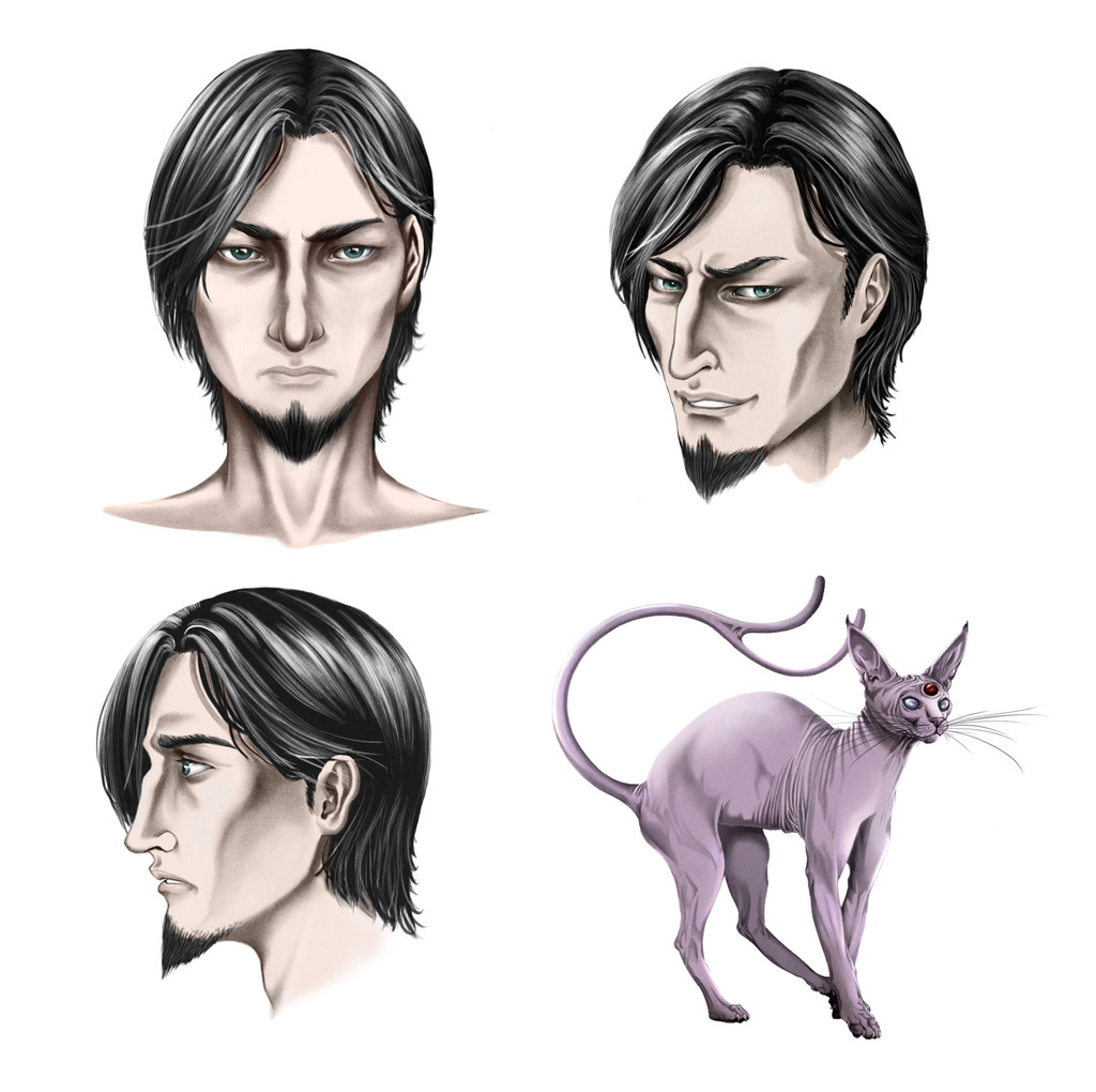
Design for an original character, Alzen.Related content


Comments: 15


So, overall this is a very nice, simple character design. Your shading is spot-on, and your anatomy is very good! You have a wonderful sense of form.
My only suggestions for you are to be more weary of your proportions. For your full character drawing, his head seems too small for those proportions, specifically in his legs. His thighs are definitely too long for that head size, and it just makes him seem physically awkward. Perhaps scaling up his head will fix this, or just chopping of a mid-section of his thighs. Also, on his direct head-shot, his neck is a tad bit too thin, and seems to taper the wrong way. necks tend to get wider as they connect to the shoulders, however, his does not. Also, there is an inconsistency in the length of his eyebrows. They are much longer on his profile shot than in the 3/4 and straight-ahead pose. The placement of his ears in the straight-ahead also seems a little high. Here they reach above his eyebrow, yet this doesn't happen in any of the other shots. So, just beware of those small inconsistencies.
Overall, though, you have a great, consistent style that contrasts nicely with the anime of Pokemon, and really brings it to life more. Keep up the great work, and fantastic job!
Commented on behalf of

👍: 0 ⏩: 0

Excellent style and absolutely wonderfully done expressions!
The pokemon cat looks perfect to me. It appears very much alive in my eyes. ^^ I suppose the areas I will be pointing out are either mistakes or simply your style, so please be aware that I understand some things that I may call as flaws may just be intentionally made by you.
The hair strokes look very nice, but I think the highlights are too much. On the 3rd face, the one facing directly sideways to the left, the line of crease/shadow in front of the tip of the brow looks too much because I get the impression that the nose is disconnected to me.
Over all, you know how great this piece is, let me just tell you again, it's excellent!
On behalf of

👍: 0 ⏩: 0

This looks like a really well done character. You've got a few different angles on the face, a few different expressions, and a full body image. Altogether it gives good coverage for what this guy looks like.
From the hair style, angular face, dark colored clothes, and deep set eyes he doesn't seem like a heroic character. Some sort of villain for sure. The top 3/4 view of him gives an expression that makes me think of him as manipulative.
On all the pictures you've done a great job detailing his hair. The different shades and the highlights give an excellent sense of the style as well as making it feel realistic. The same for the clothes in his outfit, the shadows from the wrinkles really make it look like real cloth.
For some reason his head appears a little small on his body. Rough measurements lead me to believe he's 7 heads high, so its height ought to be fine. I think this effect is coming from his arms, which might be a little too thick. Eyeballing the measurements and his arms look as wide as his head and nearly as thick as his legs, which can work if he has a powerful upper body. The tightness of his clothes on his chest make him seem fairly muscular, but his shirtsleeves hang rather loosely on his upper arms and undermine that interpretation.
This proportion issue doesn't seem to really harm the picture though. The guy still looks great.
Comment on behalf of
👍: 0 ⏩: 1

Thank you so much for taking the time to tell me what you seemed good or less good in your comment !
I have taken good note of your suggestions on his body's proportions, I thought there was something wrong with that too, but I hadn't yet found the cause !
Thanks again for your useful comment !
👍: 0 ⏩: 1
You're welcome! It's really good work despite my complaint. Well done!
👍: 0 ⏩: 0

Love this looks, looks like a villain concept , how long did it take?
👍: 0 ⏩: 0

Very well done. ")
Dat espeon. ")

👍: 0 ⏩: 1
Thank you very much ! ^^ he's a naughty boy in ''in career transition'' ")
and yes , that espeon look like a sphynx cat ! I wanted a weird look for him
👍: 0 ⏩: 1
Loool. Career transition. Good one.
Sphynx cat! that was the species.
👍: 0 ⏩: 0

He has a very distinct face and expression and you've done an incredible job making his face look consistent from different angles!
And I love the realistic Espeon!
👍: 0 ⏩: 1
Thank you for the comment  (Smile)")
👍: 0 ⏩: 0

Yep ! for sure, he is ! and thanks for the fav !
👍: 0 ⏩: 1