HOME | DD
 bugfrag — The New Age
Published: 2005-11-20 08:26:54 +0000 UTC; Views: 114; Favourites: 0; Downloads: 18
Redirect to original
Description
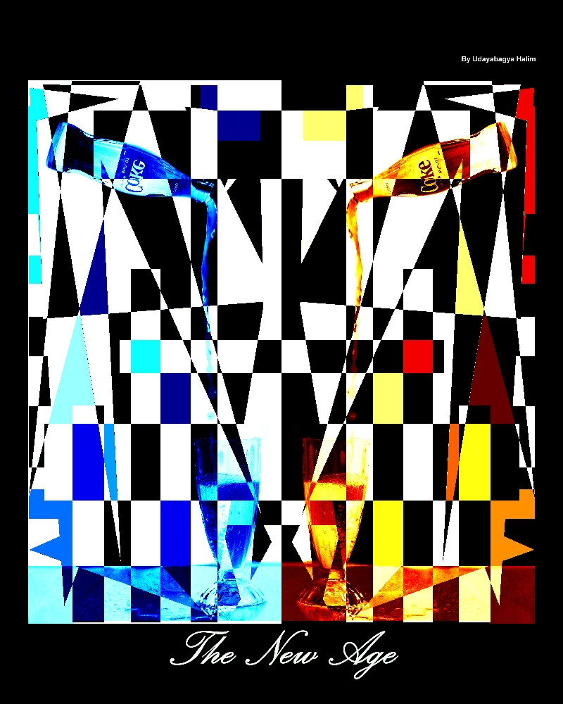
What I've been working on this couple daysCoca cola style
the real size is 20" x 20"
Related content


Comments: 20

Art in chaos. It has an African abstract style to it.
👍: 0 ⏩: 1

really? I didn't plan it to go that far.
👍: 0 ⏩: 0


I dig it. I could see this in a magazine. Beware, you might end up working fore Coca-cola
👍: 0 ⏩: 1
hahhahaha; I'll take that as a compliment
your'e a funny guy
👍: 0 ⏩: 0

Not much I can say that hasn't been said. I like this, and you clearly spent some time doing it. A little pixelated looking in some areas, a little smoothing goes a long way, but very nice besides.
👍: 0 ⏩: 1

hey buddy nice concept and i like hte layout of it but its missing something like hte middles so empty. making an even border l the way alroud with jsut help the balance of hte piece and what with the crop/cut/cliping errores (choppy)
👍: 0 ⏩: 1
cliping errs?
could you show me where
thanx
👍: 0 ⏩: 0

hmmm... i think the concept is nice but it is poorly rendered...the crispness of the lines detract from the intention, and the lack of textures leaves it flat. maybe less lines/black+white and more texture?
👍: 0 ⏩: 1
hm... something to think about -- I'll try something new.
thank you
👍: 0 ⏩: 0

Hmm, interesting work. It looks cool. Nice work
")
👍: 0 ⏩: 0

I like the fact that it's symetrical. Although at first it doesent seem like it because both sides are colored differently. To me, it creates tension. That is a good thing. Nice work.
👍: 0 ⏩: 1
 (Wink)")

Seeing as you really wanted me to comment on this i'll make a list of what i don't like and i like ok
Like
Colours
Symetry
Concept
Hate
Choppiness
Text at bottom not in the middle.
Border not even all the way around
Thats all
 (Smile)")
👍: 0 ⏩: 1
could you explain to me what the choppiness means?
thanx
👍: 0 ⏩: 1
the edge of some of the lines are jagged not smooth.
👍: 0 ⏩: 1
... I c...
thanx; I'lll do something about it
👍: 0 ⏩: 1