HOME | DD
 BullyDingo — WHHHHEEEEEEE
Published: 2007-01-17 19:35:33 +0000 UTC; Views: 1650; Favourites: 22; Downloads: 20
Redirect to original
Description
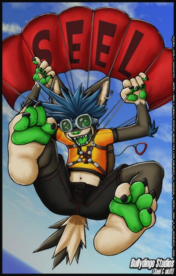
Is this not a cool way to start the new year? >:3 Be careful, the dingo is on the way! xDRelated content


Comments: 45

Man i just love the action and perspective on this, it blows my mind, and those colors are just stunning
^3^ lovely work as always you two!
👍: 0 ⏩: 0

I kinda like the slight blurriness of it. :3 I think it looks more dynamic that way or something...for me at least. I guess I'm trying to say the same thing AC said, that it's a nice change from what I've seen of your normal, solid shading. Oh, and the colors are really great too. Nice job!
👍: 0 ⏩: 0


I dunno, Seel mentioned it looking a bit blurry, but it seems like what you did, skeef, was make it just darker and dull the lines, giving it a blurred appearance. It's nice, but I like your other coloring styles more I think. They come off a bit more vibrant in a sense, evocative, if you will.
👍: 0 ⏩: 0


hehehe, i was starting to think you had forgotten about this piece XD
interesting new colouring style. i'm not sure if i like it or not... o_O; there's something about it that i like, but there's also something that i don't. i think this style merges with the line art a bit more, and makes it look a bit more natural, but the thing i don't like, which really bugs me, is the blurryness. it almost feels out of focus, or like i'm trying to stare at it with my glasses off or something. it's nothing MAJOR, it's just there a little bit, but enough to annoy. i don't really know much about colouring, so i wouldn't know how to go about fixing it
but overall i really like this piece, especially how the goggles came out! X3
👍: 0 ⏩: 1

That must mean you didn't check your e-mail or that you have me in your spam list... XD I finished it weeks ago, and since you always complain about me uploading everything we do together in my account first, I sent you the final colored image to your e-mail account, so you could do it first this time ;3 But since you didn't, I finally placed it in the common gallery, risking to get Seel's Wrath if you dind't like it enough and that was the reason for not uploading it yourself XD *is safe now*
The picture has done in the usual way, but with a tad of gaussian blur effect in the last stage... would you want to see it hard-colored just before doing it, to check if you like it more or not? :3
👍: 0 ⏩: 1
well i haven't checked my email in weeks....maybe that's why XD
but yeah sure, i'd like to see how the non-blur version looks :3
👍: 0 ⏩: 1
OK, then remember me to send you that version next time on AIM or MSN.... :>
I'm still in a doubt about blurry or non blurry thing.... x3
👍: 0 ⏩: 2
well, if it's the same thing that was done with your most recent poll (and the bird thing being blurry or not) then i would say to go with the sharper version. blurry things annoy me :[
👍: 0 ⏩: 1
Mmmm..... 
Unless I do it half-half, not so blurred, but enough to blend lineart with colorworks :3 I think I'm going to try it ^^
👍: 0 ⏩: 1
hehehe, well...there's not harm in experimenting! hey, you might actually find out something that looks really cool
can't wait to see what you come up with :3
👍: 0 ⏩: 1
I'm even thinking about taking down my VOID submissions and update them with new stuff XD You already saw what I did at first, I even uploaded some here, but now I keep drawing some for it, and it may be a bit better :3
I mean, if I can do it with these new skills, it could work :3 Or, at least, to make it easier to be accepted :3
Just now, I wanna try something JayAxer-ish, with airbrush more than with cel-shading ^^ But I need to find a really detailed lineart for it, I want to give it a chance with some good quality artwork and currently I have none like that by myself
👍: 0 ⏩: 1
well, you know you can always change you refference/win/lose poses AND even your intro pages at any time after you get accepted :3
if you keep drawing new stuff, you'll never get in.... XD; but hey, if that's what you think is best, then go for it! 
and i can't wait to see what you come up with for this new colouring technique you want to try. why not jsut doodle something up really quick, strictly for the purpose of testing some colours out? :3
👍: 0 ⏩: 1
Well, because if what I want is to experiment about that lineart blending effect without making it blurry, I need a pretty clean lineart, with details enough to find out the differences :3
Hahaha, and I changed the victory pose becaus that one done with markers... well... I think my real media skills were not good enough yet... but the new one is almost finished! ^_____^ And, hahaha, fully original, so no pose taken from any other image, lol. The same with the defeated thing... and you're there to support my broken bones xD Also, instead a "neutral pose" as the one I already did, I made a new character reference design with all the new stuff, you know, the tail power, the whirl on the tail also.... ^^ Pretty nice
And what is taking me more is the comic thing XD I will use the idea I told you about with the *from idea to full color, panel by panel* effect... let's see if they blame me for it or not, I don't plan to do it perfect, but just to show you how it works! ^^
👍: 0 ⏩: 0
well, if it's the same thing that was done with your most recent poll (and the bird thing being blurry or not) then i would say to go with the sharper version. blurry things annoy me :[
👍: 0 ⏩: 0

WHHHEEEeeeeEEEE~ ")
👍: 0 ⏩: 0

SEEL IS THE SIZE OF A BUILDING AND LANDING ON YOUR HOUSE.
Awesome.
👍: 0 ⏩: 1


i agree with AC and Ryu

👍: 0 ⏩: 1
We should try to make more like this.... xD
👍: 0 ⏩: 0

I agree with AC. The outlines seems to blend alot more with the coloring. Looks fabulous 8>
I love how that face looks |3
👍: 0 ⏩: 1

HAW HAW HAW 3's company
👍: 0 ⏩: 1
oh jesus something fucked up
👍: 0 ⏩: 1

I agree with AC. The outlines seems to blend alot more with the coloring. Looks fabulous 8>
I love how that face looks |3
👍: 0 ⏩: 1
Hahaha, but then just read Seel's comment in this same image xD
👍: 0 ⏩: 0
I agree with AC. The outlines seems to blend alot more with the coloring. Looks fabulous 8>
I love how that face looks |3
👍: 0 ⏩: 0

I wanna be able to see the way you (Seel) start out from a blank sheet and work your way to the finished Lineart, and to see the way you (skeef) start on flats and work to complete coloring. Ahhh that'd take a long time to make :3
Wonderful job as always you two. I agree with AC about that fuzzy-ness. Looks cool 'n different.
👍: 0 ⏩: 1
Lineart: 2-3 hours, or even less....
Colorwork: 1-2 hours or so
Not so long time to make 
👍: 0 ⏩: 1

That's gotta be one hell of an adrenaline rush!!
Really awesome job here though, the colors are strong and the expression and perspective are nice too.

 (Smile)")
👍: 0 ⏩: 0


now that IS cool, i'd love to go parachuting ^o^
....finally Seel's goggles have a purpose!!! lol
👍: 0 ⏩: 1
Whoa, now that you mention it.... o___O; True
👍: 0 ⏩: 0


oooh I like how the colors came out on this .o. for some reason they look different than normal. And the outlines are blended into it, it has a fuzzy poofy quality kind of. I like it, it's a change from the hard solid shading thats normally done :]
👍: 0 ⏩: 1

The question is: Is that a change for bad, or for good?
Even if the only way to evolve is to change from time to time, if it means to go worse, then there's time to step back :3
👍: 0 ⏩: 1
It's means.... I LIKE IT a whole lot better xD
👍: 0 ⏩: 0

coooooollll!!!!!!!!
great work!!!!!
the bast duo!!!!!!!!

👍: 0 ⏩: 1
