HOME | DD
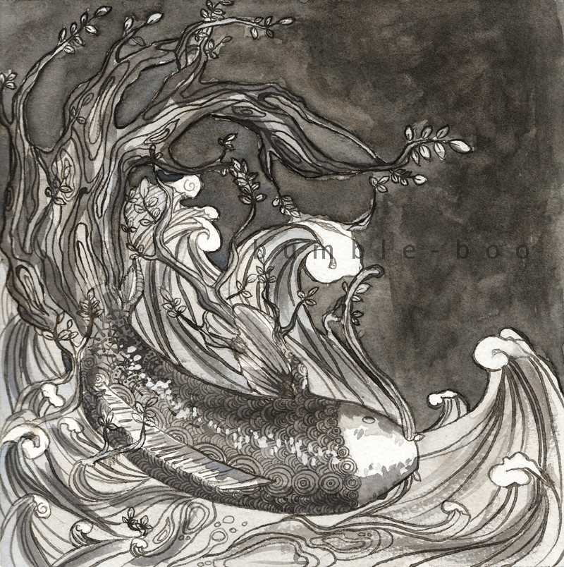
 bumble-boo — Elemental Project BW

Published: 2009-10-02 03:42:14 +0000 UTC; Views: 450; Favourites: 18; Downloads: 13
Redirect to original
Description
Sooo here's the black and white tonal study thing. It's not the best cause I kinda suck at tonal studies heh. Ah well maybe my teacher will have some suggestions...Related content
Comments: 28

Thanks! 
👍: 0 ⏩: 0

That's an amazing piece of work, I like how the fish fits in quite nicely within the pattern of the sea.
👍: 0 ⏩: 1

Really nice work! I like how the tones aren't perfectly flat, that they still have some texture to them. The highlights on the fish really make it look wet and shiny ^-^ I do agree with *karooble about the contrast thing, but it's still a pretty fine piece in my opinion!
👍: 0 ⏩: 1

Thanks! Yeah, I plan to fix the tonal problem when I bring it into colour, and hopefully it'll turn out okay! I'm going to darken the inks for the fish too so the pattern stands out a bit more.
👍: 0 ⏩: 1

You're welcome ^-^
I'm sure it'll be awesome no matter what you do to it!
👍: 0 ⏩: 0

Thanks very much! And thanks for the favourite as well!
👍: 0 ⏩: 1

Thanks! And I thank you for the favourite as well!
👍: 0 ⏩: 0

I think it's coming along nicely! The most common difficulty with value studies, in my experience, is to make everything too mid-range. Note, for example, that the grays in the wave are almost the same brightness as the grays in the background. I downloaded the image and bumped its contrast way up in Photoshop so you can see what I mean: [link] It makes a pretty big difference!
This still looks great, though. I can't wait to see the colored version!
👍: 0 ⏩: 1

Oh wow! Thanks so much! That helps a lot, I'm going to reference this when I do the final. 
👍: 0 ⏩: 1

I'm so glad I could help!
👍: 0 ⏩: 1

I'm glad you could help too!
👍: 0 ⏩: 0

Waaah, I dunno, I think the tonal version looks really nice. 

The only thing I can think of to suggest is taking a look around the edges of the picture that meet the dark background. There's a bit of white spots in some places that could be darker, maybe?

👍: 0 ⏩: 1

Oh yeah! You're right. I kinda did a shitty job, but I'm going to try to fix that on the coloured version! I will keep an eye on that when I do it. THANKS!
👍: 0 ⏩: 1

Thanks! And thanks for the favourite!
👍: 0 ⏩: 1

0_0
Awesome!
Fav'd!
Gah, I can't wait to see the colored version!
👍: 0 ⏩: 1

Thanks very much, and thanks for the favourite!
Hopefully the coloured version comes out all right!
👍: 0 ⏩: 1

It probably will, the other ones look great.
And it will be Fav'd.
👍: 0 ⏩: 0


