HOME | DD
 BurianPi — Random RM sprites 10
#brawl #gear #man #mega #megaman #megaton #oc #robotmaster
Published: 2017-04-06 17:08:25 +0000 UTC; Views: 2563; Favourites: 42; Downloads: 4
Redirect to original
Description
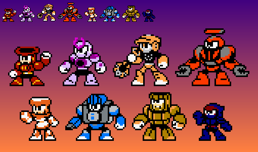
The theme for today's "Random RM sprites" is "Big, medium and small"1. Megaton Man - borockman (someone please just tell me if the shading is really necessary. The biggest dude I ever sprited - 43 px tall)
2. Gear Man - ultimatemaverickx (one of my favourite fan-made robot masters tbh)
3. Brawl Man - SilverKazeNinja (he probably is larger and I don't even know if he has a sprite, so here's my try. I just couldn't get him right)
EDIT 10.04.17 - Fixed some issues with Megaton
Related content


Comments: 18

These look so cool man. Megaton Man! I remember, I still need to draw him. Always love those big bruiser types. Gear Man's back gear could be a bit more round though. And maybe Brawl Man could use a bit more shadows? I don't know. 

👍: 0 ⏩: 1

You are another one to point out Gear man's wear looking back gear, so I finally decided to give it a re-do.
As for Brawl, I like him for his simplicity.
👍: 0 ⏩: 0

Gear Man is my favorite of UMX's bunch too but yeah, his designs don't lend themselves well to MM sprite form because of their intricate details. You did an admirable job with some fine tuning needed at the grey gears but his back gear ring looks messy. Maybe it needs a resprite. Also I cant unsee the tip of his head looking a bit phallic.
Megaton and Brawl look fine however. I just think that the former could use less coloring, unless you don't care for nes limitations of 3 colors plus a shader.
👍: 0 ⏩: 0

Now that is one rm I never expect people would do the fanart of.
Thanks.
👍: 0 ⏩: 1
You're welcome. Something in me wanted to do sprite of him when noticing he was the one without one.
👍: 0 ⏩: 0
In a good or in a bad way? Wait, I actually realised what is wrong with each, I was a bit unsure when submitting, it's only that I can't seem to know what to do, but I'll do my best.
👍: 0 ⏩: 1

Bad. They don't resemble their namesakes perfectly, and look very stiff. They also need more polish:
Gear Man:
Gear Shoulders: The dark gray is a little too light. Also, the hears geometrically don't look like proper circles. They don't look round and they lack depth.
Try drawing the gears as cylinders. You need to really consider their shape and volume as you move them about.
The gear on his back: It's lopsided. The distance it has on both shoulders are unequal, and it thus looks bad in perspective.
He's a hard design, so you should map out his geometry. Keep in mind the distances. Make mental landmarks so you know where parts of his anatomy stop and begin.
Break him down into polygons, think about how they'd look from the perspective you're showing them from, and put those polygons together mentally piece by piece.
You did a good job so far, as I can recognize his identity.
Megaton Man:
This is Megaman. Don't shade with more than two colors, and use shading liberally. In Megaman style art, we use a few colors and the arrangement of shapes to make the consummate form of our subject.
His feet should not both be pointing opposite of one another. It's a stiff pose and it's unnatural.
You forgot the treads in his legs. I understand if you didn't because of the complexity. In general, if you can't put in the detail, then just block in and color the form.
People will use their imagination to fill the rest in.
His hands are tiny. Make them a bit bigger. After all, those are what he wrecks people with.
What I think you need to work on is your depiction of form. I struggle with it as well. Just keep at it.
Your job as a pixel artist is to cram in as much detail in the cleanest way possible. Make each different part distinct enough to be discernible from a distance.
Study the official sprites. Practice.
And don't ever stop.
👍: 0 ⏩: 1
I tried to fix Megaton's issues (although if you look below, it still has some issues), Gear might require some more tinkering.
👍: 0 ⏩: 1
I say take away one of the yellow/orange tones. They Don't mix well together.
👍: 0 ⏩: 1
You meant something like change Megaton's main color to the burnt orange Gear Man has? Because that's how I interpreted it. Sorry if I misunderstood. Although it really blends...
👍: 0 ⏩: 1
I mean to say that you ought to take one of them out since they still use too much color. Plus them blending well is not really a good look. It would look better to contrast the 2 colors but since you use too much coloring, better to leave one out. Actually, just make them contrast eachother.
Also, if you ever want to stay accurate to the nes style, stick with 3-4 colors (including the black outlines; excluding the shader for the face color).
👍: 0 ⏩: 1
Just saying that I wanted to exchange the yellow for the gray of the treads (or for the lighter orange on feet), but now I'm unsure about it. So, go for what I wanted to do originally?
Speaking of color limitations, I wonder what would happen to that Blast Man sprite I did quite a time ago.
👍: 0 ⏩: 1
I just checked the MM6 rm sprites and they got away with additional colors because of layering (plant man for example). But if you can, avoid using a lot of colors, see how you can work around the limits. That's if you want your sprites to be accurate. I\I hope you don't mind but I decided to mess with some coloring to see how some color combos can work for him (his overall sprite still needs a few tweaks) cdn.discordapp.com/attachments…
Off course I'd be hypocritical about talking of color limitations when I kinda cheated with my sprites by adding one extra color to the limitation.
👍: 0 ⏩: 1
Nah, I don't mind it, but there I realise the problem with my spriting - I want to stay very close to the source material, especially when it comes to colors. And sometimes I'm sceptical about changing something major like, for example, those treads or gloves.
👍: 0 ⏩: 1
That's the problem of sticking too close to the source, it doesnt always translate well in sprite form. Sometimes you gotta make sacrifices, even some of the nes sprites are innaccurate to the colors of the character art. That also applies to going for the exact color combo of the art. Anyway, hope I'm not dragging this out for you in which case I'll stop
👍: 0 ⏩: 0
