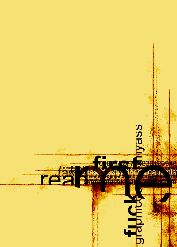
HOME | DD

burningheretic β€” me first

Published: 2006-09-12 16:37:23 +0000 UTC; Views: 15960; Favourites: 230; Downloads: 460
Redirect to original
Description .once again.
Related content
Comments: 28

tranquility4u [2014-12-25 22:56:26 +0000 UTC]

Great work

πŸ‘: 0 ⏩: 0

chriscookies [2010-10-20 14:19:16 +0000 UTC]

gamato

πŸ‘: 0 ⏩: 0

wildestdreamster [2010-07-08 05:52:16 +0000 UTC]

awesome!!!!!!!!!!

πŸ‘: 0 ⏩: 0

NajlaQamber [2009-06-30 16:10:29 +0000 UTC]

hey there.
I've featured this here: [link]

I hope you don't mind.~
~Redeemer-of-light

πŸ‘: 0 ⏩: 0

geor92 [2009-05-11 17:45:43 +0000 UTC]

gamato! Bravo!

πŸ‘: 0 ⏩: 0

spicone [2008-03-14 15:01:12 +0000 UTC]

Featured via news [link]

πŸ‘: 0 ⏩: 0

ashamandour [2007-11-12 13:06:52 +0000 UTC]

wooow coool one

πŸ‘: 0 ⏩: 0

nfectedpsychosis [2007-10-21 22:02:33 +0000 UTC]

what's the processes you used to complete this?

i guessing illustrator, and photoshop, but in what order?
really, I'm asking how you achieved the layers that come through the type. Did you just go back into photoshop with it?
if you can explain in some detail, please do. I'm looking to expand my design technique (i have no work up yet) and all my classes seem to teach is pure design, in the finer sense.

πŸ‘: 0 ⏩: 0

mashnash [2007-10-08 17:01:22 +0000 UTC]

wow

love this

adore the colours, lines and of course the words!

great piece

<3 nash x =]

πŸ‘: 0 ⏩: 0

skaRface6 [2007-08-31 14:33:31 +0000 UTC]

Fantastic!

πŸ‘: 0 ⏩: 0

cls62stock [2007-07-16 02:15:58 +0000 UTC]

I love this! What did you use to make the lines?

πŸ‘: 0 ⏩: 0

sic-one [2007-06-20 19:18:23 +0000 UTC]

FUCKIN GREAT!!!!

πŸ‘: 0 ⏩: 0

iceebeenie [2007-05-22 08:27:29 +0000 UTC]

cool

πŸ‘: 0 ⏩: 0

patoDS [2007-03-17 08:19:14 +0000 UTC]

really good... nice job!!... see you.

πŸ‘: 0 ⏩: 0

amyn [2007-02-21 16:56:16 +0000 UTC]

gorgeous!

πŸ‘: 0 ⏩: 0

fakula [2007-01-11 14:53:01 +0000 UTC]

it looks great!

πŸ‘: 0 ⏩: 0

CopyPasteRepeat [2006-12-31 12:12:33 +0000 UTC]

I agree with the majority: Very nice piece. Reminds of of the photography work seen on 'Nine Inch Nails - The Downward Spiral'

πŸ‘: 0 ⏩: 0

dareme [2006-11-20 16:24:13 +0000 UTC]

Whee, great. Love the alignment and the choatic feel. What shall I say, "pretty" would be the wrong word and "fantastic" sounds so damn clichΓ©.
Yet, I adore it.

πŸ‘: 0 ⏩: 1

burningheretic In reply to dareme [2006-11-21 13:24:20 +0000 UTC]

thank you so much for your sweet words

πŸ‘: 0 ⏩: 1

dareme In reply to burningheretic [2006-11-23 09:28:07 +0000 UTC]

You're welcome.

πŸ‘: 0 ⏩: 0

theory-x [2006-11-19 11:18:46 +0000 UTC]

excellent
i'm so fan

πŸ‘: 0 ⏩: 0

rebs924 [2006-09-23 18:56:27 +0000 UTC]

how did you get the burn effect

πŸ‘: 0 ⏩: 1

burningheretic In reply to rebs924 [2006-09-23 19:36:19 +0000 UTC]

burn tool, photoshop

πŸ‘: 0 ⏩: 1

rebs924 In reply to burningheretic [2006-09-25 18:41:24 +0000 UTC]

o awesome, i thought it was a brush in illustrator

that's hot man..you're gona make loads of money

πŸ‘: 0 ⏩: 0

lordceleborn [2006-09-15 23:08:32 +0000 UTC]

excellent job mate, very strong content and dynamic alignment.

πŸ‘: 0 ⏩: 0

DesaturatedBlood [2006-09-13 08:47:47 +0000 UTC]

you suck.
ilithio
:*

πŸ‘: 0 ⏩: 1

burningheretic In reply to DesaturatedBlood [2006-09-13 21:36:39 +0000 UTC]

ai mwri

πŸ‘: 0 ⏩: 0

StReSSs [2006-09-12 21:56:57 +0000 UTC]

wraio

πŸ‘: 0 ⏩: 0