HOME | DD
 bvdconcept — Solemn in Red
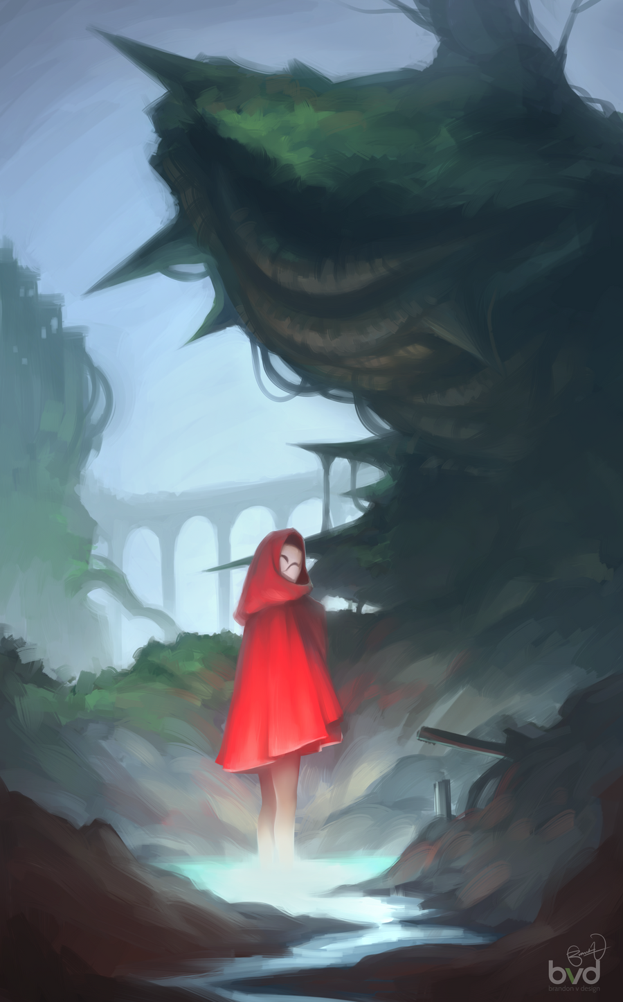
#cliffs #cloak #environment #hood #landscape #red
Published: 2015-10-14 07:11:46 +0000 UTC; Views: 1557; Favourites: 91; Downloads: 0
Redirect to original
Description
Practicing composition, lighting, and environment backgrounds. Hope you guys like it! Let me know what you think in the comments~Follow me on Facebook if you like my work: Brandon V Design
Related content


Comments: 25


Thank you! I need as much practice as I can come by
👍: 0 ⏩: 0

This is really lovely! I love the lighting and I actually really love the soft painterlyness here. Has this impressionistic feel to it, but quite well defined. This is really awesome!
👍: 0 ⏩: 1
Thank you! The more I look at it, the more I like the rawness. But, I could always detail out the foreground a touch to bring the focus out to the front. Glad you like it though n_n
👍: 0 ⏩: 1
You're so very welcome! Ahh yeah, I agree. I love it. I feel it has a good balance between being defined and being impressionistic and painterly, which is not that easy to achieve I feel. Haha it's totally upto you, I feel since the character already is wearing red and also has strong lighting cast on her, the focus is already on the front. But hey you're the artist here, so you know what you were going for
 (Smile)")
👍: 0 ⏩: 1
The contrast between colors and values was what I was going for, so I'm glad someone sees it too :>
Just not so much depth yet, but I'm working on another piece so this is probably how it'll stay for now!
👍: 0 ⏩: 1
Yay, I'm glad to hear that ")
Ah no worries, looking forward to the next one!
👍: 0 ⏩: 0

Good composition! The only big thing I think you should work on is texture and having a more polished look to your piece. Everything has a soft and fuzzy look to it and it's a little hard to differentiate things from each other. If you added more texture and polish I know this can look better than it already is!
👍: 0 ⏩: 1
Thanks! I did this as a practice piece and I'm well aware that it isn't at a high level of finish. I just wanted to get the foundation down to get the forms across, and paint a clear enough picture. It would take hours to detail it out, and I wanted to work on fundamentals, not polish - at least for this picture. I do need to work on textures though, maybe in another painting soon!
👍: 0 ⏩: 1
No problem, I know you can do it
👍: 0 ⏩: 0

The composition and lighting is pretty spot on! I love that vibrant shade of red

👍: 0 ⏩: 1
I started out with the idea of putting red against a cool background, I love how it turned out!
👍: 0 ⏩: 0

Really bold. And looks well!I like the paint or whatever you did to do it.
👍: 0 ⏩: 1
I did this all digitally, the brush I used just makes it look that way
👍: 0 ⏩: 1

Thank you! Usually I'm terrible with composition, so I'm trying to work on it n_n
👍: 0 ⏩: 0


looking amazing!!!!
i real like the lighting effect
👍: 0 ⏩: 1
