HOME | DD
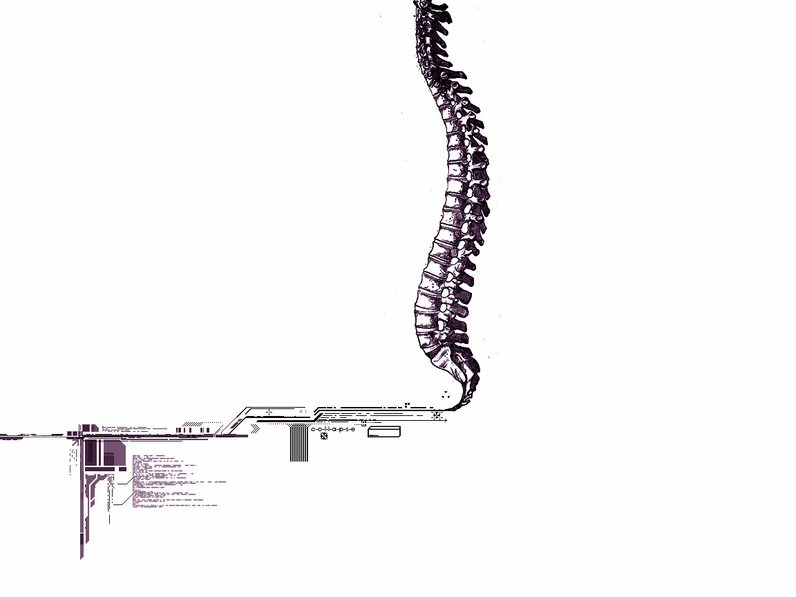
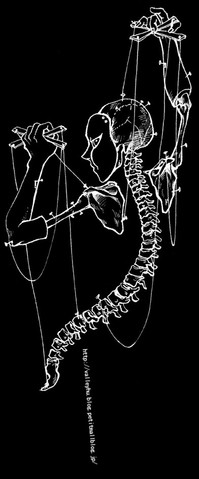
 c-o-l-l-a-p-s-e — Spine
Published: 2005-11-27 03:33:59 +0000 UTC; Views: 3426; Favourites: 28; Downloads: 591
Redirect to original
Description
photoshopRelated content


Comments: 38

i like this alot, and i'm using it as a background on myspace.com/purplecheetah
thanks!
👍: 0 ⏩: 0

Personally, I like the fact that there ISN'T more...you left us at the perfect drop off point with this. The reason why is alot of the greatest artworks I can speak for either are sensory overloads...jam packed as your usual modern day visionary, are beautifully compacted into something that, I hate to call minimalism...because it isn't that, but this steamlining is a perfect example of intensity increase from a smart downplay.
Good job!
👍: 0 ⏩: 1
 (Smile)")


Interesting. I love this idea, and the pen/brush work that went into this. Have you thought about having a different colour background? Maybe light sepia to go with the idea of bones, or grey to go with the computer chips... Or even (and I know this would take a long time) faded computer chip background? Maybe a sepia one of those to tie the two together even more. This is what I love about this - it has so much potential for so many different ideas.
👍: 0 ⏩: 1

thanks for the idea, i'll try it out.
👍: 0 ⏩: 0

Interesting, but it feels like there should be more..
👍: 0 ⏩: 0

pretty cool. I like the whole spine and the way it looks like its leaving things behind. I also like the fact that its not totally cleaned up where you see little specks here and there. it gives a nice effect.
👍: 0 ⏩: 1

i think if you gave the area where the spine connects to the tech brushes, a bit of grain or noise it woulda made the transition much more smoother, but intresting conceptual
👍: 0 ⏩: 0


Very interesting. The design itself overall seems very simple, but yet their is so much detail. The mixed media is awesome!! I can't think of anything else to say. ")
👍: 0 ⏩: 1

Mix of technical and traditional drawing. Original concept.
You do it well.

👍: 0 ⏩: 1
 (Wink)")


as i said before, your gallery is really interesting.. you have some cool ideas
👍: 0 ⏩: 1

The back-bones connected to the, barcodes!
Sorry, couldn't help myself.

👍: 0 ⏩: 1

Well I had the spine and i noticed the tip on the bottom and decided to work on from there
👍: 0 ⏩: 0

Ooh, that's really cool. I love the concept. What gave you the idea?
👍: 0 ⏩: 0

Everyone take a look at 1pu1se1's gallery and make sure you let him know how repulsive it is. thanks
👍: 0 ⏩: 0


Solid design and execution. The negative-x-ray style is killer.
👍: 0 ⏩: 0

nice interesting...
u got a pic of a spine then use brushes?
👍: 0 ⏩: 0