HOME | DD
 c0rebug — Your Perception

Published: 2005-12-16 07:29:11 +0000 UTC; Views: 1682; Favourites: 37; Downloads: 237
Redirect to original
Description
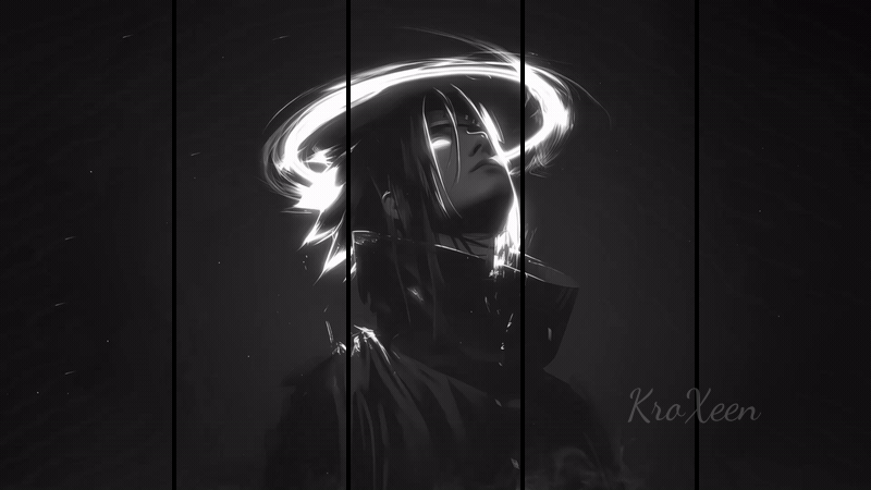
fearless in her deceptioneverything seems black and white
Related content


Comments: 17


My perception of this is quite unusual. As is my perception of most things, I suppose.
To me, the ring around her head forms a sort of halo, giving it a somewhat angelic feel. Her hair melding with the paint splotches just gives me the whole feeling that she loses herself in her heart... tries to become one with it.
And that, my friend, is my perception.

👍: 0 ⏩: 1
Loses herself in her ART.  (Smile)")
And that is all.
👍: 0 ⏩: 0


nice layout. i like the coffee cup ring/halo, makes you focus on the girl. i like how her torso is cropped off with the brush strokes. the nipple is bothering me a bit though. maybe you shouldve added the areola?
👍: 0 ⏩: 0

awesome, nice nipple too. Big fan of this type of work, actually i should learn to do this any suggestions on where to get started?
👍: 0 ⏩: 0


I really like the way the style lends itself to your ideas. I'm a big fan of paint/ink splatters, especially when they are incorperated well into an image, and I think you did that very well here. You create an almost seamless connection from the splatters into the vector portions of the image. My only criticism would be the gray stripes in the background, I feel it takes away from the picture's overall boldness. Nice work.
👍: 0 ⏩: 0

Very nice work. I'm trying to find something to critique, but there really isn't anything that I see worth noting.
Everything works, and the image just pops. The emotion the girl conveys is very sensual, and her image just draws you into the piece. I also like the contrast of the white spatter marks and the black spatter marks. Helps to balance out the image, even though each is quite visually bold in their own right. The blue color is great, and you could easily switch out the color and print up three in large format, placing them together in panel form.
I really like this, and am adding it to my favorites.
👍: 0 ⏩: 1

thanks bro, its nice to have an actual person break down what they believe to be successful in it. Thanks for taking the time.
👍: 0 ⏩: 0


Thats a really work, love the colors and background
👍: 0 ⏩: 0

thats nice
dig the inksplatts or coffee splodges.....whatever
it ripps it up
👍: 0 ⏩: 0