HOME | DD
 C5000-MakesStuff — [Art Trade] Michelangelo and Lucy
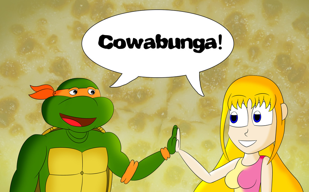
#1987 #80s #mike #mutant #ninja #pizza #tmnt #turtle #lucyaddison #cowabunga #highfive #michelangelo #teenagemutantninjaturtles #teenagemutantninjaturtlesfanart
Published: 2017-11-22 22:30:25 +0000 UTC; Views: 852; Favourites: 19; Downloads: 0
Redirect to original
Description
Made as Art Trade with as she firstly fav my TMNT logo I made.This artwork featuring 1987 version of Michelangelo from TMNT with Lucy Addison.
Cowabunga!!!
TMNT belongs to fred wolf and other original creators.
Picture Used: by iconblacksilence-stock:
Related content


Comments: 6

Overall


Vision
Originality
Technique
Impact
To start this critique off, I would like to say that I do like your color scheme. It consists of very related warm green colors, so it's pleasing on the eyes, especially for Michelangelo's skin and the woman's hair. However, the blue on the woman's shirt is a distraction, as is the odd color out. I would suggest changing it to another warm color such as pink or red. Also, the colors seem to be too saturated, I'd suggest lowering the saturation to add more color contrast. Your anatomy could also use some work, for example, the woman's left arm is too long, her head is too big and irrationally placed, her ear is placed too high on her head, one of her eyes is bigger than another, and the same goes for her breasts. My suggestion would be to look at human anatomy references whilst drawing your characters. The shading is also very minimal, it is only formed around the main edges of the characters, some places not even having shading at all. I can tell you just used a soft airbrush to do the shading. This makes the characters look as though they were made of clay. To fix this, I would suggest using a harder brush to shade and then blend it by using the blend or watercolor tool. However, these tools are not to be abused, for example, on the woman's shirt, I can see you used the blend tool too much, and the shading looks very gradient and unnatural. You need to think about your light source more and pay more attention to detail on where the light would land. Overall an average piece that could be improved on with a few adjustments.
👍: 0 ⏩: 0


You deserve it for your artworks.
👍: 0 ⏩: 1
