HOME | DD
 cacingkk — Pyro

Published: 2006-06-28 11:07:01 +0000 UTC; Views: 14289; Favourites: 208; Downloads: 84
Redirect to original
Description
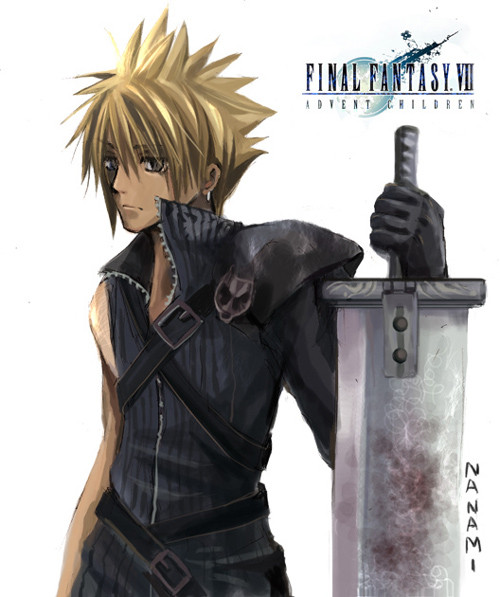
Weee...This pic i believe its giv ppl a new feeling*i guess so~~....
coz this time i include with color!! even the lecturer also suprise with it..

B&W sometime really bored so add some color to get a nice effect~!!
Well the only thing i dont like is the eyes expression not really *fierce n power~
The rest is still maitain....haha...
Hope u hav a nice visual view...
")
This work will be entry for I choosen "FIRE" as theme n is PyRo~!!
I think tat really loOK fire on his hand....haha
Media : 2B & 4B + color pencil (red yellow orange black pink)
Time : 5hr for the fire 3 hr for the figure
With Reference
Related content


Comments: 133


I notice the teacher's writing in the corner. That kind of sucks, you should ask him/her to not write directly on your work? It's your work though not mine so if you don't care that's good. This is an awesome picture. =]
👍: 0 ⏩: 0


nice pyro work i love the element of fire and i would love to control it great job on this one
👍: 0 ⏩: 1

you...yeah you really did well. one day i hope to achieve something like this. not the fire handling, mind ;D but sheesh, you have a fantastic talent, never forget it
👍: 0 ⏩: 1

That is Fantastic ! Just the perfect lil' amount of Color. Its so awesome
👍: 0 ⏩: 1

hehe...thx for the comment!
👍: 0 ⏩: 0


loove it  (Smile)")
👍: 0 ⏩: 1
yaya....he is coOL...juz too bad for him~~
👍: 0 ⏩: 0

THat definately looks like fire. The hand is absolutely AMAZING.
Definately has a Pyro-attitude. Great choice for any contest, as far as I'm concerned.
Kudos!
👍: 0 ⏩: 1
woO.....
thx for the comment!
*the contest was held in last yr~but i lost
👍: 0 ⏩: 1
Hm, dunno WHY you lost. I love this pic. You totally inspired me to put fire behind my pic of movie-Pyro. And it somewhat LOOKS like fire, too!
You're welcome
👍: 0 ⏩: 1
hahaha....is juz a contest
definitely someone is better than me!!
hehe...hey good luck for ur work!
👍: 0 ⏩: 1
Thanks so much, Cacing! You so nice. <3
👍: 0 ⏩: 0


good work with the fire !!!!! he looks like kyo kusanagi XD
👍: 0 ⏩: 0

OMG. That's sooooo HOT. Excuse the pun, couldn't help myself hehe. Wonderfully drawn! Definitely adding it to my favourites.
I love Pyro in X-Men!

👍: 0 ⏩: 1
hehe....thx for adding it to ur 
👍: 0 ⏩: 0

Awesome! I love him. Fantastic job with the shading!

👍: 0 ⏩: 1
hehe...thx~!
BTW thx for those
👍: 0 ⏩: 0


interesting style, i like the rough, patchy shading.. it works well to give it like a blurred but solid effect if that makes anysense haha. The colours and flame are pretty crazy ! good work !
👍: 0 ⏩: 1
oh.....mean this work had the "power" there...hahaha
thx~!
👍: 0 ⏩: 0

hehe...thx for the
👍: 0 ⏩: 1

Wow, great work on the fire!
Is this X-Men related? Just asking...
Oh, and good luck in the contest!
👍: 0 ⏩: 1
yup~!!
hehe...thx but there is too many great competitor there
👍: 0 ⏩: 1

Great work! That blurring effect is awesome, like real heat waves. Good luck in the contest!
👍: 0 ⏩: 1
weee...thx for the comment~~!!

👍: 0 ⏩: 1

Omgosh, I love this, pencil w/ colored pencil! Fabulous.
👍: 0 ⏩: 1


Great drawing! Loved the shadowing!
👍: 0 ⏩: 1
haha...thx thx thx...
i will keep tat...
👍: 0 ⏩: 1


Excelllent, by far the best entry for the competition I've seen so far. Very effective use of colour
👍: 0 ⏩: 1
| Next =>