HOME | DD
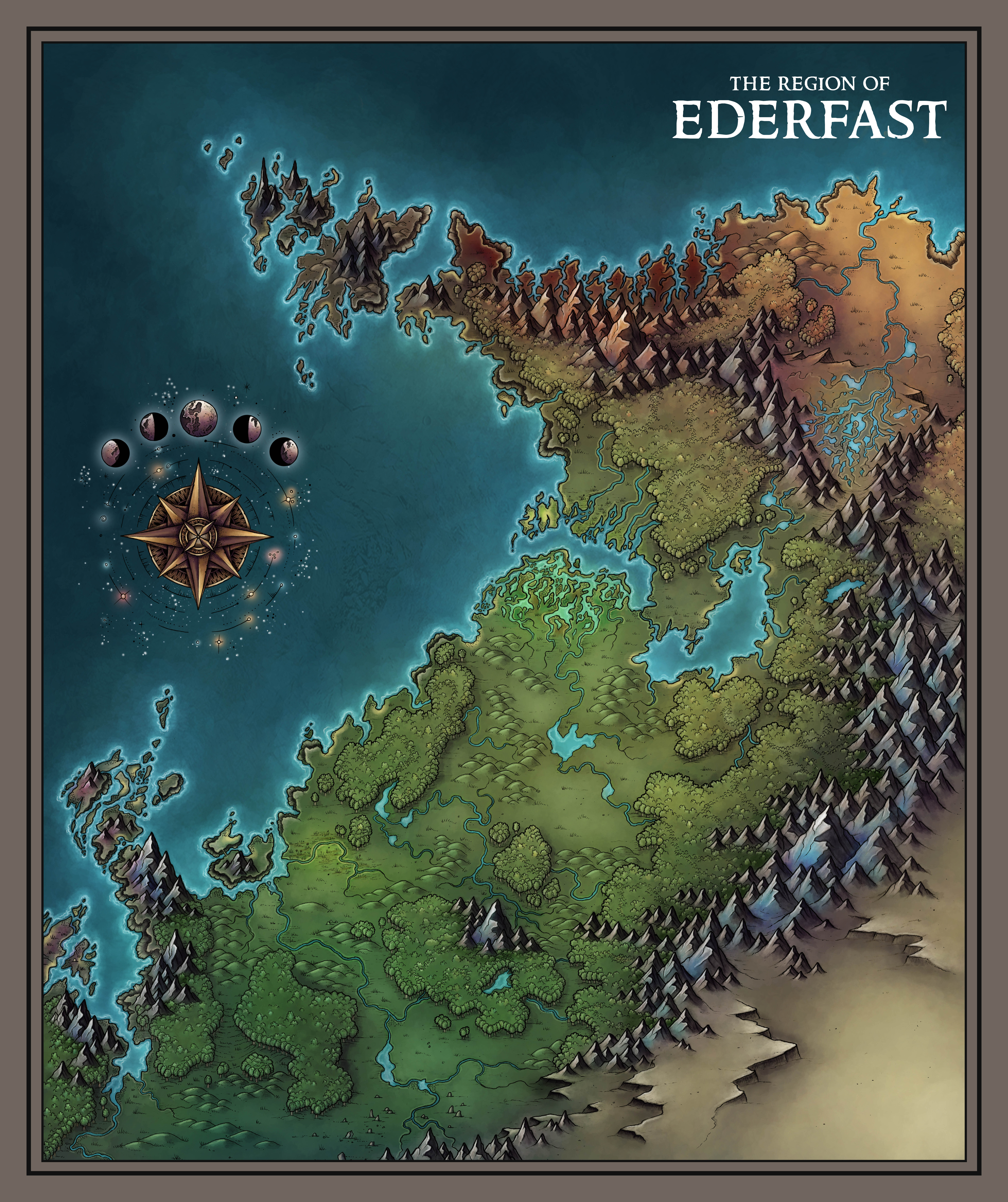
 Caeora — Ederfast

#fantasy #forests #hills #map #mountains #ocean #region
Published: 2018-07-11 15:24:18 +0000 UTC; Views: 5172; Favourites: 48; Downloads: 99
Redirect to original
Description
This is a map of Ederfast, a sprawling region of forests, mountains and more than a few rivers, also the home to kingdom of the same name! There is a blank version of this map at the link!


 www.patreon.com/posts/ederfast…
Related content
Comments: 7

👍: 0 ⏩: 0

Really love the vibrancy in the colors here. Well done.
👍: 0 ⏩: 0

Beautiful map! Great colors, and I have to agree with Starcave, the compass is amazing!
👍: 0 ⏩: 1

Awesome map! There are a lot to love about this map.
What I have to note is your compass rose. I absolutely adored how you created this starry sky feel with it. Inspiring stuff!
Thank you for the midtone tip on the other map. I want to keep the comment in the inbox so it stares me in the face, so I haven't replied on it. It would make it disappear. 
I do have a question. A problem I came across in my main continent map I am busy with. You go from very different colors in the zones on your map, yet you manage to make them blend naturally. This I am struggling with a tad on the continent map. Region maps are a little different, so the problem doesn't pop as much.
Anyway, any tips in how you would blend two different color zones? (The zone I am trying to blend is silvery -silver sands- and more normal color of sands.)(I want to tackle more real fantasy type biomes, that is why.)
Any tips in the matter would mean a lot to me.
Omri(Xcali from C-guild)
👍: 0 ⏩: 1

Firstly, thank you so much! Its awesome to hear that it's inspiring and helpful! Secondly when it comes to blending, my technique is to use an unconventional brush, in fact I use this exact ink blot instead of normal "brush" in every single one of my maps i.imgur.com/VOqOmrr.png . I then change the settings in photoshop so that the angle jitter is nice and random an typically turn down the opacity to anywhere between 5-15%. You can then get a really nice blend between pretty much any two colours 
👍: 0 ⏩: 1

I wanted to say thank you for this tip.
It really has tweaked the way I went about it. 
How is the city map coming?
👍: 0 ⏩: 0


