HOME | DD
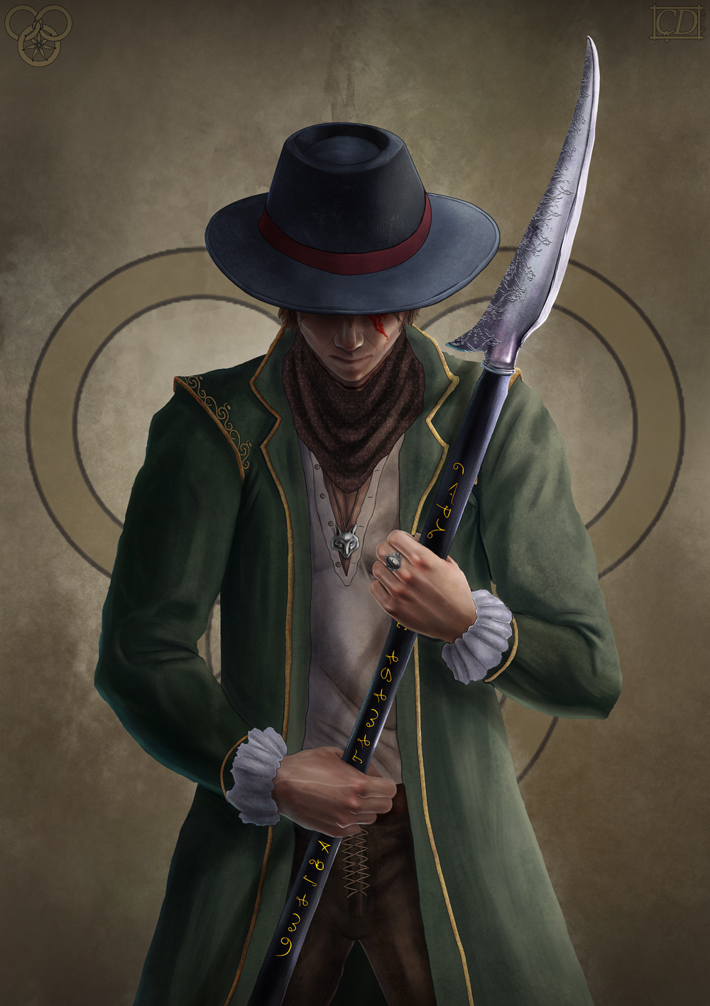
 cagdasdemiralp — Matrim Cauthon The Prince of the Ravens
#cauthon #character #fan #fox #hero #jordan #man #mat #matcauthon #matrim #matrimcauthon #prince #raven #ring #robert #robertjordan #spear #taveren #time #wheel #wot #robertjordanwheeloftime #art #artwork #characterdesign #conceptart #conceptdesign #design #digital #digitalart #digitalpainting #fanart #fantasy #fantasyart #fantasycharacter #illustration #painting #photoshop #thewheeloftime #wacom #wheeloftime
Published: 2017-09-24 18:39:14 +0000 UTC; Views: 9573; Favourites: 202; Downloads: 82
Redirect to original
Description
Hi fellas,Here is my third piece of my The Wheel of Time Card Series.
'Matrim Cauthon The Prince of the Ravens'
I hope you like it
 (Smile)")
Original Res: 4000x5658 pixels
Photoshop CC 2015
You can follow me on;
BEHANCE
Related content


Comments: 12

👍: 0 ⏩: 0

Great character. . Has a bit of Robert E Howard's Solomon Kane style too. Great artwork
👍: 0 ⏩: 0

This is so amazing. I love Mat. He is definitely my favorite. I love what you did here. The detail on the Ashandarei is awesome. The etching on the blade is brilliant. Great job.
👍: 0 ⏩: 0

Oh wow. Whee of Time fan-art. Very cool.
I have yet to read any of the books, I only know them by reputation. The little bit I think I understand is that each book is a different story set in a different time period, but some element or theme or plot device... connects them all? I dunno.
Anyway, I picked this particular portrait from your selection because there was an extra special glow or aura to it. Something about the way that you lit and shaded this makes the light feel really tangible, like it's just off screen of my computer and it's really landing on this guy. I think it's because the light drapes across the bladed staff the way it would in real life. Various artists will get this type of soft metallic lighting wrong. I also really like the extra detail work you put into the writing along the staff, the embroidery along the coat, and the folds in the cuffs. It helps bring the whole figure forward from the background.
The part where you need to take more time and put additional attention towards is your darker shaded areas. Your light areas are really strong and very crisp, but your shade is soft and under-defined. If you're going for a soft muted contrast in your work, I completely understand. But even with that, I think if you introduced a few extra darker layers and then muted them back down, you could further increase that realism that you introduce so well through your handle of anatomy.
👍: 0 ⏩: 1
Just read this comment and wanted to chime in. Did you start reading it yet?? It is my favorite series. No, it does not take place in different time periods. It is all the same age and the same characters throughout.
👍: 0 ⏩: 0


I love that you used the old tongue on the ashendarei...
👍: 0 ⏩: 1


