HOME | DD
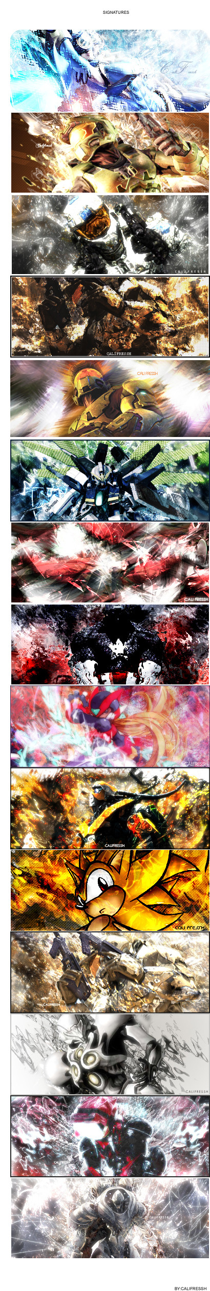
 CALIFRESSH — Signatures
Published: 2006-10-16 14:56:48 +0000 UTC; Views: 4833; Favourites: 16; Downloads: 25
Redirect to original
Description
Signatures.")
any comments ?
Related content


Comments: 23


nice did u use gimp n if so wat brushes did u use for the 9 bow down
👍: 0 ⏩: 0

from what i see Honestly is the same effects over and over with some bad text and the same dimensions on everything. Try something new and work on your color sceme, the 9th and 4th have really bad color sceme and 10, 7, and 2 have bad blending. try something new and work on the basics. Your flow needs work aswell
👍: 0 ⏩: 0

I can learn manny things from you, this is accualy verry nice...
👍: 0 ⏩: 0

I really Like your work, very nice stuff.
If you join forums you should check this one out
this forum is amazing, people showcasing tons of there work everyday. Also battles, and gfx teams.
[link]
👍: 0 ⏩: 0

hate em all, just to many effects they draw focus away from focal.
👍: 0 ⏩: 0


You might not be an expert, but dude, your colors, flow, lighting, depth...sucks. straight up. lol. Way to busy and too much going on. It has zero flow. Try looking up some tutorials man.
👍: 0 ⏩: 0

nice stuff maybe you can check out my signature site
👍: 0 ⏩: 0


mhh..nothing special sry, u should use more effects
 (Wink)")
👍: 0 ⏩: 1

umm.. more.. he has to many..
CALIFRESSH: you need to work on your flow and colors, and not worry so much on the effects.. yea they look nice while your doing them, but to many can destroy a tag..
👍: 0 ⏩: 1
thanks for the comment  (Smile)")
👍: 0 ⏩: 0


The last one is my favorite! But most of them are a little messy for my taste, but very nice work nonetheless.
👍: 0 ⏩: 0

I think it's been a month. C'mon don't quit on graphics yet!
👍: 0 ⏩: 1

i havent. ive just been really busy with school.all academics this term.ugh.
👍: 0 ⏩: 0


cram. My comment didn't get posted. **is irritated**
Anyway, I really like the way this displays your work. You can more clearly see your style. I think out of all these, I like the second one, the ninth one, and the last one.
👍: 0 ⏩: 0

thanks. ill be sending in another set in a month or so.
👍: 0 ⏩: 0