HOME | DD
 can — tint table menu
Published: 2005-04-06 17:45:49 +0000 UTC; Views: 37927; Favourites: 230; Downloads: 3694
Redirect to original
Description
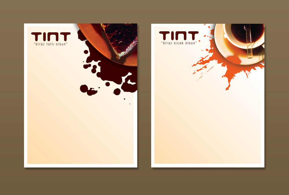
this is the menu of hot beverages and desserts which will be on the table.the prices will be written later.
texts >>> "a little bit sweeter" & "little bit hotter"
Related content


Comments: 58


i think i'd frame your menu,
and hang it up.
fantastic job. :]
👍: 0 ⏩: 0


Wonderfull...the elements distribution in the page is awesome!!and to not speak about the colors...great selection!!

👍: 0 ⏩: 0
Wonderfull...the elements distribution in the page is awesome!!and to not speak about the colors...great selection!!
👍: 0 ⏩: 0


hakkaten yuh ama ya elimi nereye atsam altından sen çıkıyosun
👍: 0 ⏩: 0

gerçekten süper olmuş kardeş phtoshoplamı yaptın yoksa başka programlamı
👍: 0 ⏩: 0

bumukemmel olmus gercekten. iyi bir grafikçiyiz anlaşılan
👍: 0 ⏩: 0


Very well done...
and it would be evemn better as I can imagine with the real stains after the meal...
👍: 0 ⏩: 0


en begendigim islerinden biri can valla ellerine saglik
👍: 0 ⏩: 0

Guzel fikir ve basarili uygulama,umarim basarili olmustur...Ama sanki biraz fazla genis gibi geldi acaba logo yu asagi cekip dikdortgen bir formata kaysan nasil olurdu hmm...
👍: 0 ⏩: 0

brilliant stuff -
may i ask..... what software would you normally use to create the pricelist inside this menu?
A lot of people are against using photoshop for text-based publications because it is bitmap-based.
I would be interested to hear how you go about doing a job like this?
(send me a note if you like! ")
Thanks, I love your work!!
👍: 0 ⏩: 0


haha great idea, I could murder a coffee and a sticky cake now
👍: 0 ⏩: 0


Not what I usually consider good design style for a resturant, but I don't know the client and the objectives of the projedt, so from a pure asethic view, i absolutly love it.
👍: 0 ⏩: 0

Hey there, love them
👍: 0 ⏩: 0


This is REALLY good.......i love everything about it. The design and balance are very nice and the colors you used are great throughout. Nice work! +FAV
👍: 0 ⏩: 0


artik bi tint yapicas son halini görmek icin
👍: 0 ⏩: 0

renkler,goruntuler ve lekeler basarili eline saglik fakat lekeler basakli(servis kötü ve örtüler pis) bir mekan izlenimi veriyo bence.leke ve goruntuler arasında kontrast bir etki yaratmissin tekrar ellerine saglik
👍: 0 ⏩: 0

abi helal olsun süper olmu$!! ellerine saglik!
yava$ yava$ di$ariya aciliyoruz

👍: 0 ⏩: 0


woowww!! Harika olmus wallaa!! Ellerine saglik! Renklerin uyumlari ve kompozisyonu yerlestirisine bayildim, minimalistik olmasi da cok guzel olmus bence.
harika!
👍: 0 ⏩: 0


love the colours and such but I don't know how comfortable people will be with spilt drinks and food as the theme.
👍: 0 ⏩: 0


aynen benim de kahve ve tatli istedi canim. bu da basarili bi menu oldugunu anlamina geliyor  (Smile)")
 (Wink)")
degisik bi fikir ama. yaratici insan
👍: 0 ⏩: 0

Cok guzel olmus
tint yazisinin altindaki aciklanmalar sana aitse onlar da super
👍: 0 ⏩: 0

nice combination of color u use... welldone... great job for two hour...
👍: 0 ⏩: 0

Very Nice Can!!
👍: 0 ⏩: 0


| Next =>