HOME | DD
 Candy2021 — Built For Speed
by-nc-nd
Candy2021 — Built For Speed
by-nc-nd

Published: 2011-01-21 00:25:30 +0000 UTC; Views: 1929; Favourites: 22; Downloads: 33
Redirect to original
Description
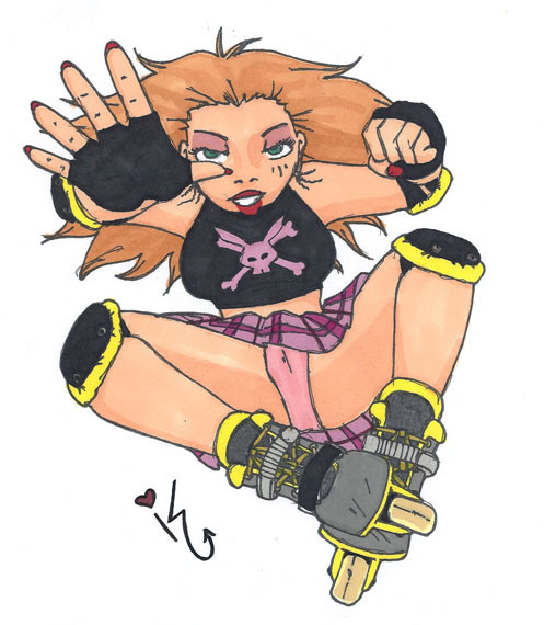
I just COULD NOT decide what one I liked better, so I'm posting them both!variant of this
If Candy had a roller derby name it would be "Internet Skate Machine"
Candy ©
inspired by - [link]
Related content


Comments: 21

(I like both versions, but I commented on this one because I like how it is just the image alone)
I think you did a good job with this! I really like Candy's cute flirty posing and her outfit. I am very fond of the neon colors on her! Nice work on drawing her skates and her stomach! I think it is hard to draw a female with a six pack that looks like an ATTRACTIVE female, but you pull it off beautifully with her!
Very great work Candy!
")

👍: 0 ⏩: 0

I really like the pose, especially the detail to hands and socks~ Be careful with the perspective on the foot, it's really high up :0 I enjoy the outfit you gave her, and colours are good as always  (Smile)")
Pleeeease stop drawing knees that way, unless absolutely everyone has crazy knobby knees. It may work for Candy, because she does have some muscle but like, on Mercy it makes no sense and many others I see you draw D: Limit lines on bodies as much as you can, it makes them more realistic.
👍: 0 ⏩: 1

The skirt is really weird, Clothing fold and weights and shit are the next thing on my hit list to tackle actually.
and Nope, sorry. my knobby knees aren't going anywhere. I learned how to draw them from an administrator on Y! and in just about every portfolio review I've had I've gotten a lot of nods for them...and Mercy's knees aren't drawn like that? her knees (and most bigger legs I draw) consist of 2 dimples under the patella...which, is what chubby knees look like (or at least mine do)
that skirt though has a lot of problems, I was aiming for foreshortening and it all fell...kinda flat. SOMEONE ( ~celluloid-dreamer ) said I should draw more than just 2 types of skirts and this was a big leap outside of what I'm accustomed too. maybe more research is needed.
👍: 0 ⏩: 1
I don't really think Y! is a great source of 'how to draw' but, if it works for you then more power to you! In your earlier works, and some of your more later works (nothing too dated that its not relevant) some of your bigger characters also have the knobby knees. I did take a look at your recent pics of Mercy, and you are correct. Personally, I strongly dislike them, they look really weird in contrast to how you draw the rest of the body, and incorrect. If you don't want to correct it, its your choice, and I know your really head strong with your work, its just my personal opinion.
👍: 0 ⏩: 1
This is very true, Y! has some sketchy art on it, but this was an administrator (~massive-destruction ) but she was making big bucks with her work.
as for the bigger knees thing, you mentioned this once before and I corrected it ( post your comment this has not been drawn again) so I really don't see why it needs to be addressed again.
I know you dislike them, some people don't/won't. but to say their incorrect I think is a bit of an overstatement I feel. a knee (in essence) is a hinge with a cap on it... the Patella (cap) and the Tibia (bone under the cap) is what I like to accent. as seen here [link] (pardon the crudeness, I'm on a lap top)
I don't really know what you mean about me being "really headstrong" in my work, but just for the record I don't purposefully perpetuate anatomy that is inaccurate. stylized in a way that may not appeal to everyone?, yes...very guilty. picking up traits from other artists are famous in the field I want to get into?...also very guilty...but if it's on the human body, in the right spot and I want to show it off I don't see why I shouldn't.
I know it's your opinion and I value it, always have, always will... do I always agree with it?...no. but I value it.
👍: 0 ⏩: 0

i love this pic1 roller derby is absolutely amazing, me and my friend cody are on a roller derby team called The Deathrow Cupcakes. are names are Princess Penalty and Peaches and Scream..idk i just wanted to share tht haha
👍: 0 ⏩: 1
OMG so exciting! my derby name is Candy Neckbrace and I used to skate for the queen city roller girls and I am currently looking for a new team / league to skate for.
thank you so much!
👍: 0 ⏩: 0

This looks great! I love her pose and the colours!
👍: 0 ⏩: 1

I love both versions a lot, but I have say that I love the way the black brings out the greens and purples in this one a lot; it really makes her pop. As always, I love how you do female anatomy and how feminine she looks, even with abs. (I tend make women look more masculine, somehow, when I give them abs, so I admire you for that. xD) Her legs are so flipping sexy and I want her socks so bad. <3 This is really great, and you've improved Hell of a lot since the original!
👍: 0 ⏩: 1
oh wow thank you!
and Oh man it's not just you it's a problem LOTS of people have with making muscular girls look manly..it's really hard not too- BUT it's not impossible! and I thrive on impossibility!
👍: 0 ⏩: 0

I thought it was a new ID at first, especially with the other version, thinking all the text was some bio or likes/dislikes information, doi ...
Internet Skate machine, that's brilliant X) Also, she looks pretty cute in a skirt B3 *punched*
👍: 0 ⏩: 0

Hm, I'm not sure which background looks best either. I'm faced with impossible choices like that all the time. A couple of years can certainly make a lot of difference in terms of talent; I end up wanting to redraw most of my old art. Anyway, Candy looks very cute in her outfit. Those bruises look painful, though. Reminds me of my recent spill on the ice. I took pictures if you're interes... No? Okay, then.
👍: 0 ⏩: 0

Lovin' her punkish outfit BTW X'D purple and green are gorgeous.
👍: 0 ⏩: 0

I don't think I can chose between both versions, but as previously said, I can totally see this as a design on a shirt or such!
👍: 0 ⏩: 0


She's hot. I love both versions, however I would see this one on a t-shirt or poster. Excellent work, as always!
👍: 0 ⏩: 0

I guess if it's something she wants then it's something she needs?
She looks amazing. I love how her bruises color her body. I want to kiss them. I know that'd hurt but I'm kinky like that.
👍: 0 ⏩: 0

I loveee this <3 She looks so cute in that derby outfit.
👍: 0 ⏩: 0

The other pic may have a more colorful background, but I can easily see this one as an advertisement with those HUGE letter screaming that kids' seats are just 5 BUCKS! 

👍: 0 ⏩: 0
