HOME | DD
 canias — Simple and Clean Icon Set
Published: 2008-02-23 14:30:40 +0000 UTC; Views: 20667; Favourites: 45; Downloads: 2798
Redirect to original
Description
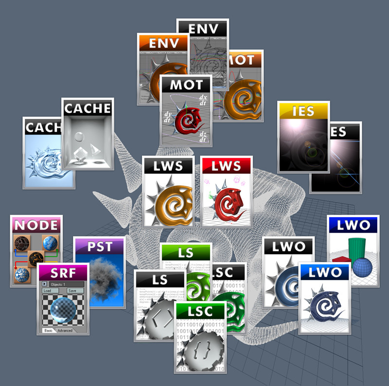
This is my first Icon Set for Docks like Rocket Dock or Object Dock.I wanted simple icons which are matching each other.
These are the icons I needed most, but i will add more icons (e.g. for Firefox) in the near future.
I hope you like this and please leave a comment after visting my work.
If you need some special icons just tell me.
I'll try to add all icons you wish.
Furthermore I will add icons anyway.
Inspired by [link]
--=UPDATE 02/24/2008=--
added new icons, there are now 38 icons overall
// green: Graphic
PS3 - Photoshop CS3
C4D - Cinema 4D
SPR - SprayR
GMP - Gimp
BRI - Bridge
GIF - Image Ready
// blue: Games
FO2 - FlatOut 2
PREY - Prey
COD4 - Call of Duty 4
UT3 - Unreal Tournament 3
CRY - Farcry/Crysis
BIO - Bioshock
STM - Steam
// orange: Applications
CCL - CCleaner
ENC - Microsoft Encarta
FRS - Fraps
DVD - PowerDVD/WinDVD
iTU - iTunes
BURN - Application like Nero
FOO - Foobar Player
VLC - Video LAN Client
AMP - WinAmp Player
WMP - Windows Media Player
// red: Folder
DOC - Documents
MP3 - Music
IMG - Images
SHT - Shutdown
* - Stack Docklet
// violet: Internet
MAIL - eMail client
FOX - Firefox
IE - Internet Explorer
ICQ - ICQ
MSN - MSN
OPR - Opera
P2P - Peer to Peer Application
SKY - Skype
TSP - Teamspeak
Related content


Comments: 10


hey canias, Ich finde, dass hast du ganz toll hinbekommen, mir gefallen diese dockicons sehr und ich nutze sie auch. Aber leider fehlen ein paar, wie ich finde . GoogleEarth, Arbeitsplatz, Word, und so Sachen ^^
LG
👍: 0 ⏩: 0


Gefällt mir gut, nur sind Text-Icons eher ein Nachteil, weil man diese nicht so schnell identifizieren kann wie Bilder-Icons, besonders in diesem Fall, weil fast alle Icons gleich aussehen
 (Wink)")
👍: 0 ⏩: 1

das sie alle gleich aussehen ist ja gewollt.
und ich persönlich kann mit 3-4 buchstaben schneller was identifizieren als mit nem kleinen logo.
aber das is wohl geschmacksache
👍: 0 ⏩: 0

Jo sieht ganz gut aus auch wenn ich mehr auf dock icons stehe die dem original nahe kommen.
 (Smile)")
👍: 0 ⏩: 0

Nett gemacht, aber wie gesagt, nicht mein Ding. ^^
Achja: "SHT" .. da dachte ich zuerst an Shit. :ugly:
👍: 0 ⏩: 0

Looks so similar to [link] ... Maybe a credit would've been cool
Nice set btw ...
👍: 0 ⏩: 1
i added a link to the set you've mentioned...
but i think only the colored stripes are the same!
the rest is different I think.
ok the three letters on the icon but there are more of this kind here on deviantart.
👍: 0 ⏩: 0