HOME | DD
 carl913 — Some site 2

Published: 2010-09-02 17:45:25 +0000 UTC; Views: 34228; Favourites: 247; Downloads: 1268
Redirect to original
Description
Other version.Related content


Comments: 55

Wg mnie jedyne słowo, które trafnie określa poziom tego szablonu to "zajebiście". Chciałbym tak umieć, szkoda że czasu brak na naukę
👍: 0 ⏩: 0

")


Bardzo dobre. Wszystko przejrzyste i przyjemne. Fav.
👍: 0 ⏩: 0

Nice Design!
--
Visit My site [link] Visit Template site [link] Visit blog [link]
👍: 0 ⏩: 0

Styl i kolorystyka wygląda jak splashscreen z CS5 gdy mi sie ładuje
👍: 0 ⏩: 0

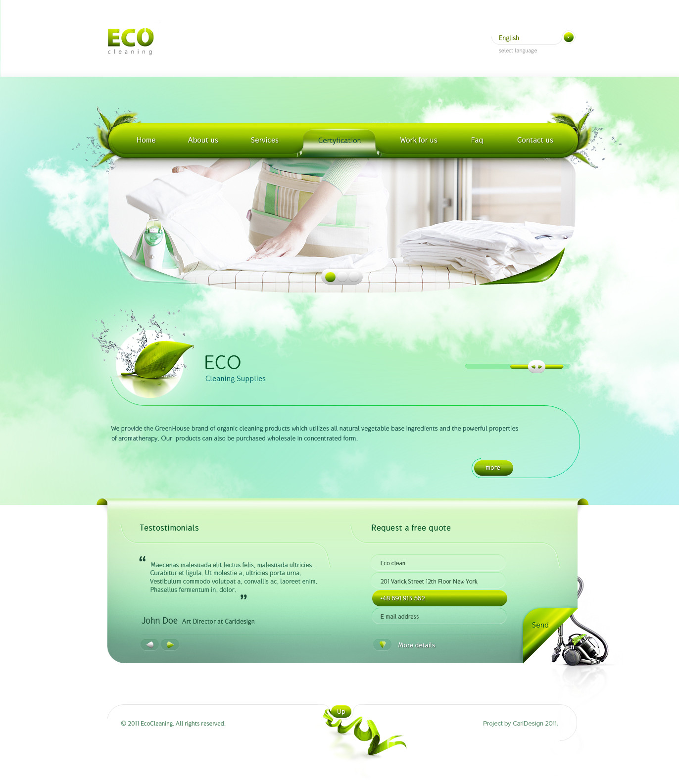
This looks really great! I like the angular windows, they make the design less static.
👍: 0 ⏩: 0


one of the best blue designs i ve ever seen! congrats!
👍: 0 ⏩: 1

nawet spoko choć jałowe trochę, brakuje choć jednego detalu /ciepła

👍: 0 ⏩: 1

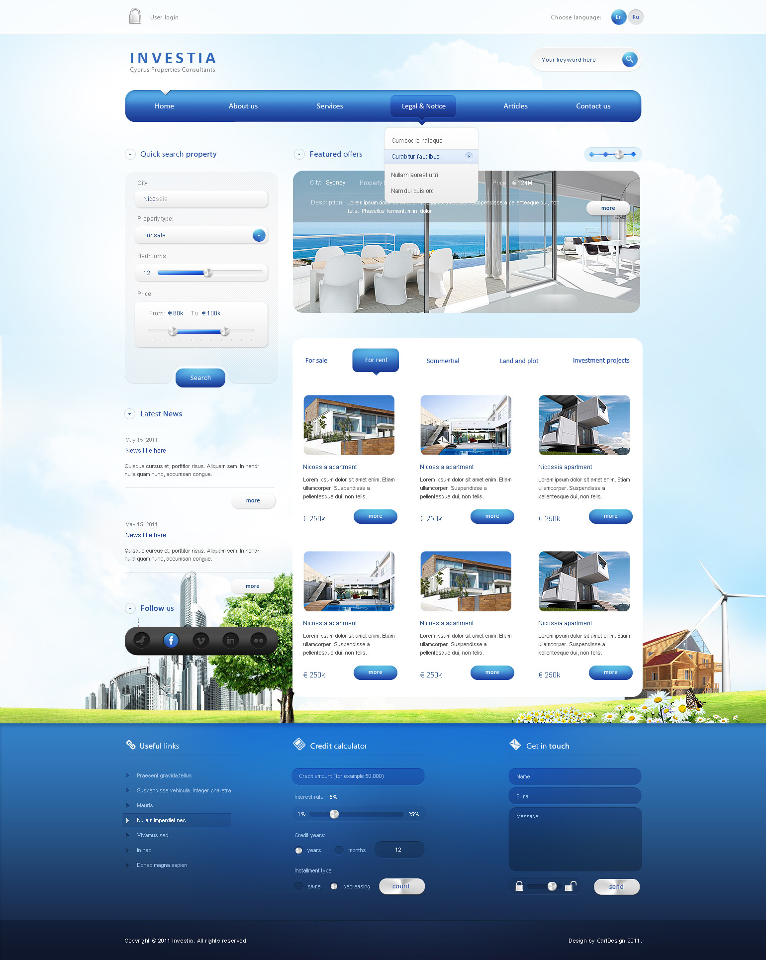
Wiem przydałby się jakiś kolorek, który by to przełamał ale niestety klient sobie zażyczył to w takich barwach (tylko i wyłącznie w takich) więc jest jak jest ale ogólnie jestem zadowolony z tego...
👍: 0 ⏩: 0

This is really nice mate. I think many poeple would buy this Design.
👍: 0 ⏩: 1
This is not for sale. It is for company. So its sale now  (Smile)")
👍: 0 ⏩: 0


dude, this is great!
I would only change one thing, in our partners box the left side of the box.. maybe it would look cleaner if it would be classic rectangle like on the top
 (Wink)")
👍: 0 ⏩: 0

Nice color chose, like the style unusual forms of windows.
Not so sure about the search button were there is this lens, i think its bit too wide for the small icon there.
👍: 0 ⏩: 0

")


really nice
I think i would keep the left side of our parter box straight to give the website a more eh... align feeling, just my 5 cents
👍: 0 ⏩: 0

Like Like Like Like Like Like Like Like Like Like Like Like Like Like Like Like Like Like Like Like Like Like Like Like Like Like Like Like Like Like
👍: 0 ⏩: 0


i like it
but some more details would be nice, light effects or something like that.
👍: 0 ⏩: 0


Thx. Can You show me Alex's work, which looks like this one ?
👍: 0 ⏩: 1
| Next =>