HOME | DD
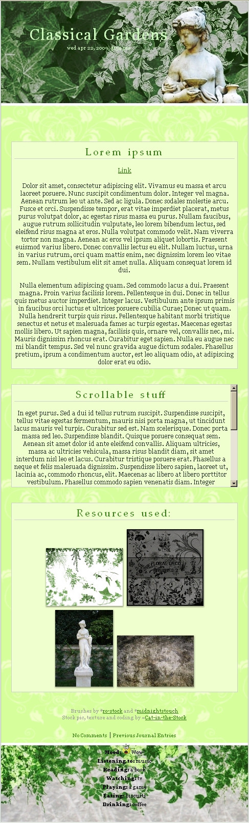
 Cat-in-the-Stock — Classical Gardens free CSS V2
Published: 2009-04-21 16:14:54 +0000 UTC; Views: 2547; Favourites: 16; Downloads: 33
Redirect to original
Description
V2: taking into account the critique I have received, I centered the boxes, darkened the images and heightened the contrasts. I can't do much more I am afraid, so i hope you enjoy this one (Wink)")
Click download for the package.
Features:
 easy to use CSS only 3 images to upload scrollable content box
Limitations:
Moods should be kept at the bottom.Please do not modify this template and reupload it as a new CSS. If i was able to learn CSS, so should you.
Brushes used by *midnightstouch and *ro-stock
Pics and texture by me.
Working example: [link]
Matching Gallery CSS here: [link]
Related content


Comments: 20

Overall
Vision
Originality
Technique
Impact
The cat wants some critique, the cat gets it e.deviantart.com/emoticons/n/n… " width="15" height="15" alt="

Of course i have to like this layout, because it is green and structured. That can never be wrong. But there are several things that can be improved.
The first thing that should be redone is the color of the mood-section. You use nearly the same green for the font that you can find in the background image as well. Which makes it nearly impossible to read the text. But even when using a lighter green you can run into trouble when it comes to the lighter parts of the footer background. So either go for a different color tone or a darker green shade. That won't merge with the background.
The next point is the spacing at the sides of the boxes. Unless there is a special reason - that i might don't see yet - you should center them and make the spacings equal. Otherwise people always will wondering if that was intended or not. And as far as the layout goes it would match better when centered. Or you have to give that left spacing some more importance/a reason.
Furthermore the contrast of the colors could be stronger. Especially for the subject, the hover-color of links and the grey credit text. I'm sitting in a light room atm and those content elements get kind of lost.
I hope this is useful for you e.deviantart.com/emoticons/h/h… " width="38" height="15" alt="

👍: 0 ⏩: 1


For the space on the left I just... did not see it! 

And lastly: I will go fix those washed-out color
Thanks for pointing all that to me

👍: 0 ⏩: 1
For such textured backgrounds it's always difficult to find a perfekt font color. So you have end with some try and error
Maybe add a bit more black to that green you are currently using? That way it still matches the overall color scheme.
I guess it's some pre defined thing. Had some problems with that already too, but of course they are more obvious if you have such a centered layout.


👍: 0 ⏩: 1
Ok, well, I tweaked the font-colors but I am only half satisfied with this header and footer colors...

👍: 0 ⏩: 1
Aww, maybe take a break and look at it tomorrow. Or just browse dA for similar colored layouts to get inspired
👍: 0 ⏩: 0


I am no expert on the art of CSS - but what I can give my opinion on is how it fits into the deviant journal - this is just so darn pretty. I am not a huge fan of bright colors - but this is such a celebration of spring it is PERFECT for the season!
The statue provides a break to all that green - and so it's fairly easy on the eyes for a bright sunshine-y CSS design e.deviantart.com/emoticons/s/s… " width="15" height="15" alt="
 (Smile)")
Great timing - lovely imagery - nice balance. All around snazzy - I thank you for sharing it with us!
👍: 0 ⏩: 1
Thank you so much
I am glad that the colors are not too bright, which was one of my main fears.
👍: 0 ⏩: 0

thanks
👍: 0 ⏩: 1

your welcome, I took another look now that you did some changes and it looks great ")
👍: 0 ⏩: 1
👍: 0 ⏩: 1

👍: 0 ⏩: 1

Okay, but how do I get one for my profile?
👍: 0 ⏩: 1
For that you need to be a subscriber, then the CSS code box will be available to you in you journal creation page.
👍: 0 ⏩: 1