HOME | DD
 catchingfyre — Falling

Published: 2012-05-26 10:10:18 +0000 UTC; Views: 8254; Favourites: 463; Downloads: 358
Redirect to original
Description
 Editing by curves
  Featured here! [link] [link]
 © Madison Frye Photography
You cannot use without my permission.
Related content


Comments: 118

Overall

Vision
Originality

Hello! First of all, I let you know that this critique will enter the :FeedbackFrenzy:'s comment contest e.deviantart.net/emoticons/s/s… " width="15" height="15" alt="
 (Smile)")
As a still life photographer and pocket-watches freak myself (XD) I love this picture! But let's take this step-by-step e.deviantart.net/emoticons/s/s… " width="15" height="15" alt="
The composition is very nice, I like it! The fact the clock isn't perfectly centered makes it look better, and gives the idea of movement. The colours look very natural and subtle, I can pereceive a lovely vintage atmosphere. The dark green together with that light brown are a very good combination. The depth of field is almost perfect. I see you used a very low aperture, and the bokeh that way looks bigger and - in my opinion - nicer. I love that kind of bokeh in the background e.deviantart.net/emoticons/l/l… " width="26" height="17" alt="

e.deviantart.net/emoticons/s/s… " width="15" height="15" alt="
Now, I have just a few critiques for this piece. Although it doesn't really bother me, I would have used a bigger aperture: all the clock face would have been clearer and focused, and the bokeh wouldn't have been too small however e.deviantart.net/emoticons/s/s… " width="15" height="15" alt="
e.deviantart.net/emoticons/g/g… " width="17" height="15" alt="

e.deviantart.net/emoticons/c/c… " width="20" height="20" alt="

I really, really appreciated your photo: it has a great quality and it has a good impact for sure! e.deviantart.net/emoticons/c/c… " width="20" height="20" alt="
e.deviantart.net/emoticons/a/a… " width="15" height="15" alt="

👍: 0 ⏩: 2

This is an awesome critique ! Congrat's Guilia !
👍: 0 ⏩: 1
Haha thank you so much, I'm doing my best for this critique contest ")
B-but... You mispelled my name!!!

👍: 0 ⏩: 1
Awwwwwh sorry Giulia D:
Well, could you do me a critique for your contest ?
👍: 0 ⏩: 1
Unfortunately we can critique just the pieces of art by the ones who entered the contest. Each of the partecipants had to choose up to 3 deviations of theirs to be critiqued, and we can just critique them for the contest 
👍: 0 ⏩: 1
Oh, i see :l
I never understand this kind of contest, if you want feedback, or critique, just search it by yourself :3
No no, the critique was only for your contest ! As well, if you wanna write me one, you can, but i don't ask you, that was only for your contest
👍: 0 ⏩: 1
It's not to get feedback, it's more to learn how to give useful feedback to other fellow deviants
I see, but I'll write you a critique anyway, I'm starting to have fun doing this 
👍: 0 ⏩: 1
Awh okay ^^
Yeah, i always try to put some constructive critism, in every comment, exept the banals ones "Awesome" "wow, amazing" and etc xD
One time I wrote a very bad critique, i'm shamous now of it *blush* it was during a difficult period for me, and i recognize I was severe. You can see it here : [link] (if it doesn't work, chek the pic here : [link] ), but... I still don't like this pic
And thank you very much ;3 You're not forced ^^
👍: 0 ⏩: 0

Thank you so much for the kind words!
👍: 0 ⏩: 1
You're most welcome! 
👍: 0 ⏩: 0

Overall
Vision
Originality
Technique
Impact
Hello e.deviantart.net/emoticons/w/w… " width="25" height="20" alt="

I'd like to start off with saying, that I really like this piece. It stood out to me amongst the other pieces, and I was instantly drawn towards it. I enjoy still life photography and I see some really nice pieces in your gallery!
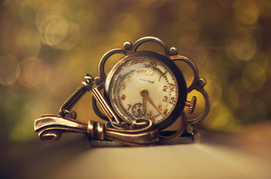
What I see here is an old and vintage pocket watch flowing in the open air. It's almost as if I can feel it moving and hypnotizing me as I write this.
Your colour scheme is really powerful but still subtle. The golden watch is in great contrast to the green bokeh-background.
However, I wish that the whole watch was in focus and not just the bottom. The golden reflection on the bottom is beautiful and intriguing, but the chain from which the watch hangs is out of focus, and I feel it would have worked better for the whole expression of the picture, if it had been standing out more. Sadly I'm unsure about it even being possible without changing the angle. The chain creates an effect where a part of the picture is blurry and I feel like I'm already going under as if I was being hypnotized.
I'd suggest that when want to take these kind of pictures, be aware of the light on the setting. Here, I feel that the light is hitting the top of the watch in an unlucky way, so it creates a very strong reflection.
These images can be super hard to nail, because the angle is untraditional. Either one can place oneself in an awkward position in order to get the desired picture, or one can let the watch dangle from side which I think is the desired effect of this piece. Especially moving targets are tricky to catch, and that's sometimes the great thing about still life pictures. It's when you can sense movement! e.deviantart.net/emoticons/c/c… " width="20" height="20" alt="
I think a position such as this: [link] would have worked better for your golden pocketwatch because the whole watch is sharp and very detailed.
Many photographers has tried their take on the infamous pocket watch, and *lieveheersbeestje has done a lot of these kinds of images, for example this one: [link] where the angle is directly onto the subject. This way the whole watch is in focus and is in great and sharp contrast to the rest of the picture. The thing to be careful of if you want to try out for this kind of picture as *lieveheersbeestje is the background. It can easily get boring! You remind me a lot about this deviant. Maybe it's the similar avatars, but also your galleries are very similar in key aspects! e.deviantart.net/emoticons/s/s… " width="15" height="15" alt="
Your picture is anything but boring, though and this is truly a great photograph. I hope you will keep taking such pictures in the future, and I hope this was somewhat helpful for you! e.deviantart.net/emoticons/h/h… " width="38" height="15" alt="
e.deviantart.net/emoticons/l/l… " width="26" height="17" alt="
If you have any questions, please don't be afraid to ask me to elaborate or go even further into my statements and the rating, I've given. e.deviantart.net/emoticons/h/h… " width="38" height="15" alt="
👍: 0 ⏩: 1
Thank ou for your kind critique! To be even compared to Megan is such an honor! I will take into account everything you said. As for the focus, I was using a macro lens with the shallowest depth of focus so I thought that would be the best place to focus. This was such a helpful critique with all the links and helpful comments. Thank you again. I really appreciate this!
👍: 0 ⏩: 1
I'm so glad you like it!
It probably was the best place to focus, really. I mean, I want a macro lens myself, but I don't know that much about the lens itself. But I can imagine it has a very small point of focus?.. So it wouldn't be able to catch the whole watch anyway, I guess.
It was definitely the best point to focus on. If you would have focused on the string, the image would look really weird. Also, because the focus is where it is, it's really like it's going to hit you right in the face

👍: 0 ⏩: 1
Hahaha, yes. The focus was quite hard to capture, I took a few hundred shots before deciding on the best point of focus.
👍: 0 ⏩: 1
Hundred?! Wow, that's dedication, my friend
👍: 0 ⏩: 1


Very nice image. The bokeh is great but I feel that the colors are a little muted.
👍: 0 ⏩: 0

That looks just stunning, may I ask what gear&software did you use? Again, perfect!
👍: 0 ⏩: 0


👍: 0 ⏩: 1

Hello!
I founded a group called "Passion of Photo"! And i want to invite you, to be a member! I love your photos. I would be proud of you, if you are a member! I would be grateful! You can show all of your photos!
xoxoxo
Link: [link]
👍: 0 ⏩: 1
Thanks but I'm part of too many groups.
👍: 0 ⏩: 1


The depth of field is just perfect in this photograph! And I really like how the clock looks like it's in motion, similar to how time is always moving away from us.
👍: 0 ⏩: 1
Thanks so much for your words
👍: 0 ⏩: 0


Nice Photo ,, I like the general concept of this piece ,
The angle of shooting is creative
The look of Bokeh is also good
I belive that it's better to increased the aperture to bring the whole object into focus ...
In general , this photo is stunning
 (Wink)")
👍: 0 ⏩: 0


This is a critique for FF
I have been itching to critique your photos! However time has really been an issue so I find myself last minute critiquing D:
Anywho! I adore that watch I want to know where all of these deviants find such wonderful still life subjects, I should probably paroose some antique shops more often. I really love this picture, The motion is captured so well I'd love to know how you did it, the way the clock slowly goes out of focus you can sense the motion. The background, in my opinion, is perfect its there but not distracting away from the subject the perfect amount of bokeh! I think the only thing I would like diffidently is the lighting on the top of the clocks face, its a little over exposed and I wish it could be a little darker but the picture is so well done I don't really think it takes away from the picture at all. Wonderful job, you have earned a favorite from me!
👍: 0 ⏩: 1

Heya, so this critique will be for Feedback Frenzy so I hope you enjoy ^-^
Firstly, I LOVE stop watches and have seen many similar photographs across not only deviantart but the internet in general but what really sets them apart is the overall image wuality and exactly how the image is executed and here it is executed brilliantly!!
The macro-esque small D.O.F. used here is perfect to create this very magical type atmosphere where all our focus is on the little pocketwatch, maybe a slightly larger depth of field would have worked nicely here as the numbers towards the top of the watch are slightly out of focus which is a shame when it is the focal point of the image.
One thing I particularly like is how the aperture settings have created a lovely bokeh background that is very natural and beautiful with the green tones and the lovely LARGE size of the bokeh gives us an amazing background in general, giving us the sense of time falling away naturally all around us every second of the day.
I love that you've decided to use this as a landscape framing too and how the watch is slightly off places to the left I only wish it were slightly MORE to the left and so fitting in to the rule of thirds - perhaps you could achieve this my cropping the image in slightly.
The angle of the watch is another thing very worth mentioning. I'm not sure if this was achieved from simple angling the camera or if the watch was actually in motion but the angle of it makes me think of it as though it is swinging like the things in the huge grandfather clocks.. swinging to every second and so the sense of movement makes me think that every moment, time is going by and we're falling out of out lives slowly into older age etc.
And, perhaps a strange thing to comment on, but I like the placement of your watermark balancing out everything that's going on in the top left by placing it in the bottom right.
One thing I personally would've changed would be to try and either use a higher shutter speed with the lowest ISO or so on to try and keep all of the watch surface at a reasonable light level because its a shame that it's slightly over exposed towards the top of the watch which I know can be quite tricky to NOT have when dealing with reflections in glass but it just slightly bothers me that the numbers are harder to see at the top so maybe experiment with angles or even just changing your camera settings slightly can make a huge difference to this.
Overall this piece is gorgeous though and I can see from your artist comments that you obviously LOVE to take photographs of watches and with time concepts and you've definitely got a talent for macro photography ^-^
I will definately be looking through your gallery now ^-^
👍: 0 ⏩: 0

Hi, I'm writing this on behalf of #FeedbackFrenzy . (However, all opinions stated are my own.)
First of all, I like the angle you shot the clock at. I also like how you used a shallow DoF to make the clock stand out and make the background creamy smooth. This piece speaks to me, it says "time is ticking and you better make the best of that time." I also like the color of the background, it makes the piece seem calm and relaxing.
Some things to consider: The clock is in focus but it isn't really that sharp. I would experiment with different apertures until you find one which still blurs the background and makes the clock sharp. Other than that, there is nothing else that I could see improved in this photo.
Sincerely, Jonathan
👍: 0 ⏩: 0

Hello! This comment is for from team #40
i like this piece very much cause when i first saw it, it reminded me about how the time is passing by and that we can't turn back the clock
it made me a bit sad and melancholy
this piece resonated with me and i think that it's great, that's what every artist want to do, doesn't it?)
i like the round shape of the watch and i aslo like that on the background there are some repeating round shapes in lights (i'm sorry for my poor English and i hope you understood what i meant
i have no suggestions about what to improve, i'd just like to conclude by wishing you good luck
nice photo, you should be proud of this piece of work!
Regards, Anna
👍: 0 ⏩: 0

Critique for FF ^^
I love pocket watches! The focus is brilliant in this. I love how the focus fades into the chain. I also love the bokeh as it really makes the pocket watch pop out. I also really like the lighting. Everything about this is just beautiful. Very nicely done!
👍: 0 ⏩: 0

Hello, my name is Vanessa and i am one of the four team members from Team 1. in the feedback callenge hosted by #FeedbackFrenzy
I hope that my critique will be helpful for you
Now to your photo :
I absolutly love the concept and the mood of this photo !
The overall look is almost dreamlike and really beautiful
The first think that came to my mind when i looked at the background was :
no noise even though it is such a dark background !? Very well done !
Apart from that, the big bokeh fits really well and the simplicity of the background make the clock, as the main focal point, really stand out.
The pocket watch itself is really beautiful and fits the old mood of the photo very well
I also like the perspective, the viewer doesn't look at the watch frontal but in a slight angle, which is really nice and remarkable !
One thing that is somewhat disturbing is the focus on the clock.
The focus is set on the clock but doesn't capture it completly:
Personally i would use a little higher aperture settings so that the whole clock is sharp
But overall this photo is really amazing and you are a great photographer !
Keep up your good work and have a nice day
_________________________________________
i am sorry for any grammatical or spelling mistakes
👍: 0 ⏩: 1
Thank you so much for your comment, this means a lot to me!!
👍: 0 ⏩: 1

So beautiful! You really took the picture greatly!
👍: 0 ⏩: 0


I featured this [link]
Keep up the awesome work!
👍: 0 ⏩: 1
| Next =>