HOME | DD
 cavia — I see tree colour
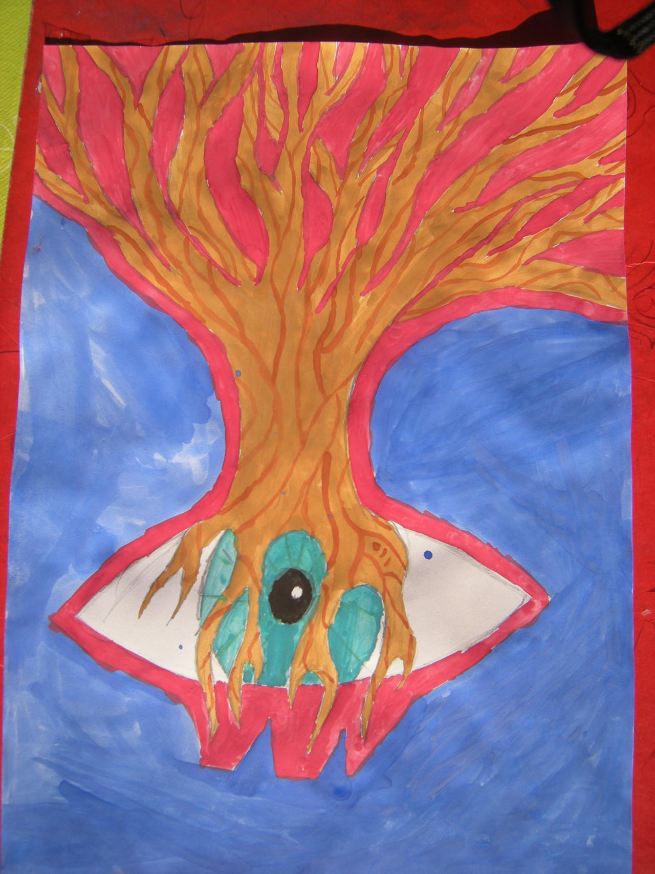
Published: 2009-04-05 15:59:50 +0000 UTC; Views: 329; Favourites: 16; Downloads: 4
Redirect to original
Description
the colourt versionbut I think the sketsh is better
Related content


Comments: 27

nice water colours
i think acrilick would off worked better but hay still kwl
👍: 0 ⏩: 1
yr u could of got more detail with it
👍: 0 ⏩: 1

yes but it was only thing i had
👍: 0 ⏩: 1
yr i could probz tell that from the image but i was just saying dude
👍: 0 ⏩: 0


It reminds me of something out of Digimon season 3... weird...
👍: 0 ⏩: 1
never watched the show
but thanx for comment
👍: 0 ⏩: 1
It's not as good as the first two seasons ^^
👍: 0 ⏩: 1

Looks better colored x3
Captures the style of the eye better this way (:
👍: 0 ⏩: 1
do you think so
thanx
but I think the non-colourd was much better
It had something mysterieus
👍: 0 ⏩: 0

yep ^_^
i never seen anything like it. ^_^
👍: 0 ⏩: 1


 (Smile)")

I like em both
allebei goed
de kleuren zijn wel vet, en de boom is echt gaaf!
👍: 0 ⏩: 1
dank maar had niet het juiste gerief
👍: 0 ⏩: 0