HOME | DD
 cbrfreak — Portland at Night II
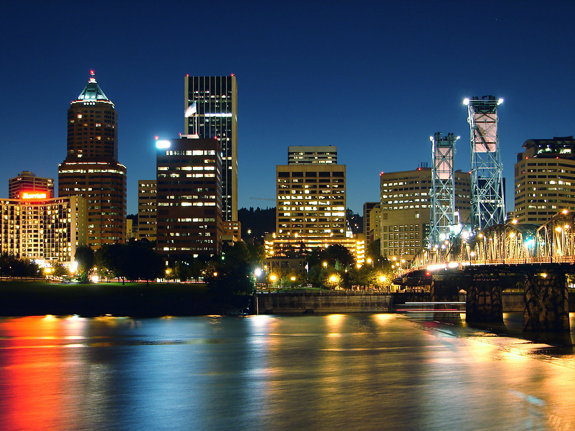
Published: 2005-08-31 04:11:29 +0000 UTC; Views: 1751; Favourites: 15; Downloads: 343
Redirect to original
Description
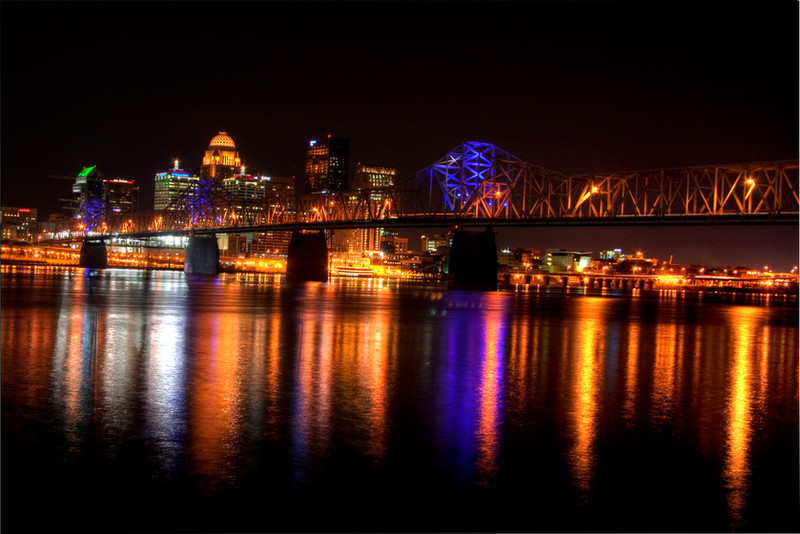
This version is cropped and color corrected to remove the orange hue cast by the sodium lighting. I don't know which way I like it better...Related content


Comments: 21

 (Wink)")

Thank you!
And thanks for the fav!

👍: 0 ⏩: 0

 (Smile)")

This is one of the best skyline shots I've seen in a while. I'm not quite sure what it is, but I really like the reflections on the water.
👍: 0 ⏩: 1

Saw that you visited my page, and saw this... so awesome! 
👍: 0 ⏩: 1
Thank you! I'm glad you enjoyed it.
👍: 0 ⏩: 1
Yeah, I need to get a tripod so that I can do something like that. What was your exposure set on?
👍: 0 ⏩: 1
It was ISO 64, F/2.8, for 8 seconds.
👍: 0 ⏩: 0

It's the same photo in a way but I think I like this version a little better. Less glare of the lights makes my eyes happy...
👍: 0 ⏩: 1

Awesome! I love the reflections in the water, and I especially love how vivid the photo is (I've been having trouble with that)
Also, that bridge would make a good subject for some photos.
👍: 0 ⏩: 1
Thanks for the comments! I think I'll probably do a shoot of all our bridges in the near future. We have like seven of them crossing the river here. All of them are interesting in their own way.
👍: 0 ⏩: 0

")

Pretty shot. Reminds me of one I downloaded years ago from a bulletin board before the internet made it this far. Not sure if it's the light tweaking or just the shot, but the water looks very solid. 
👍: 0 ⏩: 1
Did you see the original version of this without the tweaking in my gallery? Which do you prefer?
👍: 0 ⏩: 1
No, I didn't but I went and looked. It's a real toss up. The water looks softer and the whole picture feels more "real" in the original. But I don't like the orange glow much either (orange and yellow are not my favorite colors 
👍: 0 ⏩: 2
I did a blue shift and the results were much better. I updated picture to the new version. Thanks for your help! I still don't know which I like better though.
")
👍: 0 ⏩: 1
It looks more natural this way. ^-^ I think I prefer the blue shift.
👍: 0 ⏩: 0
Thanks for looking! I used manual color correction in PSP 9 to filter the orange out. I'll try shifting the whole spectrum and see what happens. I just don't want to loose the natural colors. I looked at your gallery and your artwork is right up the same alley as my wifes! LOL
Her gallery is at [link] if you are interested.
Thanks again for your input!
👍: 0 ⏩: 0