HOME | DD
 cc-Designs — Colors
by-nc-nd
cc-Designs — Colors
by-nc-nd

Published: 2008-06-16 12:43:18 +0000 UTC; Views: 3516; Favourites: 23; Downloads: 143
Redirect to original
Description
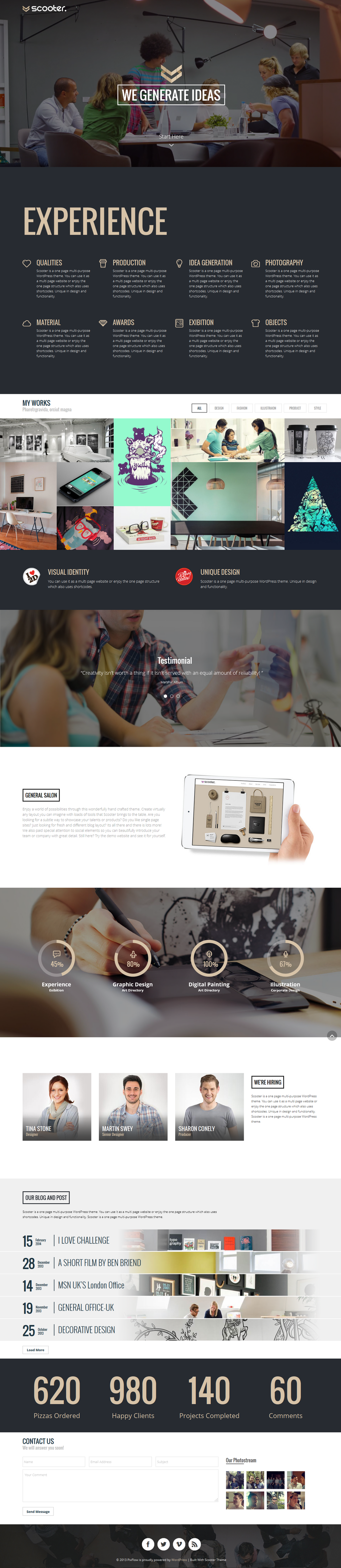
It feels so good being back!
After my Abitur examinations, all I wanted to do is come back with a bang. Actually, I've been working on this project since April and finally I finished it. It was my aim to create a combination of 'hypermodern' elements and basic, old school materials. Let's see if you people like it or not. Comments and fav's are always appreciated.
 (Smile)")
Please refrain from cutting edges into your monitor, lol.
")
P.S.: The bottom part doesn't really belong to the design, moreover it's a feature which presents several parts of the design.
Project name: Colors - Digital Community
Status: For Sale (.psd file)
Colors: All (mainly pink & dark grey)
Related content


Comments: 7

THIS IS AMAZING! I wish I have a journal css like it!
👍: 0 ⏩: 0


Wieder einmal eine Arbeit, wo man sofort deinen Stil erkennt. Klasse Farben die du gewählt hast.
Die Aufteilung ist sehr übersichtlich, wie nicht anders von dir gewohnt.
Super Job mal wieder! Klasse
👍: 0 ⏩: 0

Das abgehackte colors oben im head gefällt mir net rest ist richtig stark...super layout und schöne details!!
👍: 0 ⏩: 0

I think "horrible" is the wrong word to use, but I agree with *Igorka that the logo doesn't match the style of the rest of the design.
👍: 0 ⏩: 0

Hey Digga. Also auch wenn nicht dein Name drunter oder drüber stehen würde,
würde man 100m gegen den Wind erkennen, dass das genau dein Style ist.
Wie immer ist auch dieses Werk bzw. das Webtemplate hochwertig & man kann
nichts kritisieren, außer vielleicht persönliche Eingebungen zu benennen.
In meinem Fall würde ich die Farbtö
& runder gestalten & einen Pinsel von den beiden entfernen
+ Beim Journal eventuell Seiten des Buches andeuten bzw. den Farbverlauf
bei diesen nicht vertikal sondern horizontal ziehen.
Richtig gut gefällt mir diese gesamte Ringbuch-Optik im Zusammenspiel mit
den frischen pink- & lila-Tönen. Sehr sehr schick, mein freundlicher Freund!
👍: 0 ⏩: 0

Good work mate, I like your style. There are few details which I dislike in this design.
First of all, logo is horrible. It doesn't match site's style.
Second, it's fonts and different style of same elements. For example you use same font for different object (in this case, it is menu and titles 01 Welcome to colors 02 Featured Contests) or different font for same objects, and etc.
Third, there is no shades on paper-clips.
And in the end, I hate two paint pots. In my mind, only one pot would be nice.
Cheers. Good luck and I will wait for new version.
👍: 0 ⏩: 0