HOME | DD
 ccSuga — Uraraka

#coloredpencil #fanart #fanarttraditionalart #bokunoheroacademia #myheroacademia #urarakaochako #ochakouraraka #uraraka_ochako #uravity #bnhafancharacter #urarakabokunoheroacademia
Published: 2018-07-08 07:03:17 +0000 UTC; Views: 938; Favourites: 74; Downloads: 0
Redirect to original
Description
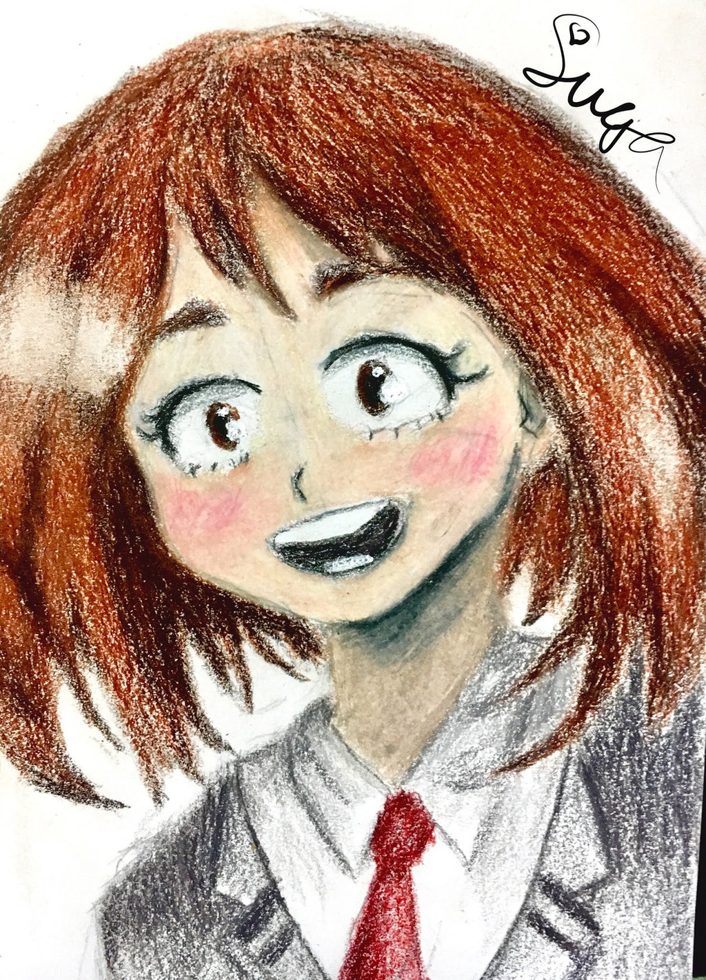
I'm back from my trip! I am still OBSESSED with #myheroacademia or #bokunoheroacademia This is #urarakaochako or #uravity


 Her personality, determination and motivations are so inspiring to the viewers. This took about 2hrs, pretty impressed with the results.
 I am still very thankful to my watchers, and here are the two featured this time- drum roll for Inarts92 AVGN-NostalgiaCritic If you are my watcher, you will definitely get mentioned. It's thanks to you that I am able to improve!!


I hope you enjoyed this fanart. Please remember to fav, comment, critique or watch me. It is very appreciated! Thank You so much!
Related content
Comments: 18

Hi, I'm form project comments!
To start off, the shape of the body, hair and face are really good! The one thing with the face that looks a bit unnatural are the eyes, I know this is anime and eyes usually aren't really realistic, but Ochako usually has quite round eyes, whilst the eyes in your piece are more oval, almost like a square.
I also noticed a few problems with her position compared to her clothing, if Ochako is at a 15 degree angle as shown in the photos, then her clothes should be showing that, her tie should be bagging up or it should be showing some kind of gravity, however, in the drawing it is completely straight.
I really liked the colouring and blending that you used the your piece, the colour in the uniform and hair is fantastic, however, the colour in the face is very olive, almost sickly, maybe try to make her face a bit rosier and peachy.
Over all this is quite a nice piece of art, keep it up!
👍: 0 ⏩: 1

Hi, thank you for taking your time to comment on this! 
Yes, the eyes are a bit different than the ones in the anime, mine do look more square and it should be more round. Thank you for pointing that out. Thank you for stating the problem with the tie. Now that I look at it, it doesn't look right, it is too stiff and not natural in the pose. Her face color looks different from the anime. I will make her face rosier like you said to give her more life and character.
Thank you again!
👍: 0 ⏩: 0

Heyy! I'm from :devprojectcomment!:
I love the softness of this whole piece! Throughout it all, you can mostly see the white of the paper through the
pencil colouring. However, this doesn't detract from it at all! In fact, it even adds to it! The lines also tend to blend
into each other, and while that may be seen as confusing in some pieces, it works perfectly here! The shading,
too, is soft and looks pretty painterly! I really like your blending and use of different brown tones. Although, I do
have one nitpick about the shading. Under the neck area and inside of the ear, it doesn't look very... right? The
rest of the image seems to stick with warmer tones, so the grey shading you used there looks kinda of out place.
Grey tends to take life out of colourful pieces. I'd suggest using brown if the whole image is "Warm", and perhaps
purple or dark magenta if the image is "Cold". The pencil lines that you used to sketch her face also tend to show
through pretty prominently on her face (the little crisscrossed guidlines), so I'd recommend that in the future you
try your best to erase them before you start on the colouring! Everything tends to look more professional that
way. There's also something I'd like to criticism with the lighting on her hair. I absolutely love the way you
blended it, but the right side of her hair seems to be missing a highlight. Judging from the reflection in her eyes,
the light source seems to be coming from the right (and judging from the upper left highlight, a little bit above), so
I think everything would look more coherent if you basically moved the highlight on the bottom right of her hair
right up, until it's adjacent with the higher-up highlight on the left. (Maybe curve the highlight a little too, in
keeping with the natural curve of her head.) Even with all that work done, you could still keep the highlight on the
bottom if you wanted! It might make everything look glossier that way!
All this being said, this piece still looks incredibly adorable and pleasing to the eye. You really brought out her
eyelashes and the voluminous layers of her hair!
I really, really like this piece. I think- how do I say this? It really captures the essence of youth in a nostalgic and
light, whimsical way. Also, yay Uraraka!!
👍: 0 ⏩: 1

Hi! Thanks for commenting on this!
I think the paper effect is pretty cool too, it is a bit different that what I usually try to strive for so it was a fun and successful experiment! 
Thanks again for the tips!
👍: 0 ⏩: 1

You're welcome! I'm glad you're finding my advice useful. Good luck on further pieces, then!! :>
👍: 0 ⏩: 0

Hi, I'm from ProjectComment . I really like the energy and expression of the drawing. What a fun piece. You've got the basic elements down on this drawing and seem to have an intuitive sense of where most of the color and shading should be, so at least you are on the right track. There is actually nothing wrong with having some outlines on a piece like this as long as they are stylishly done.
As others have observed, you seem to be having a spot of bother with the application of color. Let me give you a few tips that will help. You mentioned that you are using colored pencils, so I'm going to assume that you mean pencil crayons, not watercolor pencils or colored charcoal pencils. Pencil crayons contain wax so the pigment can be moved to some extent by rubbing. The best way to color with pencil crayons is to start with a really light touch. Put just a tiny amount of pigment on the paper and spread it out with your finger. When you have an even application of color, add a little more color and rub again. Slowly build up the color to have the hue and saturation of pigment that you need. The pigment is also semi-transparent so don't be afraid to let the luminosity of the paper show through; it will only add depth to your drawing. When you have achieved the look of color that you want, then add some lines of color on top to give your piece the detail and definition that you desire. Pencil crayons are incredibly versatile when you get the hang of it, and a really nice set of high-end pencil crayons (e.g. Faber Castell) are marvelously versatile in someone who has developed the skill. Keep practicing and you'll get there.
👍: 0 ⏩: 1

Hi, thank you for taking your time to comment on this! 
I was going for a fun and airy feel, and it seems to be successful as you were able to pick up on it! Outlines are something I am debating on because I do like its ability to confine something, but I do not like how it makes it look less 3D.
Thank you for the tips with the colored pencils. I tried it out on something I am working on, and it works and looks amazing. It leaves almost no white spots and it looks a lot more realsistc and relaxing to the eye.
Thank you again for your time and your helpful coloring tips! Have a nice day!
👍: 0 ⏩: 0

Same! I love My Hero Academia. I started watching it about maybe two and a half months ago.
👍: 0 ⏩: 1

Yess!! My Hero Academia is AMAZING! I'm addicted. I started watching it about a half year ago I think when KittyKatari recommended it to me! I am in love with all the characters, who's your favorite (I know its hard).
👍: 0 ⏩: 1

Probably Deku just cause he's such a pure, cute boy!
👍: 0 ⏩: 1

Oh yes, Deku is an adorable cinnamon roll!
👍: 0 ⏩: 0

Ohh, I see you tried something new! By removing the lines you go a bit closer to realistic. It's something in between those two right?
It's like you remove the lines, you make it smoother but still you use cartoony proportions I find it pretty interesting, but also harder to do at the same time.
I've seen something similar like this one:
I think you did really great on it! With the shadow and light effects on the hair, really amazingly done! Also the texture looks really nice, did you use some kind of color that's similar to a candle when you touch it? I used to have those kind of colors, but I don't remember how are they called.
👍: 0 ⏩: 1

Yeas, that was what I was going for, but I am still struggling with it. It looks good, but is harder to do in my opinion as well. Thank you, I really think the light was pretty good, but the shading still needs work. I'm still trying to have that smooth transition of shading like in life.
For the colors like a candle, was it oil pastel? They are cool and fun, but I just used colored pencils!
Thank you for your help!
👍: 0 ⏩: 1

Anytime!
Keep it up!
👍: 0 ⏩: 0


