HOME | DD
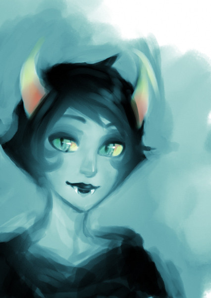
 celestier — improvement

Published: 2013-01-07 16:08:26 +0000 UTC; Views: 8498; Favourites: 318; Downloads: 16
Redirect to original
Description
; w ;Related content


Comments: 29

Both are beautiful! Great improvement on coloring in the 2nd one, but I think the face on 1st picute is prettier
👍: 0 ⏩: 0


the 2012 version has a better anatomy then the new one but you improved on the rendering.
👍: 0 ⏩: 0

")

FEFERIIIIIIIIIIIIIIIIIIIII!!! (Great improvement!!)
👍: 0 ⏩: 0

")


Woooooow! I LOVE your newer style compared to the old one. Everything is just softer and smoother. I especially love her eyes and nose. And the cute little point chin is just ADORABLE. FANTASTIC work. I love all of your art.
 (Smile)")
👍: 0 ⏩: 0


You've really improved in just two months, I like the new style <3
👍: 0 ⏩: 0

The colors are softer, which is good for the atmosphere.
Just one question, though- Why is her chin so pointy in this new one?
👍: 0 ⏩: 1

Thank you! c:
I have caught the animes.
👍: 0 ⏩: 0

ThAtS aWoSoMe!!!!!!!!!!!!!!!!!!!!!!!!!!!!!!!!!!!!!
👍: 0 ⏩: 0

wow...thats SOME IMPROVEMENT why do you have to be so awsome ;n;
👍: 0 ⏩: 0


First one is already good, but man, the new one is AWESOME! amazing job!
👍: 0 ⏩: 0


These are both so gorgeous! I'm amazed by how much you improved in three months.
👍: 0 ⏩: 0


I actually don't have anything bad to say about this, your improvement is huge!
👍: 0 ⏩: 0

It actually looks like you put more detail into the shading on the earlier pic. OTOH, the shadow from the tiara makes more sense in the new pic.
👍: 0 ⏩: 0

In all honesty, I really like the style you had back then. The drawing looks really cute and very nice too. Truth to be told, you definitely improved: The new drawing looks far better in technique and detail. Outlines are far smoother and there's more life in it.
What I like the most about the improvement? Probably the hair, and the way you've drawn the tiara. I prefer the face of the old version, eventhough the new one is technically way better.
Both great works
👍: 0 ⏩: 2

Wow! I totally agree with you!
👍: 0 ⏩: 0

Boy, that style escalated quickly. the only thing i can "find wrong" is the new chin. it's more of a peeve than anything, but im not a fan of pointy chins
👍: 0 ⏩: 1
Haha! I'll try to change that! Thank you! c:
👍: 0 ⏩: 0

Wow! Great job! ^^ 
👍: 0 ⏩: 1