HOME | DD
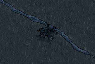
 celinh0 — Nazgul
Published: 2005-08-02 09:49:40 +0000 UTC; Views: 482; Favourites: 5; Downloads: 71
Redirect to original
Description
"Yo. Im looking for, like, the One Ring."-Witchking
Related content


Comments: 11

"Give me the ring, bitch, or I'll pwn your ass"
Love it mate.
👍: 0 ⏩: 0

Very good Job man, you are one of the more prolific artist I now...is incredible the frequency you send your scenes to DA. :strong
")
👍: 0 ⏩: 0

I popped by and saw this yesterday, and I'm back to comment properly.
The detail on the horse and the rider is quite good. Shade blending is done well, especially over the head and the hindquarters. You've managed to capture some of the ragged look on the Black Rider himself, especially around the edges of the cloak which looks good. Small details like the reins and blinkers around the eyes fit well, but maybe the blinkers should have a more metallic look to them or something, since parts of it is made out of hammered steel.
I think what ~zi- is getting at is the back hoofs look really out of proportion. They look a bit like shoes instead of actual hoofs. After reading your comment reply on the black background, I understand why you've put it there. Would be good to see further on, having this against a stone floor like background, or a muddy path. It'll look cool, plus give it that contrast enough so we can focus better on the details.
Top work though. Sounds like this bigger piece should be pretty interesting.
-Tom
👍: 0 ⏩: 1

oh, ok, i got it... actually i didnt know what hoofs were :-P... now that i know i can properly reply! well, when drawing the horses for my LOTR project, i decided to draw 2 kinds of horse: one that is stronger and heavier, with fur on their hoofs and a more wide face, and an arab sort of horse, thiner, clean legs and slim face. i checked in the movie and i found ou i did the wrong hoof for the nazgul horse... i plan to correct that soon. i am also gonna improve the highlighting, im still a newbie in some pixelling techniques, so my effects sometimes come out really...um.. miserable.
i appreciate very much all ccs, im improving a lot from them
ty ty
 (Smile)")
👍: 0 ⏩: 1
The bigger of the horses would be those big stockhorses they used to pull wagons and such way back in the day right? Clydsdale I think they're called.
I wouldn't call your effects miserable. Despite the whole piece looking dark, you've got some relatively smooth shading techniques, and the linework is pretty good. Mistakes, learning from them and practice does make practice though, and seeing you feel you have a fair bit to go I can't wait til you really hit your strides, cause there is bound to be some sexy pixelling.
👍: 0 ⏩: 1

nice work ...
only one think: horse have very large hoofs ... hm and shadows under horse - in right part isn't good, need more light pixels there
👍: 0 ⏩: 1
hehe shadowing always make me mad....i never get it right :-P
and what would be the hoofs..? i didnt get it..
👍: 0 ⏩: 0

It looks good from what I can see, but I suggest you use a brighter background because it's a bit hard to see the Nazgul.
👍: 0 ⏩: 1
hm... well, i guess its because the square is too small. actually, the background has to be pretty dark because the nazgul itself is REALLY dark... that way the details appear better. what i plan to do is to draw the moon glow reflecting on the nazgul, so that his shape will be more easily identifiable and less 'black thing over a very dark gray bkground".
👍: 0 ⏩: 1