HOME | DD
 cellular — Zebra Outline
Published: 2005-11-28 03:11:01 +0000 UTC; Views: 10610; Favourites: 39; Downloads: 1481
Redirect to original
Description
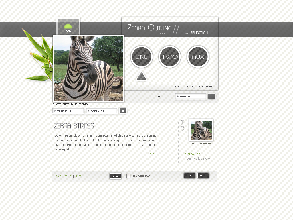
A remake of the previous submission. I needed a site with three main sections. Navigation options are expanded as one of the main sections is selected.I'm not sure if the design seems somewhat disordered, I'm open for suggestions. Something about the footer bothers me, I'm kind of stuck on it and don't know how to change it.
Related content


Comments: 54

you can get it over at Dafont.com. It's called "asenine", see link below
Asenine
👍: 0 ⏩: 0


this is absolutley breathtaking, i love it, brilliant = D
The Love MonkeyTM
👍: 0 ⏩: 1

I love the clean, sharp lines. Very nice. Keep it up!
👍: 0 ⏩: 1


[
👍: 0 ⏩: 1
")


Thanks a lot, glad you like it.
👍: 0 ⏩: 0

It looks cool, but yes -- there's a certain un-uniform feeling you get from it, maybe just around the big zebra image in the header. Or maybe make the black outline fade when it's under the "Zebra Outline" box, like it fades when under "Home".
The footer looks "cut off", somehow. Just floating on the screen. I guess either the bottom edge (or all three edges) needs to be nicely rounded, or make the footer stick to the bottom of the screen, no bottom margin.
Just some suggestions.
👍: 0 ⏩: 1
Thanks a lot for your suggestions, I'll give your ideas a try.
👍: 0 ⏩: 0


I love that green home button, maybe more buttons could be like that, anyway, very nice.
👍: 0 ⏩: 1
Thanks, that's a good idea, I'll give it a try.
👍: 0 ⏩: 0

wow this is really nice. I love how sleek your interfaces are. I have learned a thing or twofrom you
 (Wink)")
👍: 0 ⏩: 1


The only thing what I would say is, being a creative person you have applied your creative sence to come out with some unique design and off course it is different. I love the template, Unique, simple, looks user friendly, good clarity......
In certain points I disagry with `diamondie and certain points I do agree...... But being a design my profession I say this is a good job.
👍: 0 ⏩: 1
Thank you very much, I'm always glad to get some feedback from a professional designer.
👍: 0 ⏩: 0


Nice and stylish..
I have a little suggestion if u don't mind, if the site name is related with "zebra" then maybe you may use a vectorized version of the zebra, or a logo zebra instead of the photo of the zebra (:
I think the photo, and the placement of it gives us that disordered feeling...
Above of those ur work is just brilliant, keep up good works (;
👍: 0 ⏩: 1
Thanks a lot, glad you like it. I never thought about using a vectorized version of the zebra, but that's a really good idea.
Now if only I knew how to make vectors.
I will certainly keep your idea in mind though, a vectorized zebra would indeed be wonderful.
👍: 0 ⏩: 0

Thanks, I'm not sure though which font you are asking about. Here's a short overview
"Zebra Outline" is Brie Light
"..selection" is Trebuchet
"Zebra Stripes" is Asenine
Let me know if you need one of them.
👍: 0 ⏩: 0

I think it does look a bit disordered, there are too many different elements. They say that you shouldn't have more than seven different elements on the screen at once, because people's ultra short time memory can only hold seven things at once. Or something like that. I think it's a good rule of thumb no matter the reasoning.
The left part of the site looks very nice, I like the zebra and the body text part. I'd either like to see more of the lovely green or perhaps make the whole site black and white to go with the zebra theme. The leaves look good, but I'm not sure if they fit in with the rest. Do you need the text "Selection" or the "Online image" one?
I don't really like the Home button and the larger buttons don't appeal to me at all, they just look awkwardly huge, even confusing. I'd ditch the rectangle around them. The smaller buttons are just fine. The placement of the Search field looks strange to me, even though it's easy to locate. In general I think the design is too ambiguous, it's not clear to me which parts are clickable and what do they do. What does the More button do, for example?
👍: 0 ⏩: 1
Thanks for your suggestions. I might get rid of "selection" and "online image", but I do need "one" since that indicates which section is being accessed at the moment. I was also thinking about interchanging the login and search areas, I believe the space might be better used that way. The "more" button is just mockup, it'll probably be used for code validation and will get a different name.
👍: 0 ⏩: 0

Indeed - I really like this template especially the transparency effect over the grey bar is a nice idea! Keep it up!
 (Smile)")
👍: 0 ⏩: 1

At first sight, this template is really nice looking as usual.
You sound not sure about this one, maybe try to focus on your content, by adding some text on the main part, that would give it a more structured look ? Or maybe just add a very light grey on the central part to make it less floating.... but still an amazing template as usual !
👍: 0 ⏩: 1
Thanks a lot
I'm going to add more text. The light gray background is a nice idea as well, I think I'll give it a try.
👍: 0 ⏩: 0


| Next =>