HOME | DD
 CellularSP — Jimmy Neutron

Published: 2012-11-05 05:41:43 +0000 UTC; Views: 2703; Favourites: 37; Downloads: 21
Redirect to original
Description
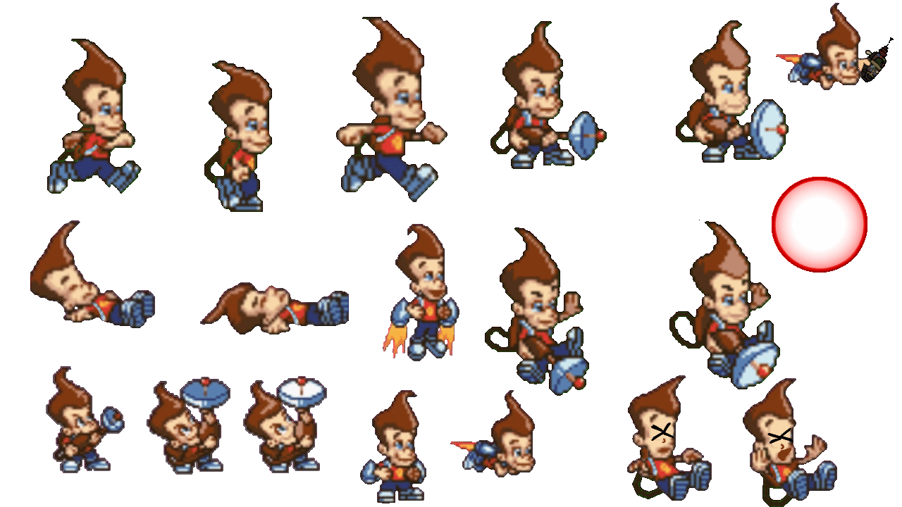
Jimmy Neutron sprite...And the more I think about it, the more I realize how much I watched this show and how much I loved it.
Weird.
Anyway, I don't like how the face came out on this one. Pretty meh. Kind of ruins the whole thing for me kinda.
Also, what do you guys think of this sprite style? Like it? Hate it? Don't care? I'm trying something different than super-defined dark outlines, and I kinda like it but what really matters if if you guys like it.
Related content


Comments: 25


 (Wink)")

Yeah,I Love It!
👍: 0 ⏩: 0


 (Smile)")

Buy me a scanner and I will nub
👍: 0 ⏩: 1

I SHALL. THE POWER OF THRIFT STORES WILL SEE TO THIS.
👍: 0 ⏩: 0
I'LL GIVE YOU A SCANNER I'LL BUY ONE FROM A THRIFT STORE JUST DRAW ON GODDAMN PAPER PLEASE.
👍: 0 ⏩: 0

I would love to play a video game using your Jimmy pixel. He looks totally AWESOME!

👍: 0 ⏩: 1

SUDDENLY JIMMY NEUTRON GOD I MISS THAT SHOW
The only thing that struck me right away is that I think his head is probably twelve sizes too small, but I may be misremembering exactly how large their heads were in relation to their bodies... and frankly I'm just kind of being sarcastic at the show's expense anyhow.
The thing with using coloured outlines is that it's a sort of practice-and-preference thing. Dark outlines are easy to be comfy with, so branching out can be weird at first. I've pretty much found that I still prefer dark outlines even with colour (as opposed to black ones). It's kind of up to you to decide which you like best. I think this style looks pretty okay, though! It doesn't need too much refining, although like you said, the face is a little wanting. Faces tend to be really bothersome to both shade and structure, I find. I've changed facial styles a few times in the past year or two, myself >.>
👍: 0 ⏩: 1
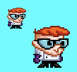
Jimmy Neutron > Dexter's Lab
Anyhow
I mainly tried to sprite like this because of the arms - this started out with having black outlines, but then I really didn't like how the arms were coming out. They were too... well, black because of the outlines. I tried thickening them by 1 pixel, but then they seemed too fat. I then just took them away and it looked weird when compared to the rest of the sprite. So I just took all of the black outlines away. Plus I figured that it kind of made sense... it was a computer animated cartoon anyways.
As for the head, I find that it's the hardest part to sprite when spriting anything with one. It's the main "thing" of the sprite, that'll make or break it. If someone can master spriting heads, they've accomplished a whole lot.
👍: 0 ⏩: 1
Black outlines basically kill thin styles or thin characters. It's like, okay, this character's arm is three pixels wide... that leaves one entire pixel length to fill in with colour? Nope, this isn't gonna work.
I think you're right about heads, though. I know that even if a breast is off or an arm is twisted or the pants are flat, as long as the face doesn't look stupid, I don't mind too much. For all art mediums, I think we're drawn to the faces first, and if that's off, it's hard to notice the rest of everything else.
Also your icon is still the best thing.
👍: 0 ⏩: 1
Yeah, the face is what people are usually drawn to first- I think that's true in art and in real life.
My icon is the best thing? I was thinking about adding some kind of hair or hat.
👍: 0 ⏩: 0


I never really "left" but thanks
👍: 0 ⏩: 0
