HOME | DD
 cepums — twinges of conscience
by-nc-nd
cepums — twinges of conscience
by-nc-nd
Published: 2007-05-18 17:45:19 +0000 UTC; Views: 2093; Favourites: 40; Downloads: 19
Redirect to original
Description
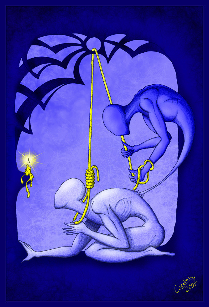
just trying to depict my relations with my conscience (Smile)")
though i don't like that english word.. latvian word is better.. we call it "sirdsapzina" - hearts consciousness...
hmz.. maybe i should drew it a bit dirtyer

Related content


Comments: 77

you can try that french word.. i used to know that language.. i lost it, but i might understand...
as for meaning of this particular drawing.. there is one why i drew it.. but there can be several for people who look at it.. there just is no right answer.. even if i drew it as a way to show how my "me" fights with my other "me".. people can see completely different things there..
btw.. a drawing "crapy thoughts" is kinda the same idea, just from absolutely different angle 
👍: 0 ⏩: 0

Very nice again, Keeps my mind flowing.
It makes me think of addiction.
👍: 0 ⏩: 1
conscience is worse then addiction
once you have it.. you can't and shouldn't get rid of it...
👍: 0 ⏩: 0

Ļoti interesanti kā tu zīmējumā izpaud sirdsapziņu, man pat nav gluži to vārdu, kurus gribu uzrakstīt. Apbrīnojami!
👍: 0 ⏩: 1
hehe.. paldies..
esmu uz vinju bezgaliigi dusmiigs.. un tanii pat laikaa visnotalj gandariits ka man vinja veel ir
👍: 0 ⏩: 0

I really like the geometry in the top half of the frame, and the light flare on the candle was an interesting addition.
👍: 0 ⏩: 0

Freakin amazing work conceptually and technically; easily a 
")
👍: 0 ⏩: 1
i'm pretty happy how it turned out myself.. tho i could draw my conscience a bit dirtyer

👍: 0 ⏩: 1
Hehehe... ya, I think that is true for all of us.
👍: 0 ⏩: 0

Excellent work. I 
Anyway, great work. I think, after three
👍: 0 ⏩: 1
yep.. we have some talented people around here
and i'm glad you like my works so much

👍: 0 ⏩: 0


Wow, I like how this is made. It has a dream-like effect like it's not really there.
👍: 0 ⏩: 1

really like how you portray such ungraspable concepts. And I see how another language can say somehting like that better.. I think multilangualism is very helpfull in doing art.. it also bring you different ideas for a same translation.. if that made sense!
Really interesting and original work!
👍: 0 ⏩: 1
tnx..
as for languages.. yep.. knowing languages make your horisonts wider.. so you can notice more ideas
👍: 0 ⏩: 0

i really enjoy looking at your works. your style is so simple, but it can show a huge amount of different emotions. this one is the best for me. i myself feel like that sometimes.
and it's just beautiful.
👍: 0 ⏩: 1

Wow, i really, really like this. Such an interesting style. the yellow against the blue really brings in a sharp contrast and catches your eyes.
👍: 0 ⏩: 0

Wow - I love this idea! You've portrayed this theme brilliantly.
Beautiful colours too
👍: 0 ⏩: 1

Thats a good one, you could draw one pulling a heart out too...maybe
👍: 0 ⏩: 1
tnx
well... when we do something that our conscience doesn't like we say that it's trying to strangle us... so riping the heart out just isn't the method latvian conscience works
at first i wanted to draw it coming out of guys chest... but i just couldn't find the right pose.. i think it looks better this way
👍: 0 ⏩: 1


Wow, another unique style. I really admire people who develop their own style, creativity at its best.
👍: 0 ⏩: 1
hehe... well.. i think DA is the place that proves that if you take 4 milions of monkeys and alow them to draw - about a couple of hundreds will manage to draw something that looks good
tnx..
i'm glad you liked thos works
👍: 0 ⏩: 0

Incredible, while simple and minimalistic.. the message I take from it is very clear and concise.
Hanging on to the last bit of life you have (the light) while inside you destroy yourself.. outstanding theme that I take from this.. I really feel it.
Great emotion and a great piece of artwork!
👍: 0 ⏩: 1
thanks...
i'm glad you took something out of it.. it's always good to know that my works make people think and feel.. that's what makes them worth to be drawn
👍: 0 ⏩: 1
Of course! Can't wait to see more from you in the future
👍: 0 ⏩: 1
oh there will be more
tnx to DA i have admited to myself that i probably have some spark of talent... and i kinda found it to be a pleasure to use that spark
👍: 0 ⏩: 1

nu kaa vienmeer,tik superiigi viss ir uzziimeets un ideja

👍: 0 ⏩: 1
nu var uz to paskatiities arii taa
bet nu es patiesiibaa meeghinaaju paraadiit ar kaadaam metodeem straadaa tas labaakais kas muusos ir - sirdsapzinja
sanaak taada riktiigi tiraaniska buutniite.. ja tu ar sho pa labam, tad shii neko... bet tikliidz kaa tu dari kaut ko shkjeersaam - taa saak mociit ;D
nu mosh vaidzeeja kraasot vinjus otraati - cilveeku tumshaaku un sirdsapzinju baltu.. mosh arii ja vinja liistu no kruutiim buutu labaak saprotams kas tas par eermu, bet nu es tur ar to pozu mocijos vairaakas stundas un sapratu ka nespeeju pavilkt
bet nu tas nekas.. es iipashi nepaardziivoju ka cilveeki manos darbos saskata ko citu.. es tik priecaajos ka vispaar saskata un aizdomaajas
👍: 0 ⏩: 0


Well, this isn't really a style I should be critiquing, but since you posted it in my thread... I love the concept and the overall composition here, both the layout and the color composition.
One thing that bugs me is that not everything on the two figures seems to be at the same level of realism... the heads, for example, are very neatly fleshed out, and the hands look somewhat flat by comparison.
That's about all I can say, other than that I like this piece.
👍: 0 ⏩: 1
tnx for very useful critique.. i will try to work on that.. just have to ponder how
as for critique on works that are different from what you do.. well.. most of people who art is made for aren't artists at all
tnx once again
👍: 0 ⏩: 1
most of people who art is made for aren't artists at all
That's true, but it's hard to give constructive criticism and suggestions on something that's too far removed from what you do yourself. Anyone can tell you whether or not they like something, but it tends to be artists that work in similar fields that can give you more in-depth feedback.
👍: 0 ⏩: 1


it depicts struggle well, the darker self tying the lighter side, and the lighter side looking to the light... yet both is part of the same self. Kinda reminds me of yin/yang
👍: 0 ⏩: 1
| Next =>