HOME | DD
 chanaka — Ridgecrest sample
Published: 2007-08-15 07:13:51 +0000 UTC; Views: 3386; Favourites: 21; Downloads: 192
Redirect to original
Description
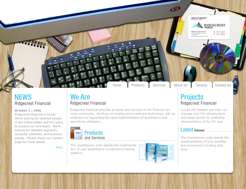
web page sample for the company im workingPhotoshop CS3
Illustrator CS3
Related content


Comments: 30


 (Smile)")

It's cool.. but i think the transition to the background image to the actually webpage is too soon.?
👍: 0 ⏩: 1

not sure, cos there are comments from there side as well, they think this si good for the DTP company than a financial one
👍: 0 ⏩: 0

really really cool stuff! like your illustrations and all.. but one question.. doesnt some of the elements look a bit of out of proportion?.. just a thought..
other than that good stuff mate!
👍: 0 ⏩: 1
hmmm ya, feel like that with the mouse and the spectacles, thanks
👍: 0 ⏩: 0


")

NICE CONCEPT BUT ONLY THING IS NAVIGATION AND CONTENTS... BUT COOOOOOOOL HA
👍: 0 ⏩: 1
thanks machan, i have to give more prominent to the content thats why i have used this technique
👍: 0 ⏩: 1


Great idea, but i think it's better for personal pages, not corporate.
And some shadows and objects are not like real.
👍: 0 ⏩: 1


nice work, but i think that some elements doesnt fit exactly together. the proportion for example of the glasses and the mouse arent exactly correct. i also would reduce the amount of elements u have used. less is more
but i like it really!
👍: 0 ⏩: 1
Yes sir !, i agree with u, thanks much for the precious comment
👍: 0 ⏩: 1

Everything would be very good but the shadow of the monitor is too artificial. Very good idea. [link]
Humor
👍: 0 ⏩: 1
ya true, i was try to find a better quality pic but i couldn't, thanks much
👍: 0 ⏩: 0


Nice work man. but ur content part should be on some paper so that goes wid your theme.. newes really nice work

👍: 0 ⏩: 1
thanks mate, i thought of give more prominent to the content thats why i used this technique, thanks again for the comments and
👍: 0 ⏩: 0