HOME | DD
 charfade — Tuscan Home Page 2

Published: 2008-11-13 19:12:15 +0000 UTC; Views: 2688; Favourites: 27; Downloads: 56
Redirect to original
Description
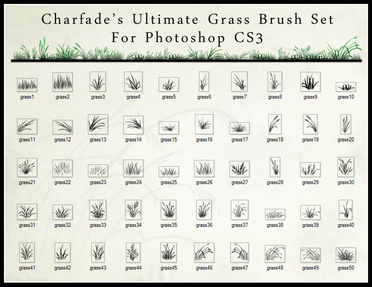
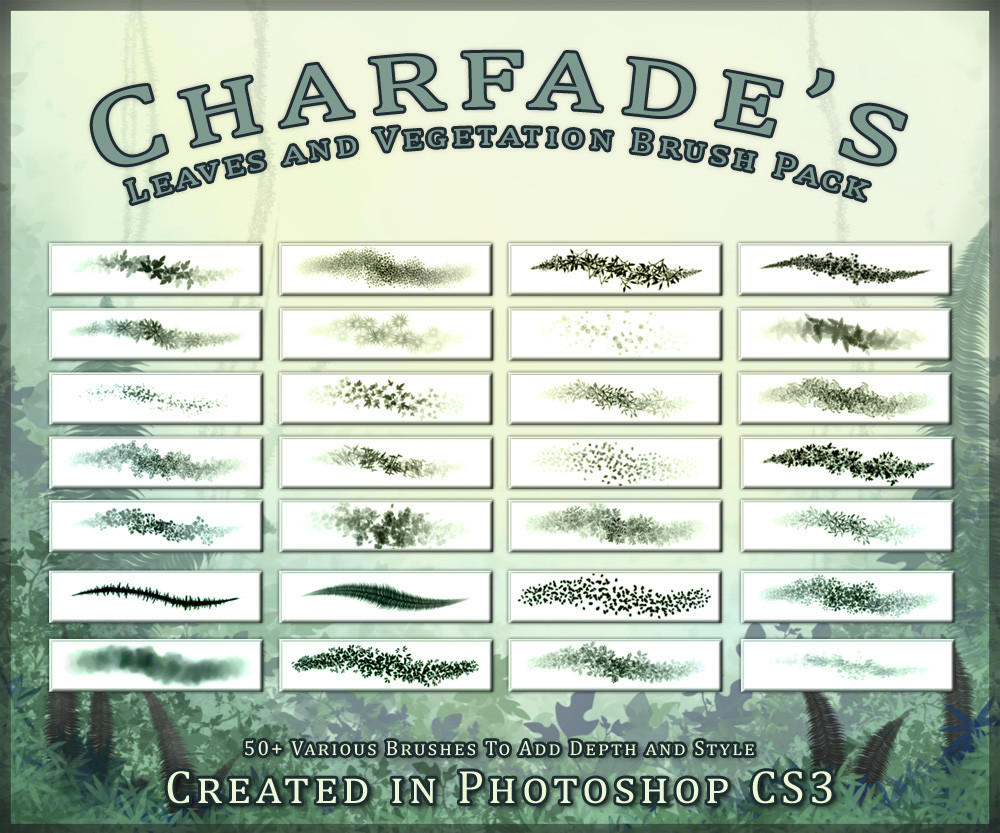
== PLEASE READ FIRST BEFORE COMMENTING ==This is the second page for a book illustration I'm commissioned to do. Please do not use for any use.
I'm posting it here because I want to get some constructive criticism on it. Its a digital painting and the commissioner wants that chalky feel. Done in CS3. I don't know if I have captured that or not. Its my first time really changing up my painting style to fit a particular look. Usually I paint until I'm happy with it.
Please comment with useful critiques. I would greatly like to improve my technique.
Follow what I do, where I'll be! Like Art of Cass Womack on FaceBook ► www.facebook.com/ArtofCassWoma…
Related content


Comments: 14

It has a very chalky feel to it especialy in the orange field
👍: 0 ⏩: 0

Try to use color balance (CTRL B) and variations on it. It needs a tad more green on the grass.
It otherwise is very lovely and stands quite well as a chalk painting
👍: 0 ⏩: 0

This is lovely!
I agree. The houses are slightly angled too low.
I don't know anything about digital painting! But maybe you could add a little more definition to things, especiallly in the foreground. It's so soft as it is, it might be taken as a bit "unfinished"? Did that make sense?
It's great, Cass. I'm really, really impressed.

👍: 0 ⏩: 0

Hmmm, I don't think that I could find anything to critic on. The things about this that I really like are how the clouds sort of curve in like that, how you drew all the foliage (especially the bushes at the very bottom of the piece) and the colors that you used. And it DEFINITELY looks like a painting, a good one at that

👍: 0 ⏩: 0

This is really a beautiful painting  (Smile)")
The only critique I could possibly think of is perhaps make the foreground a bit warmer in color so it appears closer. The middleground just looks (in color) Like it would be closer.
<3 But this is gorgeous.
👍: 0 ⏩: 0

The houses are a little off balance with the ground, and the depth is off when it comes to the farmland and houses. The foreground looks excellent!- but once your going back, it looks a little off...The green hills seem to just appear to the ground, when you also have a nice detail landscape halfway across the field. Did you try to look for references when it came to painting this? - Having reference is good when trying to do a landscape portrait.- I love the details- I really love the details you did to the ground, but it seems to just “Stop” and goes straight into the hills. And I think that’s were the balance is thrown off a bit. - It seemed rushed…the right side, however looks amazing, while the left looks rushed…On a great note- I LOVE the colors!- very well done!!! ..I hope this helps.
👍: 0 ⏩: 0

Really excellent. To my untrained eye at least, you've capture the "chalky feel".
👍: 0 ⏩: 0


I looks more or less done with chalk. but what pulls me more is the way the farm land goes, it makes my eyes follow and look to the small farm house. The way the land curves is also a very good touch, and seems to hide the lands, and give them an, off to the distance look. But what really gets to me, are the flowers in the corner. I dont know if they are done one by one or its a brush tool, but it looks more or less done by hand, and not by computer. Another neat thing is the clouds, and how they all roll to the house as wel, to where its a blue, to blue with clouds, to clouds enveloping the blue and hitting the house. There are even happy bushes(lol) and also a good scenic back touch to the art as well to pull the eye in. I really like it
Kyo-Kun >^,^<
👍: 0 ⏩: 0

i love sky veeery much
but i don't like that houses are in different perspective then the ground.. do you know about dot of connetcion? (not sure that this is how it called on english)
i'll show you
👍: 0 ⏩: 1

yeah I kinda felt the same way. not sure what you mean by dot connection.
👍: 0 ⏩: 1
hmmm, yeah your right. ^_^ thanks for the tip. I'll do some reworking on that
👍: 0 ⏩: 1
i'm very glad that it was helpful ^^
👍: 0 ⏩: 0