HOME | DD
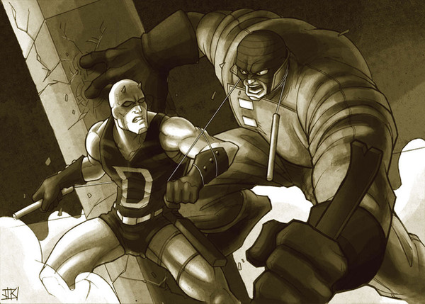
 charkxl — Cap vs. Redskull

Published: 2007-07-23 11:32:42 +0000 UTC; Views: 1274; Favourites: 42; Downloads: 25
Redirect to original
Description
Another digital painting.This one was done in just under a week, I dunno, I confused myself halfway with the lighting and stuff, its come out really rough looking. I would love if someone could help me out with whats wrong with it..
Photoshop CS2.
Related content


Comments: 7


thanks for the comments guys...this thing has racked my brain for far too long. hahaa
Dan, I think your right with his arm. I had issues making that look right, I think a lil' shadow is all it needs to foreshorten it a bit more.
Eric, I thought about casting shadows on 'em from the pillar-things, but yeah... I dunno either.
👍: 0 ⏩: 0

love the lighting but you're right there is something odd but I can't pick it either. It might be the backdrop the broken columns probably needed a bit more lighting since cap + red skull both are somewhat lit from the front as well *shrugs* or maybe casting a shadow on to them where that column is
")
👍: 0 ⏩: 0

This is REALLY good, charkxl! Your Painter skills seem to be getting better and better. Keep up the good work, man
 (Wink)")
👍: 0 ⏩: 0

This is good work man. I think that Cap might look better if he were engaging the Red Skull more. As in, if Cap was looking at him more, turning his head to face him. Cap's right arm looks a like stretched/a little unnatural at the angle it's at, at the moment. Small points though. Should be a good draw off
👍: 0 ⏩: 0