HOME | DD
 Charlene-Art — Caterpillar - Finished
Published: 2010-08-01 15:01:27 +0000 UTC; Views: 1072; Favourites: 14; Downloads: 18
Redirect to original
Description
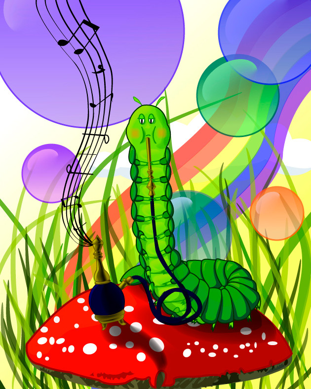
Does this look better with the grass or without it? [link]This is a piece for a book character competition [link] by :S It's the caterpillar from Alice in Wonderland, fused in with the one from A Bug's Life. The Mushroom was traced - from here [link] but the caterpillar and the bong were hand drawn. It was done using Adobe Illustrator, with the gradient mesh tool and the gradient tool.
The tutes used were: [link] for bubbles and [link] for general blending. There is also [link] for the brushes of the grass.
If I could have thoughts about the lighting and shadows, their direction and the colour scheme I've got. That would be much appreciated. I would also like thoughts on the thickness of the stroke - should it be thicker? Also, is the composition of this piece too crowded - does it distract the viewer from the caterpillar? My brother and sister were also concerned that children should see this - should it be rated M? I don't think so - kids wouldn't understand it but others might feel different.
Related content


Comments: 13


I wish someday i find some courage to learn how to use Illustrator, it seems to produce nicer things than Corel, the last time i tried to use it i almost thrown my pc through the window...
")
👍: 0 ⏩: 1

Awe. It does take a lot of patience - and a good teacher.
👍: 0 ⏩: 0

Wow, you did a vector. I tried one once, it was less than stellar. I love the idea of a caterpillar playing music.

👍: 0 ⏩: 1
Thanks ")
Don't worry, my first vector was pretty bad too. But, you must practise before you get better
👍: 0 ⏩: 0

Ha ha thanks! And thanks for looking back at my work, I appreciate it buddy
👍: 0 ⏩: 0

Hi ^^) So there is my critique:
It's a nice picture with vibrant colours and interesting to see. I don't know "A bug's life", but I recognised the smoking caterpillar from "Alice in Wonderland" ^^
However, I didn't notice the caterpillar first, the bubbles and music notes distracted me a bit from it. The second things I noticed were the caterpillar, the grass and the mushroom and then the bong and the rainbow. (I like the music notes most
About the color scheme and the main focus: as I said, you used nice, vibrant and not-plain colours which attract the wiever's attention and look great. But maybe this is the reason why I didn't notice the caterpillar first - the grass is also green and somehow "blocks" the caterpillar's colors a bit (But I think the picture with the grass looks nicer then the one without it, because the other one looks a bit too empty) and the big bubbles also distract more - they're quite bigger than the caterpillar itself. Maybe you should try to draw them a bit smaller (you can therefore add more to fill the spaces left xD) and with less vibrant colours to outstand the caterpillar and the mushroom. Also, I would colour them in a similar colour scheme -say, a range of blues or greens or whatever colour you want- but that's up to you, they look nice this way, too!
Light and shadows: you got them pretty well, especially on the bubbles and the caterpillar. However, there are still some things that bug me: on the mushroom, there are the shadows created by the bong and the caterpillar, but the first one is creating a weird curve... Maybe you should try making it less curver, "smoother", because mushrooms usually don't curve this way ^^ Also, try to make it a bit rounder on the right side  (Wink)")
In conclusion: try to do some more shadows -maybe a bit more colour highlights around the caterpillar and the bong to give them a bit more depth would look great- and use less vibrant colours on the
non-focus objects to make the focus outstand more.
Going on! About the thickness of the stroke, I think that's personal. If you like it this way, then leave it this way, it's up to your style. IMO, the stroke is a bit too thick... I would try to make them thinner in some parts to give these parts a bit of perspective (like when drawing hair, you go from thick to thin, and don't give all hair strands the same thickness). However, if you used a mouse, that's gonna be a bit more difficult... But they look good this way, too
One more thing about the rainbow - if it is intended as a flag, it's fine this way (maybe shade it a bit where it curves), but if it is intended as rainbow, then maybe you should try to blend the colours one into another a bit.
And to finish: I wouldn't rate it M. I think that's only to hide violence and nudity. If people don't get the point in an image it's okay, but let them try to figure it out if it doesn't fit in the categories above xD
I hope this has been useful! Keep up the good work
 (Smile)")
👍: 0 ⏩: 1
Thanks for the constructive criticism. Yeah, I did notice the caterpillar blended into the background too much but I wasn't sure how to change it. I might try out your suggestions later.
Yeah, I did everything with a mouse - can't afford a tablet
Thanks for the opinion on the M rating! I just wasn't sure but I'm glad someone agrees with me on it.
👍: 0 ⏩: 0
