HOME | DD
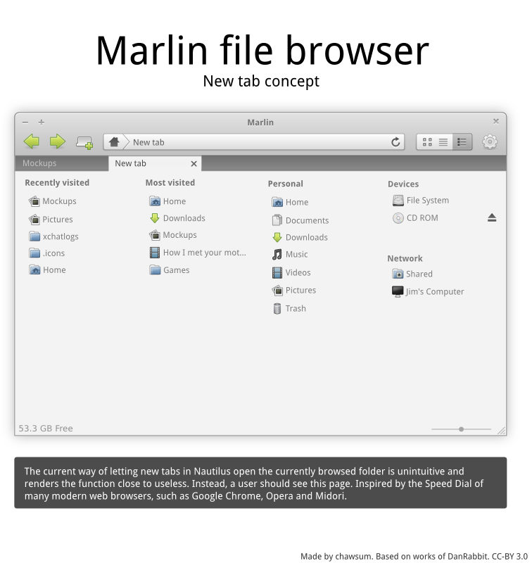
 chawsum — New tab mockup
by
chawsum — New tab mockup
by
Published: 2010-10-02 15:30:33 +0000 UTC; Views: 4148; Favourites: 28; Downloads: 61
Redirect to original
Description
Recently visited/most visited could easily be done with the help of zeitgeist.03-10: updated.
Ask if there's something you're wondering!
 (Smile)")
Related content


Comments: 14

")

This is plain old beautiful - would definitely like to see this happen
👍: 0 ⏩: 0

I'd love to see Marlin have the same/similar tab look-n-feel of Midori or Firefox/Chrome. Current Nautilus tab looks suck!!
👍: 0 ⏩: 0

looks awesome, but i agree with epheien, url bar should go under tabbar like in chromium web browser
👍: 0 ⏩: 0


this is it.
I have a tab button on my toolbar, use them a lot in nautilus, just like in firefox.
always thought the browsing experience should be the same as webrowsing.
and finally here's an excellent design for the tabs, I really hate tabs on bottom because they look awfully non-integrated.
may I use your tab design for a firefox skin?
👍: 0 ⏩: 2
well, here it is, tell me what you think:[link]
👍: 0 ⏩: 0
I also like the close button being apart from the other two. just don't know if it would work, but it kind of makes sense.
👍: 0 ⏩: 0

Isn't this mainly covered by the sidebar already? I agree that we need a better tabbed browsing experience though, as this currently feels a bit left out.
👍: 0 ⏩: 1

The right half is. The recently/most visited are not available anywhere else. I felt like the repetition of the Personal, Devices and Network were good repetition: not everyone (hi!) uses the sidebar, and they are after all some of the places which it is most plausible that the user will want to go
And I agree, the tabbing experience in Gnome overall is pretty awful. You might wanna note that I added a "New tab" button in the toolbar, for discoverability. Tabs is a killer feature for web browsers, and can be for file browsers aswell, if they just get a bit of focus from developers.
👍: 0 ⏩: 1
Why not keep the sidebar, and just have the two other columns in the browsing window? I agree the new tab button could be useful. What we really need is a standard that is simple, beautiful, and easy for even the most computer illiterate can use.
👍: 0 ⏩: 1
The main problem with that approach is, as said, that not everyone is even using the sidebar to begin with. Also, there is no logical reason to put a visual divider between the zeitgeist-related lists and the ones that exist in the sidebar. Having them in the sidebar wouldn't be bad, but I don't think it would be an improvement over the way I mocked it up. Those things could be tweaked afterhand, though. The most important issue right now is actually having a new tab page
 (Wink)")
👍: 0 ⏩: 0

I think it's a nice concept, but I'm not sure if devices & network is prominent enough in the last column.
👍: 0 ⏩: 0