HOME | DD
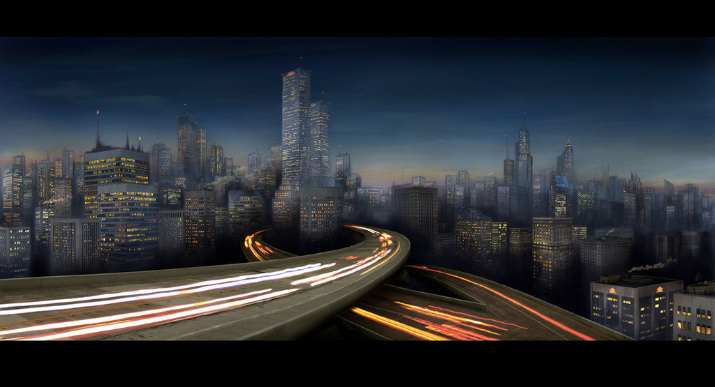
 chew-i — CITY_V44_SUNSET
Published: 2009-06-24 16:56:45 +0000 UTC; Views: 7495; Favourites: 190; Downloads: 1
Redirect to original
Description
My very first matte painting.My goals were to direct the viewers eye with simple forms through the hole image on an oval path. No area of the image should have have been less interesting then all the other.
Done in Photohop CS3 in 4k width. Hell that was a lot of work!
the making of in 44 steps: [link]
----------------------------------------------------------------------------
All the clubs in my journal have the permission to post this work in their galleries.
Related content


Comments: 93

well you worked your ass off to make something that made me happy so thank you
👍: 0 ⏩: 0

Nice picture, but I don't see lanterns - they would fit
👍: 0 ⏩: 0

Das gefällt mir richtig gut. Fast schon wie ein Foto!
👍: 0 ⏩: 1

ich danke dir für schönen worte
👍: 0 ⏩: 0

Goregous matte painting! I remember having to do one for one of my college classes. They're really fun to do, yet so tedious.
👍: 0 ⏩: 1
Thx ,what kind or which college was it ?
I wish we had done matte painting on the college here in germany. We concentrated on the traditional stuff.
👍: 0 ⏩: 1
Art Institute college. The one I'm attending is in Houston, Texas.
👍: 0 ⏩: 0

I really like this work, If you did the dashes on the road a little better it would be even more spectacular.
👍: 0 ⏩: 1
interesting suggestion. How did you imagine the dashes on the road? How they should look to look better ?
👍: 0 ⏩: 1
Well everything is set back nice and easily to see in the background, so seeing something move to quick doesn't really fit in well with the backdrop. If you see the detail with the background, i say it would probably look better with more detail into cars and whatnot, instead of the lines, that's only the suggestion though.
👍: 0 ⏩: 0


")

 (Smile)")

👍: 0 ⏩: 1

Moooment, das ist gemalt??? Wow, großartig! Eindeutig underfaved, meiner Meinung nach
👍: 0 ⏩: 1


Featured Here [link]
make sure to fave the news. thanks
👍: 0 ⏩: 0

Klasse Bild! War sicher ne Menge Arbeit, ist dir aber wirklich gelungen.
Nur der Himmel ist mir ein wenig zu fleckig, für einen fotorealistischeren Eindruck würd ich einen gleichmässigeren Verlauf nehmen.

👍: 0 ⏩: 1
Danke dir. Das mit den Wolken liegt wohl an der auflösung. Im highres sieht man die dünnen sehr hoch in der Athmosspähre stehenden Wolken besser.
👍: 0 ⏩: 1

congratulations,you've been featured!
check out the other news article as well,there are the other pieces from the collection!= D [link] [link]
thank you!
*enemy-89
👍: 0 ⏩: 1

Very very detailed. I think the resolution here doesnt show all the effort put in it. It looks like you pixel every detil bit by bit. Thats a hell load of work. It turned out awesome though.
But for a more efficient technique have a look on devs like [link] Antifan Real and other concept artists. Antifanreal for example uses built in brushes and sharpen filter to achieve a detailed impression witzhout actually painting most of them , they are being created by the edges of brushes and the sharpen filter, well visible on the wall to the right and the bridge.
👍: 0 ⏩: 1
wow thx for that helpfull comment. and yeah you are right i have still a lot to learn about the photoshop brushes
👍: 0 ⏩: 0


I like where you're headed with this--consider yourself faved and watched!
👍: 0 ⏩: 1
thx, i hope i can see some art of you soon
👍: 0 ⏩: 0

The sketchiness of this fits almost perfectly! I just think the overall color of the piece is a bit off.
I like the colors; but the background sky, the buildings, the road, and then vehicle lights could all be balanced together a little bit more.
👍: 0 ⏩: 1
thank you , especially for the critism
What did you mean with the color is a bit off. I cant translate that.
👍: 0 ⏩: 1
The road is a bit too orange/gray, where as the sky and the buildings are a soft blue. Meaning it looks like the roads up front don't really fit the scene.
I know they are the focus and the foreground, but I think you should balance the colors a bit more.
On a sunny day, everything is bright! On a cloudy day, everything is a little more gray. In the evening, everything is a bit darker, but still colorful. At night, everything is darker, and a lot more navy-like blue.
👍: 0 ⏩: 1
thanks for that imformation. i will recheck this on a color corrected monitor.
👍: 0 ⏩: 0


wow thats great! love it!
its visible that this was a lot of work!
wish I could do such stuff
 (Wink)")
👍: 0 ⏩: 0

I can see you spent alot of time on this - props for that!
The main problem in this is the focal point - It's right there in the middle. The image could be cropped to remove almost all of the lower runway and the right side of the image so that the focal point was on the right-hand side. It's a fairly good render but composition can be worked on.
Anyways - good job and keep drawing!
👍: 0 ⏩: 1

Nice painting!
I really like the city, but the roads don't seem to fit with the rest of the picture. They look like they're done in a different style and don't match the style of the rest of the picture.
Other than that, I really like it. Your city looks excellent.
👍: 0 ⏩: 1