HOME | DD
 chimpinx — Death Guard

Published: 2013-11-15 23:19:59 +0000 UTC; Views: 10254; Favourites: 281; Downloads: 141
Redirect to original
Description
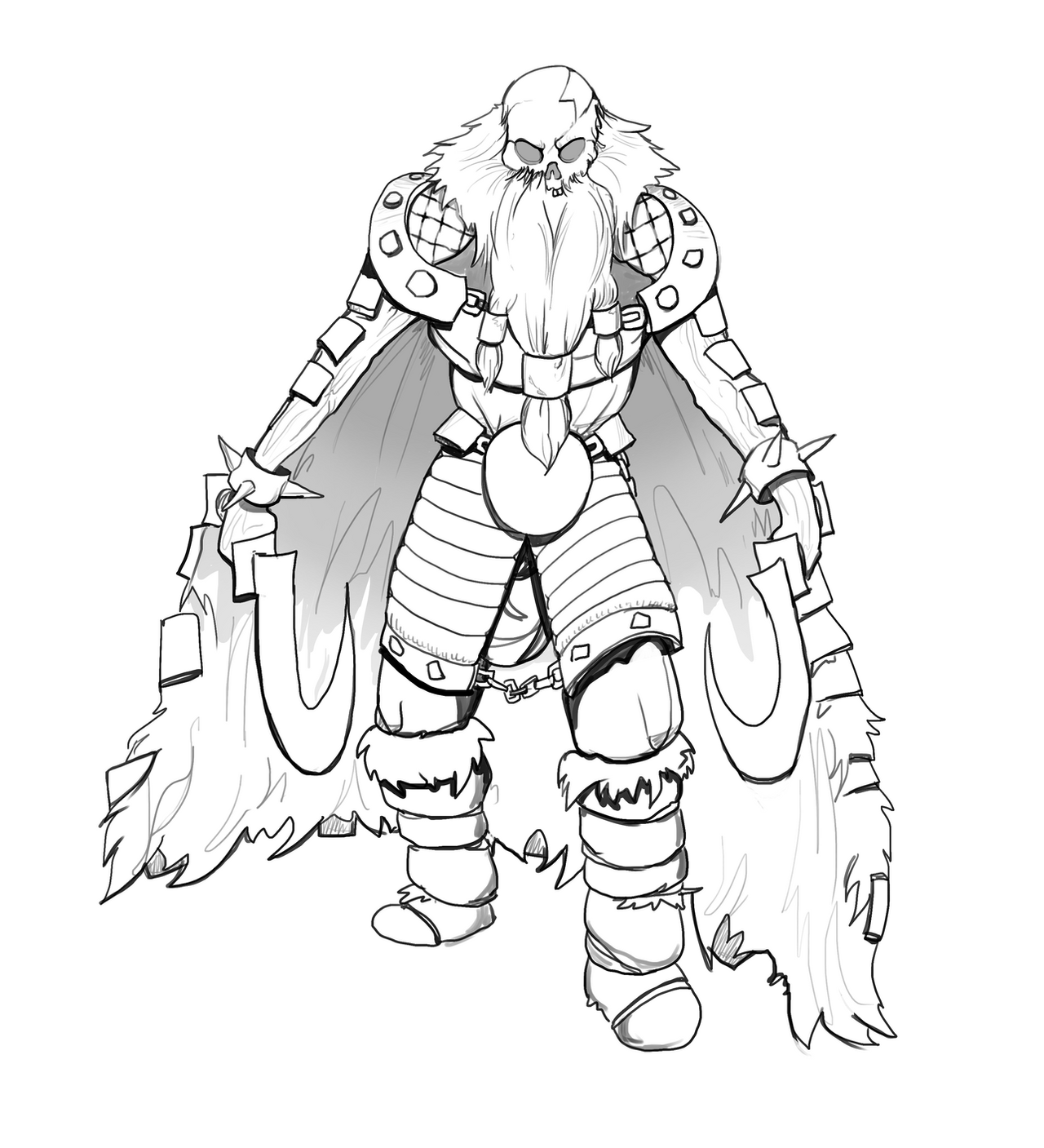
Warhammer 40.000 fanartRelated content


Comments: 23

this is one of my favorite of your artworks. love the lighting
👍: 0 ⏩: 1
 (Wink)")

Gotta love the lighting and the chainsword, sparks-thingy. Excellent.
👍: 0 ⏩: 1

the perspective on the chainsword is absolutely fantastic
👍: 0 ⏩: 1


And Grandfather Nurgle visited a thousand plagues upon them!
👍: 0 ⏩: 0


no plague knife? heh
anyway, a great piece of art and my favourite chaos legion.
👍: 0 ⏩: 1

Nah wanted to paint a chain weapon though a plague knife would have suited better. Thanks for the feedback
👍: 0 ⏩: 1
well, even w/o the knife, the picture is very good  (Smile)")
👍: 0 ⏩: 0

A lot of really gorgeous movement in this piece. I would have liked to see a bit more work on the arm holding the chainsword, as it seems a little wonky construction-wise, and there is something iffy in how the perspective of the powerpack lines up with the plague marine himself. In your atmospheric depth stuff, you could use a bit more light. Light gets eaten less effectively than shadow by atmosphere, especially any specular highlights or reflections. All that being said, this is still a very enjoyable piece. I shall poke through your gallery and see what else you've got sitting around
👍: 0 ⏩: 1
Thanks alot for the feedback, I appreciate it alot. I think i know what you mean about the powerpack. The part thats supposed to me futher away seems actually bigger then the part thats closer. Would you have highlighted the guys in the back or are you talking about the lighting on the front dude.
Stay tuned for more to follow. I´d love to get some critique on my thousond sons sorcerer which gonna be up on friday.
👍: 0 ⏩: 1
I wouldn't so much have highlighted them, as maybe add just a bit of lighter clouding behind their shoulders and heads to make them pop a little bit,
👍: 0 ⏩: 1
Yea i know What you mean. I tried some variations but i realy wanted the focus to be on the front guy. I dont. . . know maybe i gonna give it a rework
")
👍: 0 ⏩: 0

Bravo sir. I always enjoy seeing Death Guard art, especially GOOD Death Guard art.
👍: 0 ⏩: 1
Thanks alot, well appreciated.
👍: 0 ⏩: 0

The chainsword looks really dynamic. It's so awesome, I love it!
👍: 0 ⏩: 0