HOME | DD
 Chiparoo — Chicken Interloper

Published: 2009-12-15 01:36:53 +0000 UTC; Views: 208; Favourites: 1; Downloads: 1
Redirect to original
Description
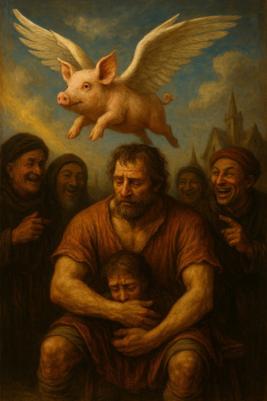
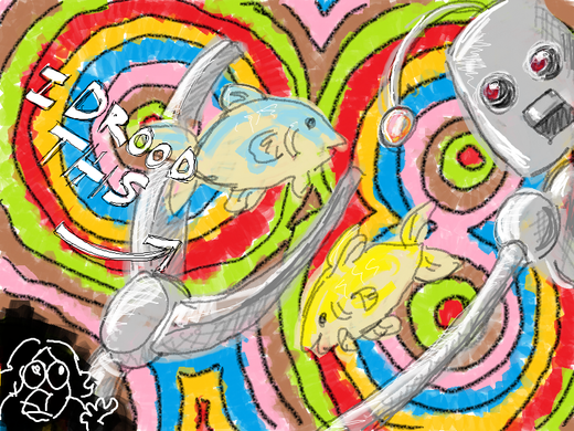
This is for , in response to his Chicken Interloper .I thought it was hilarious.
The completed version will be done late tonight or early tomorrow. Any critique from DIT students who are on tonight would be greatly appreciated!
When I upload the final version, I'll move this one to scraps :3
Related content
Comments: 9

OH MAN the dirty things I could say about this one...
👍: 0 ⏩: 0

If you want Vera's face to be the focal point, then as Jen said, fiddle with values. Knock back the light in the corridor (both value and saturation-wise) and add your brightest brights and the most contrast to Vera.
And when you play with Values, remember the different fields that Becker taught us(Neutral, Dynamic, et) and how it effects mood. The values as they are don't exactly say drama to me as they are.
Other than that... I'm really digging your environment. Nice details and rendering. :3
👍: 0 ⏩: 1

Yeah, my real focus here is being able to render different materials and actually make them LOOK like different materials. (the rusty equipment vs. plastic boxes vs. matte fabric vs. shiny gun)
Hince the non-dynamic field. I still need to push values to make a a BIT more dramatic then it currently is, though. That's going to be most of my work tonight. ^^
👍: 0 ⏩: 1

Ahhh, that makes sense. Well, God Speed! *salute*
👍: 0 ⏩: 0

Push the values: right now it's mostly mid-tones and my eye just kind of wanders around everywhere. (To see your tones, throw a black & white adjustment layer on top of everything.)
I imagine your point of interest is the alien's shadow (I can't be certain since your alien is not there), and you'll definitely want high contrast there. Just slap a level adjustment layer and mask out what you don't want. Pushing the values will also give the objects around the corridor a more metallic texture (which I think that's what you're aiming for). Plus it just gives everything a nice punch.
Bateman's right leg (the one closest to Vera) is a bit long. I understand that he is slumped but I do think that leg needs to be scooted back a bit.
One last thing, check the perspective on the pipes on the wall. Based on the perspective you've established with the floor, those pipes should be angled more.
But looking good so far, Chip. And I approve of the chicken interloper.
👍: 0 ⏩: 1

thanks for your ideas, Jen! Superthanks on pointing out the pipes- I had not noted those yet.
Actually, the current plan is to make the chicken layer gone altogether, and the focal point Vera's face. And yeah- the places that definitely need the most work on are tweaking values and fixing their anatomy
👍: 0 ⏩: 1

Ah, I see. If the alien is not in the image at all, then Vera's face definitely pulls the most attention, so you're succeeding there. You'll still want bump the contrast there (face lighter against dark hair, cheat the lighting if you must) and you might even want to hide Bateman's face with shadow since he may take too much attention away. He should be a secondary point of interest.
I can't wait to see everyone's finals for this.
👍: 0 ⏩: 1

Good idea with putting Gus' face more in shadows. I'll try it out!
I'm looking forward to seeing everyone's finals, too
👍: 0 ⏩: 0


