HOME | DD
 chopaface — Photography Spread Sheet
by-nc-nd
chopaface — Photography Spread Sheet
by-nc-nd
Published: 2006-11-28 03:48:30 +0000 UTC; Views: 834; Favourites: 16; Downloads: 30
Redirect to original
Description
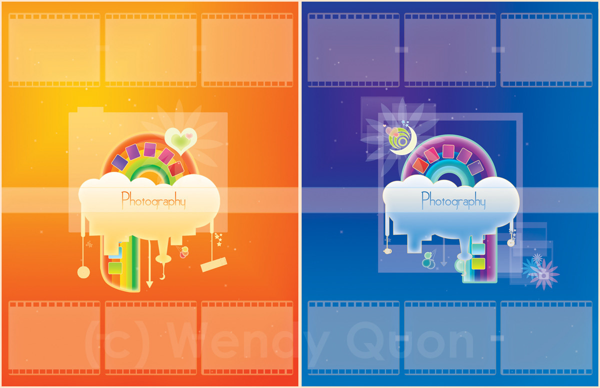
Edit: I wanted to submit the final version, so here it is!This is for yearbook class.
This is my photography spread sheet...! cute isn't it?
I took this idea from some guy who's name i don't remember.. the rainbow and the sun are the only ideas i took. lol
someone in my class complained that the boxes are too small for the photo submissions......... =\ ... well... if i made them any bigger.. than it would be 4 boxes on each sheet.. and.. well.. i dunno... >__>;!
Related content


Comments: 8

Hmm... Advanced critique for vector art? I'm not very good at giving advice because I've never done it before, but let's see if I remember what my yearbook editor told me...
If this is being in colour, I think you chose good colours that worked well together. Hopefully, they're also in theme with the rest of the yearbook, otherwise they'd clash. Your work is nicely simple yet detailed enough to be interesting. Any more, and it'd clutter the page. I think you could do without the faded box highlighting 'Photography' though, it seems a bit unnecessary because the title can be read just fine.
It'd be nice to see what photos were going into the boxes to compliment your work. They should be the standard 'Z' pattern I think where no faces were pointing outwards to draw your reader outside of the page yet all the faces need to facing somewhere to give a sense of direction. (Gosh, I hope that made sense)
I hope this helped even a little bit. I really love this piece though, I totally enjoy the gradient of colours. I LOVE colorful things!

👍: 0 ⏩: 1

oh those highlights are templates for the actual pictures.. lol
but in a newer version of this spread... um, they turned into film strips because my teacher wanted more of photography than rather just the yearbook theme...so i was like.. OKAY. fine.
it's now much more smaller (as in the rainbow figure like..) and .. um.. yeahhh :I
thanks for the comment.
i had to put the highlighting... because people at my school are so stupid that they can't read shit for beans >:\ ....... that's how my teacher always explain it...
"u gotta make it simple for the stupid people to understand" WTF.. ITS A VISUAL PICTURE, hopefully anyone can understand, EVEN TODDLERS!! >👍: 0 ⏩: 0

")


;______________;
WENDY. Give me some of your graphic design talent.
👍: 0 ⏩: 0

Aaah!! Looks pretty and cute, weee x3
Yea...I saw this before hand in your USB....I'm sorry >>;
I got bored....
👍: 0 ⏩: 0
