HOME | DD
 chris-alex — Handcuffs

Published: 2004-08-13 17:09:13 +0000 UTC; Views: 6086; Favourites: 71; Downloads: 228
Redirect to original
Description
 : Casio QV-R41
Digital editing: Yes, a little bit with Adobe Photoshop CS
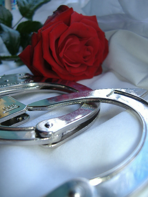
Description: On this picture you can see handcuffs.

Related content


Comments: 22


Is that an easy release mechanism or a double lock? Never seen that kind...
Anyways, very nice photo
 (Smile)")
👍: 0 ⏩: 1

You only need a key to open the lock. I don't know something what I have to do with the other thing. ^^
👍: 0 ⏩: 1
A double lock only requires one key, but it locks the handcuffs so they won't tighten during use. Professional cuffs. An easy release mechanism is a handle for opening the cuffs without a key. Toy cuffs
 (Wink)")
👍: 0 ⏩: 1
My cuffs are professional cuffs.
👍: 0 ⏩: 0

well done, love the reflections, its to cold and beautyful!
👍: 0 ⏩: 1

I'm not even going to ask where you got handcuffs from - or for what purpose... lol
I like the detail, the way you've laid them out and the areas where they actually blend into the background. Nice job.

👍: 0 ⏩: 1
Big thx!
My grandpa bought them me over 8 years ago, when I was a child.
👍: 0 ⏩: 0

Nice sharp and clean pic. I really like the way the handcuffs seem to blend in with the background. Nice how the whole is very bright!
👍: 0 ⏩: 1

Hehe..you're right, but the font is also pretty important..particularly when you make a boarder...but "über geschmack lässt sichs streiten" ")
Ich finde das Bild gut. Die Reflektionen, die Beleuchtung und die Details sind schön.
👍: 0 ⏩: 1

You got the "18% grey" right, nice sharpness all over with contained depth. Good piece mate.
👍: 0 ⏩: 1

agreed, the font could be better, and the image has blown-out highlights resulting in a loss of detail, but nice concept nonetheless.
please comment on one or more of my photos.
much appreciated.
👍: 0 ⏩: 1
Thx, but I never change the font. And you should look at the picture and not at the font or something else.
👍: 0 ⏩: 0

nice lighting on this one, very cool shot. should play with the typography used for the title and credits though, doesn't suit the image.
👍: 0 ⏩: 1
Thx 4 the flowers.
What would you say me with: "should play with the typography used for the title and credits though, doesn't suit the image."?
👍: 0 ⏩: 1
I would change the font to something else to make the text look nicer.
👍: 0 ⏩: 1