HOME | DD
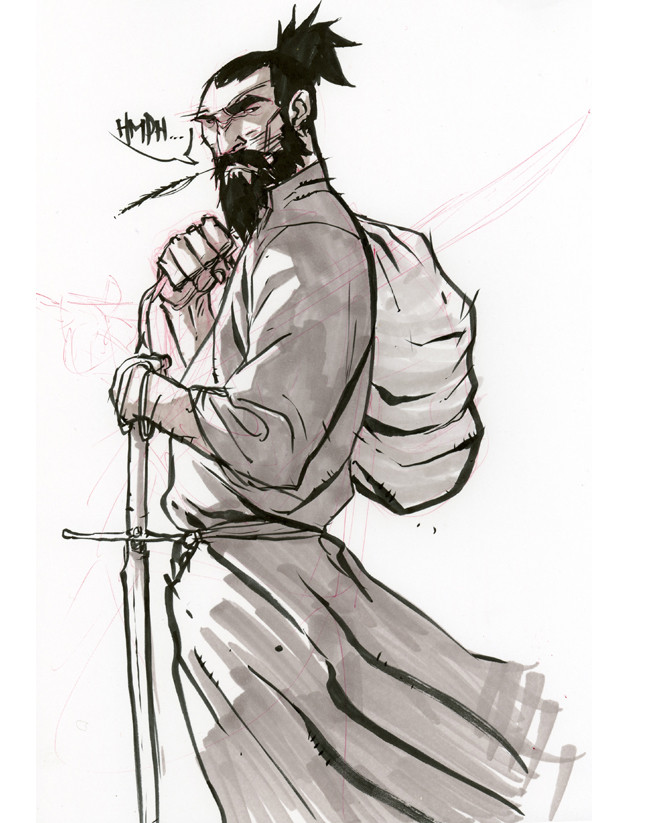
 chriscopeland — Cowboy practice

Published: 2007-09-27 21:28:18 +0000 UTC; Views: 4573; Favourites: 97; Downloads: 148
Redirect to original
Description
Weel, im so far behind where i think i should be color wise, so im really going to be working on messing around with different techniques and really pushing myself more with my work, and i think i should show you guys that progress, ONE!*edit*
Changed the nose afterall, made it a little more visible, IT BOTHERED ME! Everything else though, im keeping the same. The reality is that REALITY dictates the lighting, and if this were a real photograph that i had taken, i probably would have gone for more INTENSITY on the lighting, and i wanted this to capture that which i would have gone for, PEACE!
Related content


Comments: 44

I can't help but be taken to Mid World. My first thought was of Roland Deschain on his quest for the Dark Tower.
👍: 0 ⏩: 0

Looks like Logan (Wolverine) in the 19th century.
👍: 0 ⏩: 0

")

WOW!!!
I like the mood!!!
I think the Hat its a little bit short, but nothing to worry about it!!!!
Keep up the good work!!!
Esta perron!!!!!
👍: 0 ⏩: 0

Veiny arms ^.^
reminds me of Wolverine for some reason
👍: 0 ⏩: 0

love the texture, and likin' the clint eastwood look.
👍: 0 ⏩: 0

Nice work. I'm glad you are getting into more color work. Even if you're not working for big companies in comics, that doesn't mean you can't work for some gaming companies. The pay is not always fantastic, but it is published work.
👍: 0 ⏩: 0

reminds me of the j. scott campbell clock tower pin up. . but still very cool and very much its own. sweet colors too.
👍: 0 ⏩: 0

Good moves man...I like the creativenessity of the last few pieces
👍: 0 ⏩: 1

Hey man, this is what happens when you stop drawing the comics i guess. I havent been thinking about sequentials, and its done WONDERS for my work man, WONDERS, and plus im trying for a HUGE position so, we'll see what happens. How you been man, gimme a call sometime, PEACE!
👍: 0 ⏩: 0

Thanks yo, glad you like it, PEACE!
👍: 0 ⏩: 0


")


This is dope yo.... I hate to crit experimental work....that's why it's experimental!
👍: 0 ⏩: 0


Wait, how is this a practice? What do you plan on changing?
👍: 0 ⏩: 0

damn Chris, i'm reallly feelin this one.
experimentation's the fun aint it!
👍: 0 ⏩: 1
Hahaha, just playin catch-up homey, lol. Thanks for the AMAZING a beautiful display of how to use colors to better work, as oppose to DEFINE work, PEACE!
👍: 0 ⏩: 0

awesome!!! i really dig it dude. i think the vertical line bit over top might be pushing too hard. while it gives me that old movie reel feeling, it's not terribly convincing. but i'll get over it.
it pains me that with all the shit you got keeping you from drawing, you're still way better than me")
 (Smile)")
👍: 0 ⏩: 1
Thanks yo, yeah im trying to figure out the TABOO areas of these Filters and Texturizers.
Haha, man dood, you motivate me to be better, FORREAL! Thanks yo, PEACE!
👍: 0 ⏩: 0


Haha, YEAHHHH! Im loving it man, Thanks for the motivation.
👍: 0 ⏩: 0
I knew you'd like that realistic BG.... ;}
👍: 0 ⏩: 0


looks amazing the backround is beautiful and the cowboy looks kool. I love the wrinkles and folds in his shirt. How do you figure out where to put them? I always have a hard time with that.
👍: 0 ⏩: 0


"Naw, Mom...I can't tonight. I've got cowboy practice."
👍: 0 ⏩: 0

this has a taste of Turners style, which is unlike most of your work, but I just thought Id point it out.
I like the piece.
👍: 0 ⏩: 0

the glare on the nose is really strong.. it makes it looks like you chopped his face off.
👍: 0 ⏩: 1
Yeah i heard that one, as bad as i want to change it, im gonna use it to make the next one better, thanks yo, BETTER LUCK NEXT LINE!
👍: 0 ⏩: 0


how do you get your wrinkles in the clothing so realistic? Great job. My only beef is the light blurring his face. I think it ruins it..
👍: 0 ⏩: 0


Good job Chris! the lines is great as always, and here comes my crits, the colors of the guy don't work with the colors of the backgroun in my opinion and is the background a photo? or digital BG in Ps?
👍: 0 ⏩: 1
Thanks head, yeah im still working on it now, im trying to find out different ways to balance the colors, so im gonna be posting up a newer version of this one with the crits utilized. And thats a stock photo i found somewhere, and blew up, i like the fuzzy feeling to it, im trying to use different techniques, and decided to keep this one like this.
👍: 0 ⏩: 1
Np bro! I try to help you how I can! Keep working my friend you can only improve!
👍: 0 ⏩: 0