HOME | DD
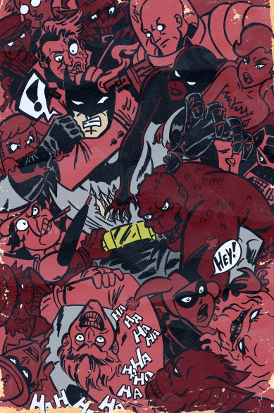
 ChrisFaccone — Batman brawl version 2
Published: 2011-01-08 04:24:28 +0000 UTC; Views: 733; Favourites: 20; Downloads: 21
Redirect to original
Description
What version do you like better?Related content


Comments: 8

yeah this one... the background of red variants still stays together but because the reds are different they create a better tone composition. The texture on top helps make the reds look more interesting too.
👍: 0 ⏩: 1

Thanks for the feedback!
👍: 0 ⏩: 0

The color variation here is nice.
Creates more visual interest.
Maybe I like this one better...
👍: 0 ⏩: 1
Thanks for the feed back.
👍: 0 ⏩: 0
Thanks for the feedback! Any reason why?
👍: 0 ⏩: 1

Like the poster below mentioned, the color variation is really nice. I think it makes it pop just a bit more.
👍: 0 ⏩: 1