HOME | DD
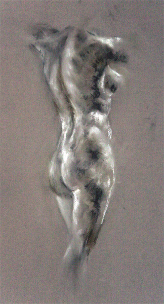
 christiana — complex back

Published: 2006-04-16 17:16:35 +0000 UTC; Views: 4268; Favourites: 76; Downloads: 115
Redirect to original
Description
omg jumprabbit will kill me...*runs*
Related content


Comments: 26
transmuth [2023-08-06 05:41:55 +0000 UTC]
👍: 0 ⏩: 0


thank you so much! it's one of my earlier works, so it was all very experimental and it worked out well!

👍: 0 ⏩: 0


This is awesome! I love the colors and the way you chose to leave off part of the figure... but in such a balanced way. Nice work!
👍: 0 ⏩: 0
thank you so much. i like this too, i think it's the best i've done thus far.
thanks!
👍: 0 ⏩: 1

Your very wellcome!! I also enjoyed you'r newer fast scketches!!! well realy most of you'r large gallery!!!
👍: 0 ⏩: 0

nice back study, you kept it fresh looking. i find it hard to keep from over-working pastels. well done
👍: 0 ⏩: 1
 (Smile)")


thanks! i love the contrast of the dark paper with the bright pastels.
👍: 0 ⏩: 0

Wow this is another good one. Great renderring of the shape and shoulder blades.
👍: 0 ⏩: 1
thanks heaps! i must say i think it's one of my best. god bless pastels!

👍: 0 ⏩: 1
I agree - it's very well done.
👍: 0 ⏩: 0

i like the dark area in the spine, gives it a nice feel, the sholders are great too.
👍: 0 ⏩: 1

pastels are yummy.... nice touch you have... just the right amount of everything... not too heavy. the figure emerges just so.
👍: 0 ⏩: 0


If this is actually drawn on grey paper, I will let you off...
Top notch work! those pastels were obviously great investment ")
")
👍: 0 ⏩: 1
oh shush u complaining thing!
yeh it was toned paper- a greyish greenish tinge.
yeh those pastels are pretty cool
i suck at using colour but i'm giving it a go!
thanks babes.
👍: 0 ⏩: 1
The colours were good...if it was indeed toned paper I guess the photo isn't so bad
I likes it
👍: 0 ⏩: 0

not sure it's 100% anatomically correct, but i try. thanks!
👍: 0 ⏩: 0

