HOME | DD
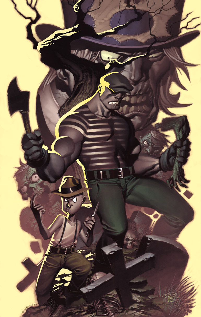
 ChristopherStevens — The Goon color test
Published: 2009-08-03 16:14:40 +0000 UTC; Views: 35416; Favourites: 991; Downloads: 7304
Redirect to original
Description
Finally got around to trying my hand at coloring one of these. Harder than I thought.With anything I do, there's things I like and things not so much here.
The Goon Copyright Eric Powell.
Related content
Comments: 144

Awesome, maybe you can change the color of the background though. The yellow is really strong and overpowering and you chose yellow because its a complement of purple but perhaps you need to go darker and possibly with a different color.
👍: 0 ⏩: 1

To be honest, I chose yellow cause I like really bright backgrounds hehe. I actually came close to going straight white on it. I wasn't really thinking compliment. Actually, all that purple is really a desaturated red. It does look purple-ish though..
👍: 0 ⏩: 1

Well it's still awesome don't get me wrong. I just think changing the yellow via Hue / Saturation in Photoshop might be a good idea to try.
👍: 0 ⏩: 1

I hear you. I don't disagree either. I might make an adjustment or two.
👍: 0 ⏩: 1

well either way its awesome.
👍: 0 ⏩: 0

so it turns out your newly devloped illustration technique....
rocks like hell!!!!
I would so pick up issues and paperbacks with that cover
👍: 0 ⏩: 1

oh awesome. I like how you did the highlight. nice use of the background colour
👍: 0 ⏩: 0

Great! Love how it still keeps the same tone and shading as the grey version
👍: 0 ⏩: 1

Thanks. Yeah, the marker piece is unchanged except for the areas where I did the bright yellow highlighting.
👍: 0 ⏩: 1

I think it's good when an artist shades their stuff before it's coloured, either by them or a colourist, as it gives a better basis for the colourist and stays close to how the artist imagined it.
👍: 0 ⏩: 1

It does help. It's also nice to have the natural hand drawn texture underneath the art. Adds some life to the usually lifeless digital colors.
👍: 0 ⏩: 1

Yeah, like how Adam Kubert has his art get coloured straight from his pencils instead of inking them first.
👍: 0 ⏩: 0

this captures the mood Of eric's character perfectly! great job, man!!
👍: 0 ⏩: 1

Thanks! That's all I can hope for
👍: 0 ⏩: 1

You are very welcome. The Goon is one of my favorite reads... and you are probably the only guy other than Eric Powell to really capture the "feel" of the characters....
👍: 0 ⏩: 1

Thanks, man. It was pretty easy..I just drew the characters as close to how Powell would as I could LOL.
👍: 0 ⏩: 0

Mieselikedieseda... As JarJar would say
Nice colors!
Best,
Chris
👍: 0 ⏩: 0

Again, Cover Quality. You're just too awesome.
👍: 0 ⏩: 0

Came out great! Badass work as usual, bro.
👍: 0 ⏩: 1

Great work, the faded characters on the background are just amazingly colored, the only thing that maybe could be changed is the intensity of the yellow rim light.
👍: 0 ⏩: 1

Hehe, the yellow either works for folks or not. That's how it goes I guess.
👍: 0 ⏩: 0

You just keep getting better and better!!! WOW!
👍: 0 ⏩: 0

genius colors man!
i saw the "grayscale" version and it already look great, but this absolutely brilliant!
i'd buy this poster in a heart beat, although i'm not a huge Goon fan, this'd look great in any wall
👍: 0 ⏩: 1

It was a great post until you said you're weren't really a Goon fan
👍: 0 ⏩: 0

I'm diggin it- you have a nice textural feel to your rendering and the addition of colour gives it an almost oil painted look.
The depth is a little off, as the Goon's left leg looks further back than other elements -- but as a first attempt at colouring this fresh style of yours, Chris I give it a B+/A- (you know it's only going to get so much better with trial and error).
My favourite parts are the gravel just below the cross in the foreground (very "Frazetta-esque") and the bold rimlight.
Lastly, I honestly prefer this approach to you standard full colour work, which looks a bit too colourful for my tastes. By colouring these value based illustrations you work looks much more distinct and the colour suggests greater mood and drama...
Don't stop!!!
👍: 0 ⏩: 1

Thanks for the feedback, mate. The leg thing is me trying things out. It sells a bit better in the b/w version, but I still like it. Like every person who's ever tried to paint..digitally or traditionally, Frazetta is a source of inspiration. The Frazetta-esques aren't accidental hehe.
The greys of the marker dull my colors a bit, but I also tried to go really desaturated to match the basic look of the comic. So that improvement to my palette was kind of accidental hehe.
👍: 0 ⏩: 0

Because I just must! LOL..Thanks!
👍: 0 ⏩: 0

really amazing. What method do you use to paint your work? Custom brushes? Sticking to detail last? etc..
👍: 0 ⏩: 1

No customs. I don't even know how to make customs..my PS knowledge is shamefully limited. I do all the colors on one layer and use one default brush.
Thanks!
👍: 0 ⏩: 0

the color is amazing on this, it really stands out in the see of same old same old stuff. I really dig this.
👍: 0 ⏩: 1
<= Prev |


